FabCon is coming to Atlanta
Join us at FabCon Atlanta from March 16 - 20, 2026, for the ultimate Fabric, Power BI, AI and SQL community-led event. Save $200 with code FABCOMM.
Register now!- Power BI forums
- Get Help with Power BI
- Desktop
- Service
- Report Server
- Power Query
- Mobile Apps
- Developer
- DAX Commands and Tips
- Custom Visuals Development Discussion
- Health and Life Sciences
- Power BI Spanish forums
- Translated Spanish Desktop
- Training and Consulting
- Instructor Led Training
- Dashboard in a Day for Women, by Women
- Galleries
- Data Stories Gallery
- Themes Gallery
- Contests Gallery
- QuickViz Gallery
- Quick Measures Gallery
- Visual Calculations Gallery
- Notebook Gallery
- Translytical Task Flow Gallery
- TMDL Gallery
- R Script Showcase
- Webinars and Video Gallery
- Ideas
- Custom Visuals Ideas (read-only)
- Issues
- Issues
- Events
- Upcoming Events
The Power BI Data Visualization World Championships is back! Get ahead of the game and start preparing now! Learn more
- Power BI forums
- Forums
- Get Help with Power BI
- Desktop
- How do i get this visual
- Subscribe to RSS Feed
- Mark Topic as New
- Mark Topic as Read
- Float this Topic for Current User
- Bookmark
- Subscribe
- Printer Friendly Page
- Mark as New
- Bookmark
- Subscribe
- Mute
- Subscribe to RSS Feed
- Permalink
- Report Inappropriate Content
How do i get this visual
Hi All,
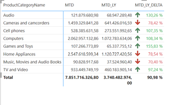
I have 2 measures MTD and MTD_LY, I want to add a 3rd column that should show if it is good or bad , please see the below sccreen shot (GREEN and RED Arrows), please advice. I looked something similar like
Measure =
IF ( MIN ( 'Table1'[Column1] ) < 600, UNICHAR ( 9650 ), UNICHAR ( 128315 ) )
but that is column againt a constant value.
Solved! Go to Solution.
- Mark as New
- Bookmark
- Subscribe
- Mute
- Subscribe to RSS Feed
- Permalink
- Report Inappropriate Content
Hi @amybirc77 ,
Additionally to your MTD and MTD_LY measure you would build a delta measure which creates the percentage difference between the first two like:
The format of the measure can be like this:
MTD_LY_DELTA =

var var_MTD = [MTD]
var var_MTD_LY = [MTD_LY]
var var_MRT_LY_Delta = var_MTD - var_MTD_LY

RETURN
DIVIDE(
   var_MRT_LY_Delta,
   ABS(var_MTD_LY),
   BLANK()
)
For this measure typically you do the following formatting.
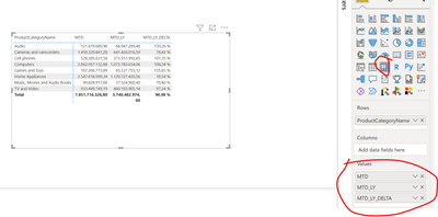
Then you put all measures into the matrix visual:
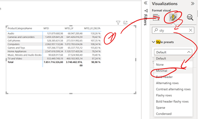
For clearer view I put the visual style on minimal
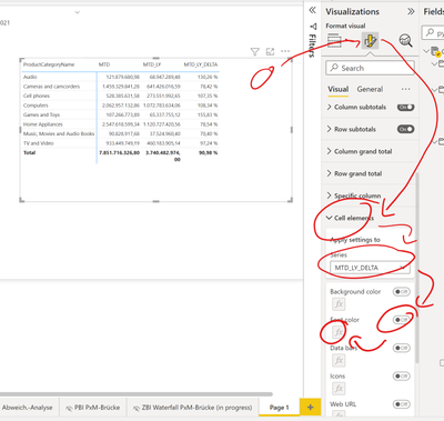
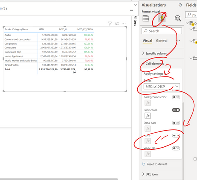
Put on the conditional formatting for the DELTA column and the click on the fomula symbol
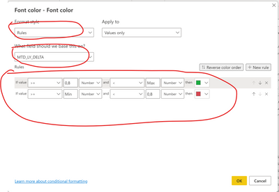
now you can set the coloring rule. I configured it to be green for >= 80% and red for < 80%. You can choose in the number type for percentage of number. I prefer to work with number in each case and use decimal numbers to represent the percentages.
after clikcing ok, the coloring is there
now you can also create icons
Result after ok
you can do some more stuff but this should give you a good overview to go on.
You can find more information here
Apply conditional table formatting in Power BI - Power BI | Microsoft Learn
Best regards
Michael
-----------------------------------------------------
If this post helps, then please consider Accept it as the solution to help the other members find it more quickly. Appreciate your thumbs up!
@ me in replies or I'll lose your thread.
Visit my blog datenhungrig which I recently started with content about business intelligence and Power BI in German and English or follow me on LinkedIn!
- Mark as New
- Bookmark
- Subscribe
- Mute
- Subscribe to RSS Feed
- Permalink
- Report Inappropriate Content
- Mark as New
- Bookmark
- Subscribe
- Mute
- Subscribe to RSS Feed
- Permalink
- Report Inappropriate Content
Hi @amybirc77, I am happy to help and appreciate your feedback.
Thank you very much!
Visit my blog datenhungrig which I recently started with content about business intelligence and Power BI in German and English or follow me on LinkedIn!
- Mark as New
- Bookmark
- Subscribe
- Mute
- Subscribe to RSS Feed
- Permalink
- Report Inappropriate Content
@amybirc77 I don't know the business rules and there isn't much to go on but the general answer is Conditional formatting.
Follow on LinkedIn
@ me in replies or I'll lose your thread!!!
Instead of a Kudo, please vote for this idea
Become an expert!: Enterprise DNA
External Tools: MSHGQM
YouTube Channel!: Microsoft Hates Greg
Latest book!: DAX For Humans
DAX is easy, CALCULATE makes DAX hard...
Helpful resources

Power BI Dataviz World Championships
The Power BI Data Visualization World Championships is back! Get ahead of the game and start preparing now!

| User | Count |
|---|---|
| 40 | |
| 35 | |
| 34 | |
| 31 | |
| 27 |
| User | Count |
|---|---|
| 135 | |
| 102 | |
| 67 | |
| 65 | |
| 56 |


