- Subscribe to RSS Feed
- Mark Topic as New
- Mark Topic as Read
- Float this Topic for Current User
- Bookmark
- Subscribe
- Printer Friendly Page
- Mark as New
- Bookmark
- Subscribe
- Mute
- Subscribe to RSS Feed
- Permalink
- Report Inappropriate Content

How do I take the extra space out of the top of a card?
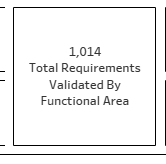
I am trying to replicate a card that looks like this in Tableau:
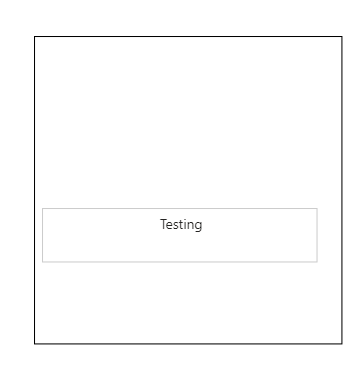
I have gotten pretty close in Power BI, but it wants to leave more space at the top and bottom:
I cannot seem to get the text centerd in the box, or get rid of the space at the top. When I try to drag the bottom of the card up to shorten it, it leaves the space at the top and cuts the text off. There must be a way to do this...what is it?
Thanks!
- Mark as New
- Bookmark
- Subscribe
- Mute
- Subscribe to RSS Feed
- Permalink
- Report Inappropriate Content

Hi @ripstaur - it might have to do with the padding property of your visual. Under the formatting pane in Power BI Desktop, you can easily reduce the padding to "0 px". I hope this solves the issue for you.
- Mark as New
- Bookmark
- Subscribe
- Mute
- Subscribe to RSS Feed
- Permalink
- Report Inappropriate Content

Thanks to all who tried to help. None of this worked. I will just live with it.
- Mark as New
- Bookmark
- Subscribe
- Mute
- Subscribe to RSS Feed
- Permalink
- Report Inappropriate Content

Hi @ripstaur ,
Based on my test, seems could not reproduce it in my environment. When I reduced the size of the KPI, it works normal.
In KPI visual, you can adjust the title and value's position to center, and the size of the internal space will change with the size of the visual. We can adjust the title and value's font size to adapt the KPI size.
If not help, maybe you can consider sharing a 'problem' sample file for further discussion.
Best Regards,
Community Support Team _ Yingjie Li
If this post helps, then please consider Accept it as the solution to help the other members find it more quickly.
- Mark as New
- Bookmark
- Subscribe
- Mute
- Subscribe to RSS Feed
- Permalink
- Report Inappropriate Content

I will give that a try...I'll let you know if it works.
- Mark as New
- Bookmark
- Subscribe
- Mute
- Subscribe to RSS Feed
- Permalink
- Report Inappropriate Content

Sorry, Namish...that did not help. If you look at the second screen shot above, the text in the KPI card is high (vertically) within the card itself as it will go. There seems to be a blank space above the number that cannot be used. What I want to do is end up with the text centered vertically within the card, with minimal space or padding above and below the number and the category label. I can't get there now, because the text can't move up in the card.
- Mark as New
- Bookmark
- Subscribe
- Mute
- Subscribe to RSS Feed
- Permalink
- Report Inappropriate Content

So that might not work for what I'm trying to do. I'm trying to work the spacing inside the KPI card.
- Mark as New
- Bookmark
- Subscribe
- Mute
- Subscribe to RSS Feed
- Permalink
- Report Inappropriate Content

Hi @ripstaur - Inside KPI Card Space will not work directly. You have to custom the visual using text box and layers of data(Or KPI Card) on top and make it look like a KPI visual with least white space at top/Bottom.
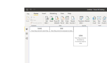
Just an example of displaying a measure in KPI Card (94) which is sitting on rectangle in the background
Cheers,
-Namish B
- Mark as New
- Bookmark
- Subscribe
- Mute
- Subscribe to RSS Feed
- Permalink
- Report Inappropriate Content

Thanks, Namish. To be clear, you are suggesting using rectangles instead of cards?
- Mark as New
- Bookmark
- Subscribe
- Mute
- Subscribe to RSS Feed
- Permalink
- Report Inappropriate Content

Hi @ripstaur - Sorry I mean you can put background as a rectangle and top visual can be anything including KPI card.
Hope this helps.
Cheers,
-Namish B
- Mark as New
- Bookmark
- Subscribe
- Mute
- Subscribe to RSS Feed
- Permalink
- Report Inappropriate Content

Hi @ripstaur - I know of a silly work around may be there is a better way to do this:
Insert a Shape > Rectangle of whatever size you want. Enable border. This acts as your bigger rectangle
Now, Your actual visual containing value should sit on top of this. Without enabling border. You can leave whatever room in top/bottom in that case.
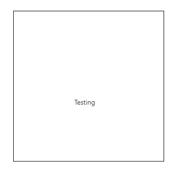
Below example: has 2 visuals:

You can fit 'n' number of visuals on this canvas. Hope this helps. 🙂
Cheers,
-Namish B
Helpful resources
| Subject | Author | Posted | |
|---|---|---|---|
| 06-05-2024 10:49 AM | |||
|
Anonymous
| 07-14-2019 12:05 AM | ||
| 06-26-2024 02:51 AM | |||
| 01-25-2024 02:02 AM | |||
| 06-14-2024 02:03 PM |
| User | Count |
|---|---|
| 127 | |
| 99 | |
| 82 | |
| 52 | |
| 46 |


