New Offer! Become a Certified Fabric Data Engineer
Check your eligibility for this 50% exam voucher offer and join us for free live learning sessions to get prepared for Exam DP-700.
Get Started- Power BI forums
- Get Help with Power BI
- Desktop
- Service
- Report Server
- Power Query
- Mobile Apps
- Developer
- DAX Commands and Tips
- Custom Visuals Development Discussion
- Health and Life Sciences
- Power BI Spanish forums
- Translated Spanish Desktop
- Training and Consulting
- Instructor Led Training
- Dashboard in a Day for Women, by Women
- Galleries
- Community Connections & How-To Videos
- COVID-19 Data Stories Gallery
- Themes Gallery
- Data Stories Gallery
- R Script Showcase
- Webinars and Video Gallery
- Quick Measures Gallery
- 2021 MSBizAppsSummit Gallery
- 2020 MSBizAppsSummit Gallery
- 2019 MSBizAppsSummit Gallery
- Events
- Ideas
- Custom Visuals Ideas
- Issues
- Issues
- Events
- Upcoming Events
Don't miss out! 2025 Microsoft Fabric Community Conference, March 31 - April 2, Las Vegas, Nevada. Use code MSCUST for a $150 discount. Prices go up February 11th. Register now.
- Power BI forums
- Forums
- Get Help with Power BI
- Desktop
- Re: How do I organise data by Year and Quarter on ...
- Subscribe to RSS Feed
- Mark Topic as New
- Mark Topic as Read
- Float this Topic for Current User
- Bookmark
- Subscribe
- Printer Friendly Page
- Mark as New
- Bookmark
- Subscribe
- Mute
- Subscribe to RSS Feed
- Permalink
- Report Inappropriate Content
How do I organise data by Year and Quarter on a line graph?
Hi all,
I have exhausted Google and Youtube, and I haven't been able to find out whether Power BI has the capability of organising data by year and quarter in a line chart.
So far, I can only organise data either by Year or by Quarter, but not both. I have serveral years worth of data to display and I need to be able to group it according to fiscal quarter and year.
As a work around, I've added a column into my data table that lists the quarter and year, I have then created a separate table that lists the quarters in one column then assigns a rank to a quarter in another column, e.g:
| Quarter | Index |
| Q1 2019 | 1 |
| Q2 2019 | 2 |
... and created a relationship between the two tables.
I can now sort the data, by using the index column on the x axis, however the data labels on the x axis are not going to make sense to anyone except me. I could hide the data labels and manually add them on as individual text boxes - but this feels a huge work around for something that can be accomplished so quickly and easily in Excel.
Is there an easier way to do this?
Any help, thoughts or ideas would be much appreciated!
Many thanks!
Solved! Go to Solution.
- Mark as New
- Bookmark
- Subscribe
- Mute
- Subscribe to RSS Feed
- Permalink
- Report Inappropriate Content
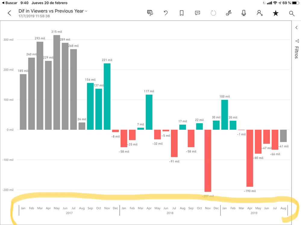
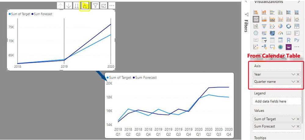
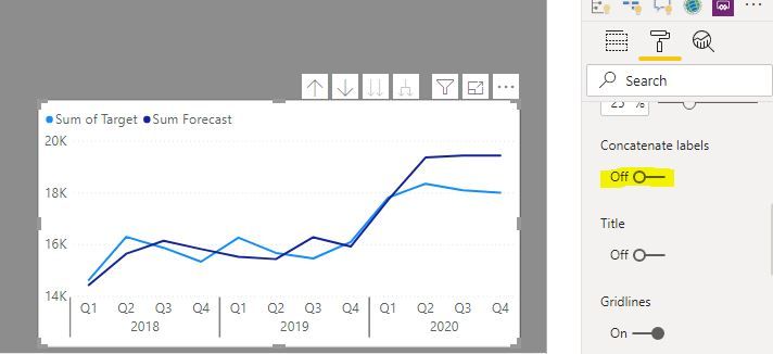
If you set up a Calendar table including fields for Quarter and year, you can add both of these to the x-axis and use the drilldown function to display the quarter/year as individual points, or you can de-select "Concatenate values" under the formatting options for the axis in the formatting pane, and get an an axis with grouped hierarchical values:
Did I answer your question? Mark my post as a solution!
In doing so, you are also helping me. Thank you!
Proud to be a Super User!
Paul on Linkedin.
- Mark as New
- Bookmark
- Subscribe
- Mute
- Subscribe to RSS Feed
- Permalink
- Report Inappropriate Content
I did not get the issue completely. Is Sorting an issue. Or display is an issue. Ideally, you should have date table, where you should all your moth, qtr , year and there sort columns. You can mark the sort column for any column. Can you explain with an example what is the issue you are facing?
- Mark as New
- Bookmark
- Subscribe
- Mute
- Subscribe to RSS Feed
- Permalink
- Report Inappropriate Content
Hiya,
Thanks so much for replying!
It's both a sorting and display issue.
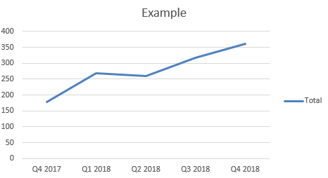
I need to sort the data in yearly and quarterly groups (i.e. Q1 2019), so that I can organise data visually by quarter and year, like so:
I achieved this view in excel by having a column in my data table that lists the quarter and year, like so:
| Example | Quarter and Year contract created |
| Contract One | Q1 2019 |
| Contract Two | Q2 2019 |
I'm able to arrange the quarters and years on the x axis in Excel by manually sorting the dates into chronological order in the Pivot table.
However, in Power BI, I'm unable to manually sort the quarters manually, which why I have used the work around as described in the opening post.
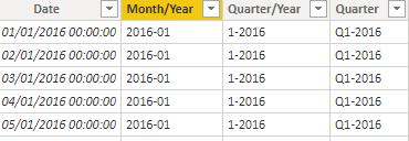
I thought about using an existing date column in the data set to organise the data, but Power BI will only allow me to organise date by Year:
Or, by Quarter:
In terms of reporting, a break down by quarter and year (or even month and quarter) is more useful than the above.
I've not tried creating a calendar table, how would that help?
Many thanks again for your support with this
- Mark as New
- Bookmark
- Subscribe
- Mute
- Subscribe to RSS Feed
- Permalink
- Report Inappropriate Content
When your table has date then we create a date table move all these months, qtr , year etc there.
First How can you get sort order for your qtr
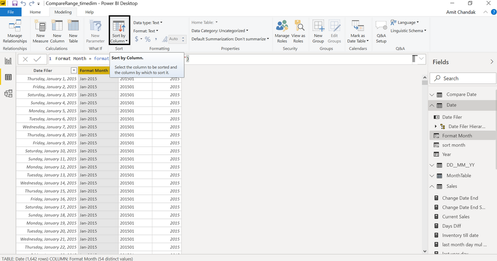
Q1 2019 is the format, create a new column in your table and make it a sort column, screen short I have given in the last post
Sort qtr = right(Table[Qtr],4) & " " & left(Table[Qtr],2)
In case you have the date, or even month(create date from the month) we create a date table
Month Year = format(date[Date],"MMM-YYYY")
Month Year Sort = format(date[Date],"YYYYMM")
Qtr Year = "Q" & Quarter(date[Date]) & " " & year(date[Date])
Qtr Year Sort = year(date[Date]) & "Q" & Quarter(date[Date]) & " "
To get the best of the time intelligence function. Make sure you have a date calendar and it has been marked as the date in model view. Also, join it with the date column of your fact/s. Refer :
https://radacad.com/creating-calendar-table-in-power-bi-using-dax-functions
https://www.archerpoint.com/blog/Posts/creating-date-table-power-bi
https://www.sqlbi.com/articles/creating-a-simple-date-table-in-dax/
- Mark as New
- Bookmark
- Subscribe
- Mute
- Subscribe to RSS Feed
- Permalink
- Report Inappropriate Content
Thanks so much for this!
I followed the instructions below and unfortunately, it hasn't solved my problem. Even when the dates are linked to a calander table, Power BI is unable to sort quarters/year into chronological order on a line chart.
I think the problem is that the values I'm trying to use are not literal dates (dd/mm/yyyy). Power BI doesn't recognise 'Q1 2019' as a date value and so treats it as text value, which is why it's sorting the data as if it's text data.
I'm not sure if I've set up my calendar table incorrectly:
But I tried linking the quarter column in the date table, to the quarter column in my contracts table- but it didn't work.
I then tried linking the date column together but that didn't work either.
I'm not sure if there is anything else I can do - it's a real shame Power BI doesn't have the same functionality as Excel to group data by quarter and year - it would defintely be a huge time saver!
- Mark as New
- Bookmark
- Subscribe
- Mute
- Subscribe to RSS Feed
- Permalink
- Report Inappropriate Content
Hi @Vicky2020 ,
Did that work to make your quarter column to sorted by your index column? Also wen can change the Quarter format to "YYYY-Q" to work around.
date = ADDCOLUMNS(CALENDARAUTO(),"YQ",FORMAT([Date],"YYYY-Q"))
For more details, please check the pbix as attached.
If this post helps, then please consider Accept it as the solution to help the others find it more quickly.
- Mark as New
- Bookmark
- Subscribe
- Mute
- Subscribe to RSS Feed
- Permalink
- Report Inappropriate Content
The date table does act like a v-lookup, so the value is pulled through, however as Power BI doesn't (yet) recognise financial quarters as an actual measure of time, so the data will be sorted as text. Your work around would would, but I was hoping that the software would have something a bit more sophisticated for dealing with quarterly data or formatting x axis (like the grouping functions in Power Pivot or the additional time measures in Tableau).
Thanks for all your help though!
Hopefully, Power BI will allow this functionality in the future!
- Mark as New
- Bookmark
- Subscribe
- Mute
- Subscribe to RSS Feed
- Permalink
- Report Inappropriate Content
If you set up a Calendar table including fields for Quarter and year, you can add both of these to the x-axis and use the drilldown function to display the quarter/year as individual points, or you can de-select "Concatenate values" under the formatting options for the axis in the formatting pane, and get an an axis with grouped hierarchical values:
Did I answer your question? Mark my post as a solution!
In doing so, you are also helping me. Thank you!
Proud to be a Super User!
Paul on Linkedin.
- Mark as New
- Bookmark
- Subscribe
- Mute
- Subscribe to RSS Feed
- Permalink
- Report Inappropriate Content
Many thanks for this!
I followed your suggestion and it doesn't work - sorry!
When I add both the month and year (from the calendar table) into the x axis field, I get the same issue as metioned in the opening post. It will only allow me to display one value (Year or month). When I try the drill down feature, it will only flip between year and month - it won't show Year and month together.
If you have any other suggestions, I'd be happy to try! Otherwise, I can use the work around as mentioned in the previous post, until this issue is addressed in the software.
- Mark as New
- Bookmark
- Subscribe
- Mute
- Subscribe to RSS Feed
- Permalink
- Report Inappropriate Content
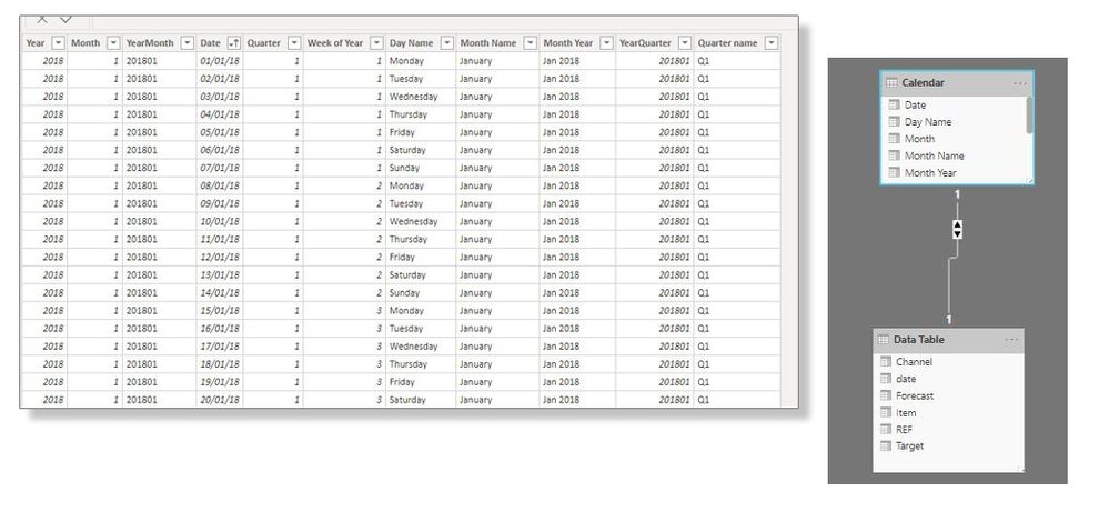
I'm not sure what is going on at your end, but this is what I have just set up:
Did I answer your question? Mark my post as a solution!
In doing so, you are also helping me. Thank you!
Proud to be a Super User!
Paul on Linkedin.
- Mark as New
- Bookmark
- Subscribe
- Mute
- Subscribe to RSS Feed
- Permalink
- Report Inappropriate Content
Thanks so much for your continued help!
Oddly, after following your suggestion from the previous post, I saved and closed my dashboard, After seeing your recent post, I reopened the dashboard and weirdly, everything was working:
Previously, when I tried flipping off the concatenate switch in the x axis formatting area, nothing worked... but now it is.
I think that when I saved my dashboard, I saved it with the concatenate switch turned off, and then when I reopened the dashboard, it started working.
Really, weird, but I'm so grateful for your help in getting this sorted. This will definitely make my reporting much easier!!!
- Mark as New
- Bookmark
- Subscribe
- Mute
- Subscribe to RSS Feed
- Permalink
- Report Inappropriate Content
Glad it worked out!
You are not alone with the switch for Concatenate Labels: it is REALLY buggy!!
I actually spent a good half hour trying to work out why the switch wasn't working when setting up the example. Very frustrating, and I tried all sorts of things. (I even opened up the report from which I got the first screenshot to see if there was some setting I was missing..)
and suddenly it worked auto-magically.
So... either I turned something on or off (which I don't think I did) or there is a bug.
I'll look around to see if there is a rational explanation to get the switch to work flawlessly.
Did I answer your question? Mark my post as a solution!
In doing so, you are also helping me. Thank you!
Proud to be a Super User!
Paul on Linkedin.
- Mark as New
- Bookmark
- Subscribe
- Mute
- Subscribe to RSS Feed
- Permalink
- Report Inappropriate Content
Thanks, Paul!
I kept wondering if it was me or the software. It didn't make sense to me that I couldn't group data by year and quarter. I'm so glad that I can - if this issue happens again I will try the old 'try switching it off and on again' method!
Many thanks again for all your support with this!
Helpful resources

Join us at the Microsoft Fabric Community Conference
March 31 - April 2, 2025, in Las Vegas, Nevada. Use code MSCUST for a $150 discount! Prices go up Feb. 11th.

Join our Community Sticker Challenge 2025
If you love stickers, then you will definitely want to check out our Community Sticker Challenge!

Power BI Monthly Update - January 2025
Check out the January 2025 Power BI update to learn about new features in Reporting, Modeling, and Data Connectivity.

| User | Count |
|---|---|
| 144 | |
| 75 | |
| 63 | |
| 51 | |
| 48 |
| User | Count |
|---|---|
| 204 | |
| 86 | |
| 64 | |
| 59 | |
| 56 |
