Party with Power BI’s own Guy in a Cube
Power BI is turning 10! Tune in for a special live episode on July 24 with behind-the-scenes stories, product evolution highlights, and a sneak peek at what’s in store for the future.
Save the date- Power BI forums
- Get Help with Power BI
- Desktop
- Service
- Report Server
- Power Query
- Mobile Apps
- Developer
- DAX Commands and Tips
- Custom Visuals Development Discussion
- Health and Life Sciences
- Power BI Spanish forums
- Translated Spanish Desktop
- Training and Consulting
- Instructor Led Training
- Dashboard in a Day for Women, by Women
- Galleries
- Data Stories Gallery
- Themes Gallery
- Contests Gallery
- Quick Measures Gallery
- Notebook Gallery
- Translytical Task Flow Gallery
- TMDL Gallery
- R Script Showcase
- Webinars and Video Gallery
- Ideas
- Custom Visuals Ideas (read-only)
- Issues
- Issues
- Events
- Upcoming Events
Enhance your career with this limited time 50% discount on Fabric and Power BI exams. Ends August 31st. Request your voucher.
- Power BI forums
- Forums
- Get Help with Power BI
- Desktop
- How do I create bar chart with multiple dimensions...
- Subscribe to RSS Feed
- Mark Topic as New
- Mark Topic as Read
- Float this Topic for Current User
- Bookmark
- Subscribe
- Printer Friendly Page
- Mark as New
- Bookmark
- Subscribe
- Mute
- Subscribe to RSS Feed
- Permalink
- Report Inappropriate Content
How do I create bar chart with multiple dimensions?
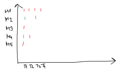
I have the following data:
| Machine | Timestamp | State |
| M1 | T1 | 0 |
| M1 | T2 | 0 |
| M1 | T3 | 0 |
| M1 | T4 | 0 |
| M2 | T1 | 1 |
| M2 | T3 | 1 |
| M3 | T1 | 0 |
| M4 | T1 | 1 |
| M4 | T2 | 0 |
| M5 | T1 | 0 |
and would like to create bar chart like this. Can someone tell me if something like that is possible?
Thanks!
Solved! Go to Solution.
- Mark as New
- Bookmark
- Subscribe
- Mute
- Subscribe to RSS Feed
- Permalink
- Report Inappropriate Content
I don't think bar chart will let you, but you could use the bubble chart or a matrix with conditional formatting (with one in columns and one in rows and your numeric column in values).
- Mark as New
- Bookmark
- Subscribe
- Mute
- Subscribe to RSS Feed
- Permalink
- Report Inappropriate Content
I don't think bar chart will let you, but you could use the bubble chart or a matrix with conditional formatting (with one in columns and one in rows and your numeric column in values).
Helpful resources
| User | Count |
|---|---|
| 70 | |
| 70 | |
| 34 | |
| 23 | |
| 22 |
| User | Count |
|---|---|
| 96 | |
| 94 | |
| 50 | |
| 42 | |
| 40 |


