FabCon is coming to Atlanta
Join us at FabCon Atlanta from March 16 - 20, 2026, for the ultimate Fabric, Power BI, AI and SQL community-led event. Save $200 with code FABCOMM.
Register now!- Power BI forums
- Get Help with Power BI
- Desktop
- Service
- Report Server
- Power Query
- Mobile Apps
- Developer
- DAX Commands and Tips
- Custom Visuals Development Discussion
- Health and Life Sciences
- Power BI Spanish forums
- Translated Spanish Desktop
- Training and Consulting
- Instructor Led Training
- Dashboard in a Day for Women, by Women
- Galleries
- Data Stories Gallery
- Themes Gallery
- Contests Gallery
- QuickViz Gallery
- Quick Measures Gallery
- Visual Calculations Gallery
- Notebook Gallery
- Translytical Task Flow Gallery
- TMDL Gallery
- R Script Showcase
- Webinars and Video Gallery
- Ideas
- Custom Visuals Ideas (read-only)
- Issues
- Issues
- Events
- Upcoming Events
Get Fabric Certified for FREE during Fabric Data Days. Don't miss your chance! Request now
- Power BI forums
- Forums
- Get Help with Power BI
- Desktop
- How can I create a bar graph visualization of a MS...
- Subscribe to RSS Feed
- Mark Topic as New
- Mark Topic as Read
- Float this Topic for Current User
- Bookmark
- Subscribe
- Printer Friendly Page
- Mark as New
- Bookmark
- Subscribe
- Mute
- Subscribe to RSS Feed
- Permalink
- Report Inappropriate Content
How can I create a bar graph visualization of a MS form question with multiple answer ?
Hello,
I am trying to create a bar chart with columns of every multiple choice answer (checkboxes) for a dashboard (Question is from MS forms) Currently, the graph is showing column names concatenated and I am trying to find a solution for this ?
Any ideas ?
Thank you.
- Mark as New
- Bookmark
- Subscribe
- Mute
- Subscribe to RSS Feed
- Permalink
- Report Inappropriate Content
- Mark as New
- Bookmark
- Subscribe
- Mute
- Subscribe to RSS Feed
- Permalink
- Report Inappropriate Content
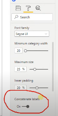
@Omar_204 I just realised that you may have the Concatenate Labels turned on... can you make sure you have this switched off?
I hope this is what's causing it.
Theo
If I have posted a response that resolves your question, please accept it as a solution to formally close the post.
Also, if you are as passionate about Power BI, DAX and data as I am, please feel free to reach out if you have any questions, queries, or if you simply want to connect and talk to another data geek!
Want to connect?www.linkedin.com/in/theoconias
- Mark as New
- Bookmark
- Subscribe
- Mute
- Subscribe to RSS Feed
- Permalink
- Report Inappropriate Content
Hi @TheoC ,
Unfortunately no. I believe the only way to do this is creating a seperate table just for this field and splitting the table using delimeters.
- Mark as New
- Bookmark
- Subscribe
- Mute
- Subscribe to RSS Feed
- Permalink
- Report Inappropriate Content
Hi @Omar_204
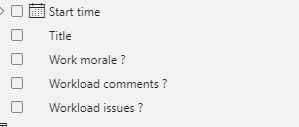
Is your column "Workload issues?" a concatenated column of all issues? If so, then yes, that is what is causing it.
However, you don't need to create a new table to fix this. If you concatenated the columns yourself, then undo that. Keep the Workload Issues as independent columns and then go to Power Query.
- Once in Power Query, select all of the Workload Issue columns by holding down Ctrl button.
- Right click and press "Unpivot Columns". This will turn all of the individual columsn into a single column.
- Press the Close and Apply button.
From here, you can drag the new unpivoted column to your category axis of the visual. Then, if you don't have one already, create a new measure using DISTINCTCOUNT that counts the distinct number of Workload Issue IDs. Drag the new measure into the value field of the visual, and all should be fixed.
Let me know if you need me to better explain the above!
Theo 🙂
If I have posted a response that resolves your question, please accept it as a solution to formally close the post.
Also, if you are as passionate about Power BI, DAX and data as I am, please feel free to reach out if you have any questions, queries, or if you simply want to connect and talk to another data geek!
Want to connect?www.linkedin.com/in/theoconias
- Mark as New
- Bookmark
- Subscribe
- Mute
- Subscribe to RSS Feed
- Permalink
- Report Inappropriate Content
Hi @TheoC,
So the method I used to make the workload issues visual was by using "Split by Column" --> by Comma (,) delimeter. So when I visualize this into a bar graph it displays correctly. But, when I apply the filter for the team it doesnt take any affect. I am not sure why the filter is not applying. Keep note that I decided to create a seperate table for workload issues. Any help would be appreciated.
Thank you.
- Mark as New
- Bookmark
- Subscribe
- Mute
- Subscribe to RSS Feed
- Permalink
- Report Inappropriate Content
Hi @Omar_204
Given that you created a separate table, you will need to create a relationship for any Slicer / Filter to work. Have you done this? If not, try that and it should fix it.
Hope that helps!
Theo
If I have posted a response that resolves your question, please accept it as a solution to formally close the post.
Also, if you are as passionate about Power BI, DAX and data as I am, please feel free to reach out if you have any questions, queries, or if you simply want to connect and talk to another data geek!
Want to connect?www.linkedin.com/in/theoconias
- Mark as New
- Bookmark
- Subscribe
- Mute
- Subscribe to RSS Feed
- Permalink
- Report Inappropriate Content
Hi @TheoC ,
I was able to get the visual that I want (bar graph with individual columns). I decided to create a new table and split the columns by comma , delimeter. Now I am trying to apply a filter on the visual, but there is no effect. Any ideas ?
- Mark as New
- Bookmark
- Subscribe
- Mute
- Subscribe to RSS Feed
- Permalink
- Report Inappropriate Content
Hi @Omar_204
Can you provide an example of the data you are dealing with? It's just a bit hard to provide a solution without this.
Thanks heaps!
Theo
If I have posted a response that resolves your question, please accept it as a solution to formally close the post.
Also, if you are as passionate about Power BI, DAX and data as I am, please feel free to reach out if you have any questions, queries, or if you simply want to connect and talk to another data geek!
Want to connect?www.linkedin.com/in/theoconias
- Mark as New
- Bookmark
- Subscribe
- Mute
- Subscribe to RSS Feed
- Permalink
- Report Inappropriate Content
Hi @TheoC,
No problem,
Here is the bar graph that its producing, see below.
As you can see, it's concatenating the same columns on other columns. I just want to have individual columns for each answer.
Thanks.
- Mark as New
- Bookmark
- Subscribe
- Mute
- Subscribe to RSS Feed
- Permalink
- Report Inappropriate Content
Hi @Omar_204
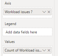
Thanks for sharing! Can you take a screenshot of the Visual pane and the way that you have structured your fields in the visual itself?
Thanks in advance!
Theo
If I have posted a response that resolves your question, please accept it as a solution to formally close the post.
Also, if you are as passionate about Power BI, DAX and data as I am, please feel free to reach out if you have any questions, queries, or if you simply want to connect and talk to another data geek!
Want to connect?www.linkedin.com/in/theoconias
- Mark as New
- Bookmark
- Subscribe
- Mute
- Subscribe to RSS Feed
- Permalink
- Report Inappropriate Content
- Mark as New
- Bookmark
- Subscribe
- Mute
- Subscribe to RSS Feed
- Permalink
- Report Inappropriate Content
@Omar_204 thanks for that. In terms of the visual, what columns have you put on the X and Y axis?
If I have posted a response that resolves your question, please accept it as a solution to formally close the post.
Also, if you are as passionate about Power BI, DAX and data as I am, please feel free to reach out if you have any questions, queries, or if you simply want to connect and talk to another data geek!
Want to connect?www.linkedin.com/in/theoconias
Helpful resources

Power BI Monthly Update - November 2025
Check out the November 2025 Power BI update to learn about new features.

Fabric Data Days
Advance your Data & AI career with 50 days of live learning, contests, hands-on challenges, study groups & certifications and more!


