FabCon is coming to Atlanta
Join us at FabCon Atlanta from March 16 - 20, 2026, for the ultimate Fabric, Power BI, AI and SQL community-led event. Save $200 with code FABCOMM.
Register now!- Power BI forums
- Get Help with Power BI
- Desktop
- Service
- Report Server
- Power Query
- Mobile Apps
- Developer
- DAX Commands and Tips
- Custom Visuals Development Discussion
- Health and Life Sciences
- Power BI Spanish forums
- Translated Spanish Desktop
- Training and Consulting
- Instructor Led Training
- Dashboard in a Day for Women, by Women
- Galleries
- Data Stories Gallery
- Themes Gallery
- Contests Gallery
- QuickViz Gallery
- Quick Measures Gallery
- Visual Calculations Gallery
- Notebook Gallery
- Translytical Task Flow Gallery
- TMDL Gallery
- R Script Showcase
- Webinars and Video Gallery
- Ideas
- Custom Visuals Ideas (read-only)
- Issues
- Issues
- Events
- Upcoming Events
The Power BI Data Visualization World Championships is back! Get ahead of the game and start preparing now! Learn more
- Power BI forums
- Forums
- Get Help with Power BI
- Desktop
- How apply conditional formatting using multiple co...
- Subscribe to RSS Feed
- Mark Topic as New
- Mark Topic as Read
- Float this Topic for Current User
- Bookmark
- Subscribe
- Printer Friendly Page
- Mark as New
- Bookmark
- Subscribe
- Mute
- Subscribe to RSS Feed
- Permalink
- Report Inappropriate Content
How apply conditional formatting using multiple columns in PBI Desktop - Help required
Team,
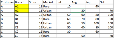
I have below scenario where have data of various customers (Branches, Store, Market type and Month wise business) of approx 400 excel files.
Help required: how to apply conditional formating using combination of Customer+Branch+Store ID to highlight in which month the market type was changed from Rural to Urban and back to Rural.
E.g. Customer A (A1 branch) has the scenario where in Jul month Market type was "Rural" and in Aug it became Urban and then in Sep again Rural.
Please guide
Thanks and Regards,
Prashant
Sample table:
Solved! Go to Solution.
- Mark as New
- Bookmark
- Subscribe
- Mute
- Subscribe to RSS Feed
- Permalink
- Report Inappropriate Content
Hi, @PrashantA
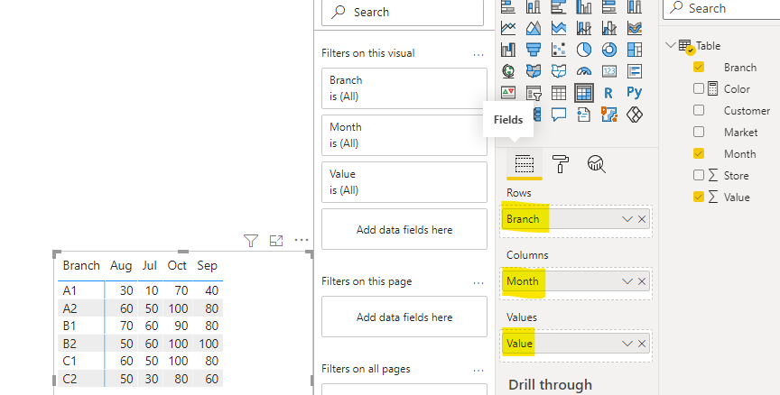
According to your description and sample data, I can roughly understand your requirement, I think you can use the “Conditional formatting” function in the Power BI matrix to achieve this, you can try my steps:
- Go to the Power Query and do some operations as below pictures:
Unpivot columns:
Then rename the column:
- Click on the “Apply and close” and create a matrix and place it like this:
- Create a measure:
Color =

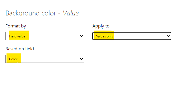
IF(MAX('Table'[Market])="Urban","Green","Yellow")- Go to the “Format” pane and set it like this:
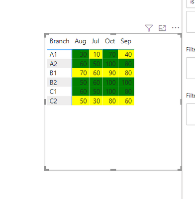
And you can get what you want, like this:
When the Market type is "Urban", it displays green color and displays yellow color if it’s “Rural”.
You can download my test pbix file below
If this result is not what you want, you can post some sample data(without sensitive data) and your expected result.
How to Get Your Question Answered Quickly
Thank you very much!
Best Regards,
Community Support Team _Robert Qin
If this post helps, then please consider Accept it as the solution to help the other members find it more quickly.
- Mark as New
- Bookmark
- Subscribe
- Mute
- Subscribe to RSS Feed
- Permalink
- Report Inappropriate Content
Hi,
I am not sure of how much i can help but i'd like to try. Share the link from where i can download your PBI file. Also, share the source Excel file (from where you imported data into the PBI file).
Regards,
Ashish Mathur
http://www.ashishmathur.com
https://www.linkedin.com/in/excelenthusiasts/
- Mark as New
- Bookmark
- Subscribe
- Mute
- Subscribe to RSS Feed
- Permalink
- Report Inappropriate Content
Hi Ashish,
Sorry but unable to share it with you as first of all its big data 45gb and restricted one. Hence shared with you the sample table.
Hope this helps.
Thanks and Regards,
Prashant
Helpful resources

Power BI Dataviz World Championships
The Power BI Data Visualization World Championships is back! Get ahead of the game and start preparing now!

Power BI Monthly Update - November 2025
Check out the November 2025 Power BI update to learn about new features.

| User | Count |
|---|---|
| 68 | |
| 46 | |
| 44 | |
| 28 | |
| 19 |
| User | Count |
|---|---|
| 202 | |
| 131 | |
| 102 | |
| 71 | |
| 55 |


