Join us at FabCon Vienna from September 15-18, 2025
The ultimate Fabric, Power BI, SQL, and AI community-led learning event. Save €200 with code FABCOMM.
Get registered- Power BI forums
- Get Help with Power BI
- Desktop
- Service
- Report Server
- Power Query
- Mobile Apps
- Developer
- DAX Commands and Tips
- Custom Visuals Development Discussion
- Health and Life Sciences
- Power BI Spanish forums
- Translated Spanish Desktop
- Training and Consulting
- Instructor Led Training
- Dashboard in a Day for Women, by Women
- Galleries
- Data Stories Gallery
- Themes Gallery
- Contests Gallery
- Quick Measures Gallery
- Notebook Gallery
- Translytical Task Flow Gallery
- TMDL Gallery
- R Script Showcase
- Webinars and Video Gallery
- Ideas
- Custom Visuals Ideas (read-only)
- Issues
- Issues
- Events
- Upcoming Events
Enhance your career with this limited time 50% discount on Fabric and Power BI exams. Ends August 31st. Request your voucher.
- Power BI forums
- Forums
- Get Help with Power BI
- Desktop
- Highlight rows from last x days based on slicer
- Subscribe to RSS Feed
- Mark Topic as New
- Mark Topic as Read
- Float this Topic for Current User
- Bookmark
- Subscribe
- Printer Friendly Page
- Mark as New
- Bookmark
- Subscribe
- Mute
- Subscribe to RSS Feed
- Permalink
- Report Inappropriate Content
Highlight rows from last x days based on slicer
Hi
I'm new to Power Bi and have a question concerning slicing and relative dates.
So i have a table, that records actions taken in a system, based on categories and aggregated by date.
| Date | Category | Amount |
| 01/01/2020 | A | 5 |
| 22/01/2020 | B | 10 |
Now I'm using a date slicer, so that i can look at my data in a monthly, or yearly fashion.
And now i would like to see, which category has had the most amount of actions in the last x days of the period, that i'm currently looking at.
My first intuition, was to calculate a new column, that shows me, if the date is within my set period (lets use a week, so 7 days as an example)
So with a new column calculated like this :
Within_last_7_days = 'data'[Date] >= MAX('data'[Date])-7
My data would look like this:
| Date | Category | Amount | Within_last_7_days |
| 01/01/2020 | A | 5 | False |
| 22/01/2020 | B | 10 | True |
Which would be exactly what i want:
Exept for the small problem, that columns are not dynamically recalculated based on the slicer.
So this only works for the last month in my dataset and not for any other selection.
How can I achive this with a dynamic solution?
Solved! Go to Solution.
- Mark as New
- Bookmark
- Subscribe
- Mute
- Subscribe to RSS Feed
- Permalink
- Report Inappropriate Content
Hi @Anonymous ,
It should be noted that the column is static and can be used as a legend field, and measure is dynamically changed based on the current row context and cannot be used as a legend field.
In addition, based on your description, you could use the category as a legend and apply the created measure in the visual level filter.
Best Regards,
Liang
If this post helps, then please consider Accept it as the solution to help the other members find it more quickly.
- Mark as New
- Bookmark
- Subscribe
- Mute
- Subscribe to RSS Feed
- Permalink
- Report Inappropriate Content
@Anonymous , Try a measure like
Within_last_7_days =
var _1 MAXX(allsellected('data'), 'data'[Date])-7
return
if( max('data'[Date]) >=_1, true(), false() )
- Mark as New
- Bookmark
- Subscribe
- Mute
- Subscribe to RSS Feed
- Permalink
- Report Inappropriate Content
@amitchandak I must be doing something wrong. The code that i'm using is what you suggested:
Within_last_7_days =
var _1= MAXX(ALLSELECTED(data),  data[Date])-7
return
if( max(data[Date]) >=_1, true(), false() )
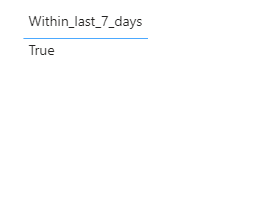
But the result, if i plot it as a table is this:
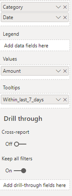
And i can not add it as anything other, then a tooltip for my visualization, whereas i'd want it to be a legend.
- Mark as New
- Bookmark
- Subscribe
- Mute
- Subscribe to RSS Feed
- Permalink
- Report Inappropriate Content
Although it does work with a table. (The whole of april is selected in this case)
Helpful resources
| User | Count |
|---|---|
| 80 | |
| 73 | |
| 39 | |
| 30 | |
| 28 |
| User | Count |
|---|---|
| 107 | |
| 99 | |
| 55 | |
| 49 | |
| 46 |


