FabCon is coming to Atlanta
Join us at FabCon Atlanta from March 16 - 20, 2026, for the ultimate Fabric, Power BI, AI and SQL community-led event. Save $200 with code FABCOMM.
Register now!- Power BI forums
- Get Help with Power BI
- Desktop
- Service
- Report Server
- Power Query
- Mobile Apps
- Developer
- DAX Commands and Tips
- Custom Visuals Development Discussion
- Health and Life Sciences
- Power BI Spanish forums
- Translated Spanish Desktop
- Training and Consulting
- Instructor Led Training
- Dashboard in a Day for Women, by Women
- Galleries
- Data Stories Gallery
- Themes Gallery
- Contests Gallery
- QuickViz Gallery
- Quick Measures Gallery
- Visual Calculations Gallery
- Notebook Gallery
- Translytical Task Flow Gallery
- TMDL Gallery
- R Script Showcase
- Webinars and Video Gallery
- Ideas
- Custom Visuals Ideas (read-only)
- Issues
- Issues
- Events
- Upcoming Events
The Power BI Data Visualization World Championships is back! Get ahead of the game and start preparing now! Learn more
- Power BI forums
- Forums
- Get Help with Power BI
- Desktop
- Highlight Row in Table Based Off Date
- Subscribe to RSS Feed
- Mark Topic as New
- Mark Topic as Read
- Float this Topic for Current User
- Bookmark
- Subscribe
- Printer Friendly Page
- Mark as New
- Bookmark
- Subscribe
- Mute
- Subscribe to RSS Feed
- Permalink
- Report Inappropriate Content
Highlight Row in Table Based Off Date
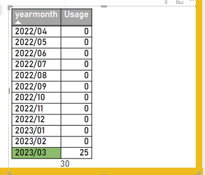
I have a table with all of our transaction history, I have created a table visual by extracting the yearmonth from the TransactionDate and summed the Qtys with a measure.
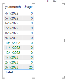
My table looks like this
| yearmonth | Usage |
| 2022/04 | 0 |
| 2022/05 | 0 |
| 2022/06 | 0 |
| 2022/07 | 0 |
| 2022/08 | 0 |
| 2022/09 | 0 |
| 2022/10 | 0 |
| 2022/11 | 0 |
| 2022/12 | 0 |
| 2023/01 | 0 |
| 2023/02 | 0 |
| 2023/03 | 25 |
I want to highlight the last six months in green like this :
| yearmonth | Usage |
| 2022/04 | 0 |
| 2022/05 | 0 |
| 2022/06 | 0 |
| 2022/07 | 0 |
| 2022/08 | 0 |
| 2022/09 | 0 |
| 2022/10 | 0 |
| 2022/11 | 0 |
| 2022/12 | 0 |
| 2023/01 | 0 |
| 2023/02 | 0 |
| 2023/03 | 25 |
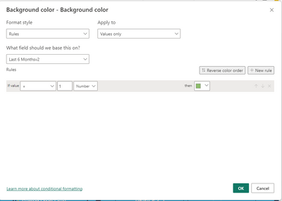
Ive tried using the cell elements tab and applying a measure to the background color using the "rules" format style but so far it is just returning like this.
Does anyone know any way of doing this? Am I missing something obvious?
Thank you in advance for any help.
My background formatting
My last six months measure:
Solved! Go to Solution.
- Mark as New
- Bookmark
- Subscribe
- Mute
- Subscribe to RSS Feed
- Permalink
- Report Inappropriate Content
Hi, @Anonymous
You can try the following methods.
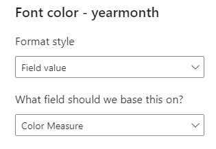
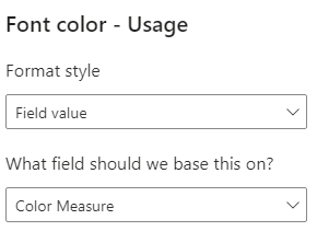
Color Measure = IF(SELECTEDVALUE('Table'[yearmonth])>=EOMONTH(MAXX(ALL('Table'),[yearmonth]),-6)+1,"Green",BLANK())Is this the result you expect?
Best Regards,
Community Support Team _Charlotte
If this post helps, then please consider Accept it as the solution to help the other members find it more quickly.
- Mark as New
- Bookmark
- Subscribe
- Mute
- Subscribe to RSS Feed
- Permalink
- Report Inappropriate Content
Really weird, it works perfect in your provided pbix file but in my report it just refuses to let me do it. Thank you anyway for your help. Marking this as the solution as it does indeed work just not in my instance for some reason.
thanks!
- Mark as New
- Bookmark
- Subscribe
- Mute
- Subscribe to RSS Feed
- Permalink
- Report Inappropriate Content
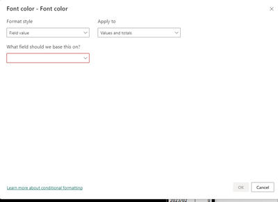
This is precisely what I need but how were you able to select the measure in the formatting pane? Mine will not let it be selected and highlights that box in red instead.
Helpful resources

Power BI Dataviz World Championships
The Power BI Data Visualization World Championships is back! Get ahead of the game and start preparing now!

| User | Count |
|---|---|
| 41 | |
| 38 | |
| 36 | |
| 31 | |
| 28 |
| User | Count |
|---|---|
| 129 | |
| 88 | |
| 79 | |
| 68 | |
| 63 |
