Join us at FabCon Vienna from September 15-18, 2025
The ultimate Fabric, Power BI, SQL, and AI community-led learning event. Save €200 with code FABCOMM.
Get registered- Power BI forums
- Get Help with Power BI
- Desktop
- Service
- Report Server
- Power Query
- Mobile Apps
- Developer
- DAX Commands and Tips
- Custom Visuals Development Discussion
- Health and Life Sciences
- Power BI Spanish forums
- Translated Spanish Desktop
- Training and Consulting
- Instructor Led Training
- Dashboard in a Day for Women, by Women
- Galleries
- Data Stories Gallery
- Themes Gallery
- Contests Gallery
- Quick Measures Gallery
- Notebook Gallery
- Translytical Task Flow Gallery
- TMDL Gallery
- R Script Showcase
- Webinars and Video Gallery
- Ideas
- Custom Visuals Ideas (read-only)
- Issues
- Issues
- Events
- Upcoming Events
Enhance your career with this limited time 50% discount on Fabric and Power BI exams. Ends September 15. Request your voucher.
- Power BI forums
- Forums
- Get Help with Power BI
- Desktop
- High volume entry affecting chart scale, move to s...
- Subscribe to RSS Feed
- Mark Topic as New
- Mark Topic as Read
- Float this Topic for Current User
- Bookmark
- Subscribe
- Printer Friendly Page
- Mark as New
- Bookmark
- Subscribe
- Mute
- Subscribe to RSS Feed
- Permalink
- Report Inappropriate Content
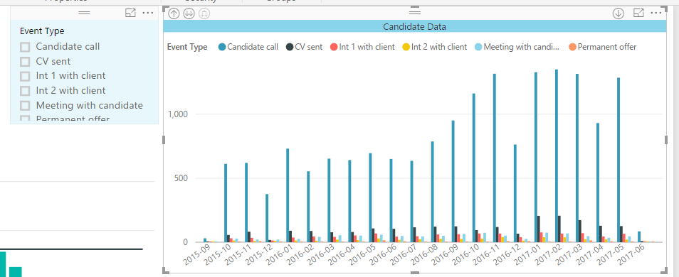
High volume entry affecting chart scale, move to secondary axis or divide by 10,100
Hi guys,
In below screenshot I have a value that is in the 100 where the rest are in 10s whats the best way of handling this?
Solved! Go to Solution.
- Mark as New
- Bookmark
- Subscribe
- Mute
- Subscribe to RSS Feed
- Permalink
- Report Inappropriate Content
I guess I could create a new table that is just the Candidate calls from the events table and then join to back to it so I can still use the ref as the count value? I'll give it a go. Thanks.
- Mark as New
- Bookmark
- Subscribe
- Mute
- Subscribe to RSS Feed
- Permalink
- Report Inappropriate Content
Hi @Anonymous,
For your requirement, I think broken axis chart will be suitable, but current power bi not support this feature, I think you can send this requirement to ideas forum.
Reference:
Broken Y Axis in an Excel Chart
Regards,
Xiaoxin Sheng
- Mark as New
- Bookmark
- Subscribe
- Mute
- Subscribe to RSS Feed
- Permalink
- Report Inappropriate Content
Is it possible to sum the event types (activity) that are candidate calls and divide it by /10 or /100?
- Mark as New
- Bookmark
- Subscribe
- Mute
- Subscribe to RSS Feed
- Permalink
- Report Inappropriate Content
Generally if you have data that are orders of magnitude different scale, normalization via logarithm will help. Not sure if this can be used in this use case, but thought I would point this out.
If you can get away with a line and column chart, you can set two different axes, but again, not sure if this is applicable here.
- Mark as New
- Bookmark
- Subscribe
- Mute
- Subscribe to RSS Feed
- Permalink
- Report Inappropriate Content
I guess I could create a new table that is just the Candidate calls from the events table and then join to back to it so I can still use the ref as the count value? I'll give it a go. Thanks.
Helpful resources
| User | Count |
|---|---|
| 69 | |
| 64 | |
| 62 | |
| 55 | |
| 28 |
| User | Count |
|---|---|
| 203 | |
| 82 | |
| 65 | |
| 48 | |
| 38 |


