Microsoft is giving away 50,000 FREE Microsoft Certification exam vouchers!
Enter the sweepstakes now!Prepping for a Fabric certification exam? Join us for a live prep session with exam experts to learn how to pass the exam. Register now.
Hi there! i've been trying to find a solution for this particular problem with presenting an aging receivables report.
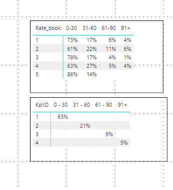
I have a table with aging totals divided by age groups (0-30 days, 31 - 60, etc)
I also have a table with kpi totals (example 31 - 60 days should never be higher than 21%)
I've included an iamge so you can see how they're defined. These two tables are related by the age group field.
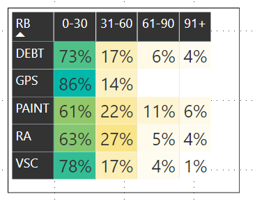
I'm trying to show this as a matrix that changes color whenever a number is above KPI.
Example, if 61-90 is above 9% turn the background red
This is as close as I have been able to get using a Matrix visualization. But this doesn't take into account the KPI table, just looks at percentages.
I'm writing in hopes of finding a solution in the community as im pretty much stumped.
Any ideas?
Solved! Go to Solution.
HI @sllanos,
>>Example, if 61-90 is above 9% turn the background red
You can try to use conditional formatting feature.
Conditional Formatting for a matrix and table Power BI
BTW, you can also try to use power bi kpi matrix visual to create report.
Regards,
Xiaoxin Sheng
HI @sllanos,
>>Example, if 61-90 is above 9% turn the background red
You can try to use conditional formatting feature.
Conditional Formatting for a matrix and table Power BI
BTW, you can also try to use power bi kpi matrix visual to create report.
Regards,
Xiaoxin Sheng
Check out the April 2025 Power BI update to learn about new features.
Explore and share Fabric Notebooks to boost Power BI insights in the new community notebooks gallery.
User | Count |
---|---|
72 | |
71 | |
65 | |
42 | |
42 |
User | Count |
---|---|
49 | |
42 | |
29 | |
28 | |
26 |