- Power BI forums
- Updates
- News & Announcements
- Get Help with Power BI
- Desktop
- Service
- Report Server
- Power Query
- Mobile Apps
- Developer
- DAX Commands and Tips
- Custom Visuals Development Discussion
- Health and Life Sciences
- Power BI Spanish forums
- Translated Spanish Desktop
- Power Platform Integration - Better Together!
- Power Platform Integrations (Read-only)
- Power Platform and Dynamics 365 Integrations (Read-only)
- Training and Consulting
- Instructor Led Training
- Dashboard in a Day for Women, by Women
- Galleries
- Community Connections & How-To Videos
- COVID-19 Data Stories Gallery
- Themes Gallery
- Data Stories Gallery
- R Script Showcase
- Webinars and Video Gallery
- Quick Measures Gallery
- 2021 MSBizAppsSummit Gallery
- 2020 MSBizAppsSummit Gallery
- 2019 MSBizAppsSummit Gallery
- Events
- Ideas
- Custom Visuals Ideas
- Issues
- Issues
- Events
- Upcoming Events
- Community Blog
- Power BI Community Blog
- Custom Visuals Community Blog
- Community Support
- Community Accounts & Registration
- Using the Community
- Community Feedback
Register now to learn Fabric in free live sessions led by the best Microsoft experts. From Apr 16 to May 9, in English and Spanish.
- Power BI forums
- Forums
- Get Help with Power BI
- Desktop
- Re: Help to add Custom Visual in PowerBI Desktop
- Subscribe to RSS Feed
- Mark Topic as New
- Mark Topic as Read
- Float this Topic for Current User
- Bookmark
- Subscribe
- Printer Friendly Page
- Mark as New
- Bookmark
- Subscribe
- Mute
- Subscribe to RSS Feed
- Permalink
- Report Inappropriate Content
Help to add Custom Visual in PowerBI Desktop
Hi All,
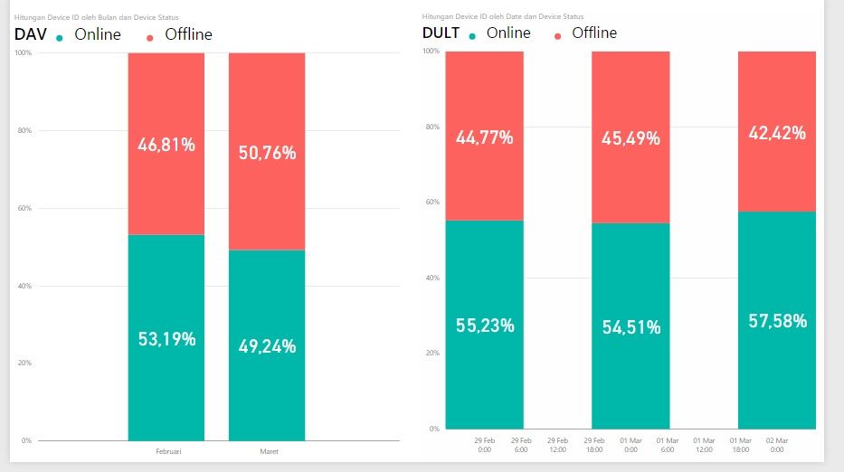
I need help, how to sort the visual (for eg. I want the online in the bottom and offline in the top)?
Thank you.
Solved! Go to Solution.
- Mark as New
- Bookmark
- Subscribe
- Mute
- Subscribe to RSS Feed
- Permalink
- Report Inappropriate Content
Right now your [Device Status] column is being sorted alphabetically which is why Offline is on the bottom and Online is on top of the stacked column chart. To reverse the order of these you need to add another column to the table that has [Device Status] that can be used to change the sort order of [Device Status]. Add a column in the edit queries step that is 1 whenever [Device Status] = "Online" and 2 the rest of the time. In the Home ribbon go to Edit Queries -> Add Column - > Add Custom Column. The Add Column Step would look like this:
= if [Status] = "Online" then 1 else 2
Then Close & Apply the changes. Now go to the data view -> select the status column -> Modeling ribbon -> Sorty By Column -> chose to sort by the new column that was added.
Now the visual should have Online on the bottom of the chart and Offline on top.
-Anthony
- Mark as New
- Bookmark
- Subscribe
- Mute
- Subscribe to RSS Feed
- Permalink
- Report Inappropriate Content
Hi Anthony,
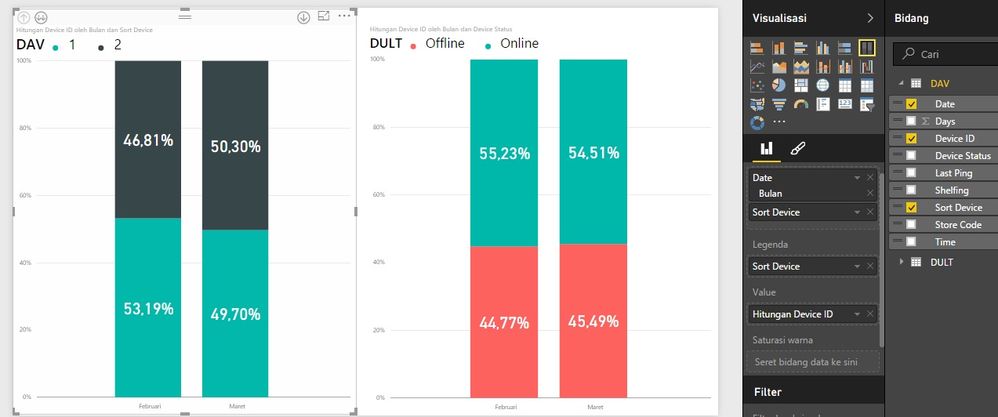
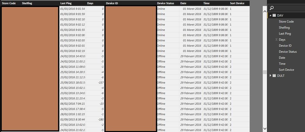
Thanks for the reply. If I applied the changes like you said, the result will be like enclosed screenshots. I don't know if I've implemented it correctly or not. The legend will only tell 1 or 2, not online or offline. Any other way? Say to sort descending the report view?
Thanks.
- Mark as New
- Bookmark
- Subscribe
- Mute
- Subscribe to RSS Feed
- Permalink
- Report Inappropriate Content
You almost have it working! You don't need the [Sort Device] column in any of the chart fields. Just make sure in the data model you have set the [Device Status] column to be sorted by the [Sort Device] column. Then put the [Device Status] column as the chart Legend like you did in the original chart.
Here is a tutorial on how that explains the steps you need to do to sort the [Device Status] column by the [Sort Device] column.
- Mark as New
- Bookmark
- Subscribe
- Mute
- Subscribe to RSS Feed
- Permalink
- Report Inappropriate Content
It works! Thanks @Twan!
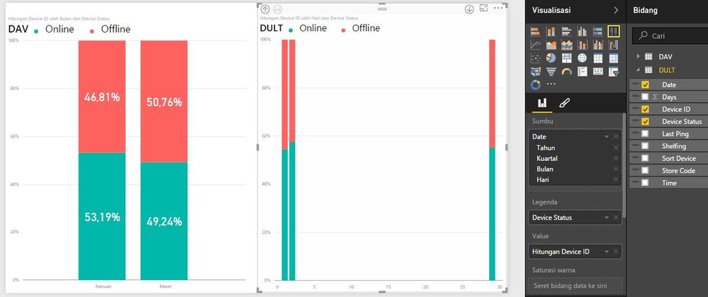
My next challange is this, my data so far consisting of row from date 29th Feb until 2nd March. When I view the report on daily level, it is divided by date, 29 Feb on the right, 1-2 March on the left (refer to DULT report). Can we view it historically from left to right so the end user didn't get confused?
- Mark as New
- Bookmark
- Subscribe
- Mute
- Subscribe to RSS Feed
- Permalink
- Report Inappropriate Content
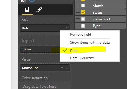
Yes you can @denisdav. Right now the data is grouped by the day number (1 - 31). That is why it is sorting March 1-2 before Feb 29. To sort this correctly left click on the [Date] column in the Axis section of the chart and change it to be Date instead of Date Hierarchy.
- Mark as New
- Bookmark
- Subscribe
- Mute
- Subscribe to RSS Feed
- Permalink
- Report Inappropriate Content
- Mark as New
- Bookmark
- Subscribe
- Mute
- Subscribe to RSS Feed
- Permalink
- Report Inappropriate Content
Helpful resources

Microsoft Fabric Learn Together
Covering the world! 9:00-10:30 AM Sydney, 4:00-5:30 PM CET (Paris/Berlin), 7:00-8:30 PM Mexico City

Power BI Monthly Update - April 2024
Check out the April 2024 Power BI update to learn about new features.

| User | Count |
|---|---|
| 108 | |
| 105 | |
| 88 | |
| 74 | |
| 66 |
| User | Count |
|---|---|
| 126 | |
| 111 | |
| 100 | |
| 83 | |
| 71 |
