Fabric Data Days starts November 4th!
Advance your Data & AI career with 50 days of live learning, dataviz contests, hands-on challenges, study groups & certifications and more!
Get registered- Power BI forums
- Get Help with Power BI
- Desktop
- Service
- Report Server
- Power Query
- Mobile Apps
- Developer
- DAX Commands and Tips
- Custom Visuals Development Discussion
- Health and Life Sciences
- Power BI Spanish forums
- Translated Spanish Desktop
- Training and Consulting
- Instructor Led Training
- Dashboard in a Day for Women, by Women
- Galleries
- Data Stories Gallery
- Themes Gallery
- Contests Gallery
- QuickViz Gallery
- Quick Measures Gallery
- Visual Calculations Gallery
- Notebook Gallery
- Translytical Task Flow Gallery
- TMDL Gallery
- R Script Showcase
- Webinars and Video Gallery
- Ideas
- Custom Visuals Ideas (read-only)
- Issues
- Issues
- Events
- Upcoming Events
Get Fabric Certified for FREE during Fabric Data Days. Don't miss your chance! Request now
- Power BI forums
- Forums
- Get Help with Power BI
- Desktop
- Help on two values (Value and %) in one column to ...
- Subscribe to RSS Feed
- Mark Topic as New
- Mark Topic as Read
- Float this Topic for Current User
- Bookmark
- Subscribe
- Printer Friendly Page
- Mark as New
- Bookmark
- Subscribe
- Mute
- Subscribe to RSS Feed
- Permalink
- Report Inappropriate Content
Help on two values (Value and %) in one column to be displayed in Power Bi visual
Hi,
Seek your help on how to display same column data where both % and value existed after applying unpivot option. In visual a person can only select either value format or % format.
E.g. Site 1 and Site 2 have both expenses in Indian rupees and also expense % of Sales.
Please help.
Thanks and Regards,
PrashantA
Solved! Go to Solution.
- Mark as New
- Bookmark
- Subscribe
- Mute
- Subscribe to RSS Feed
- Permalink
- Report Inappropriate Content
Oh! now I understand better what you need.
After you have the data in the query editor, this can be solved in 3 steps:
1) Identify the rows with values or percent.
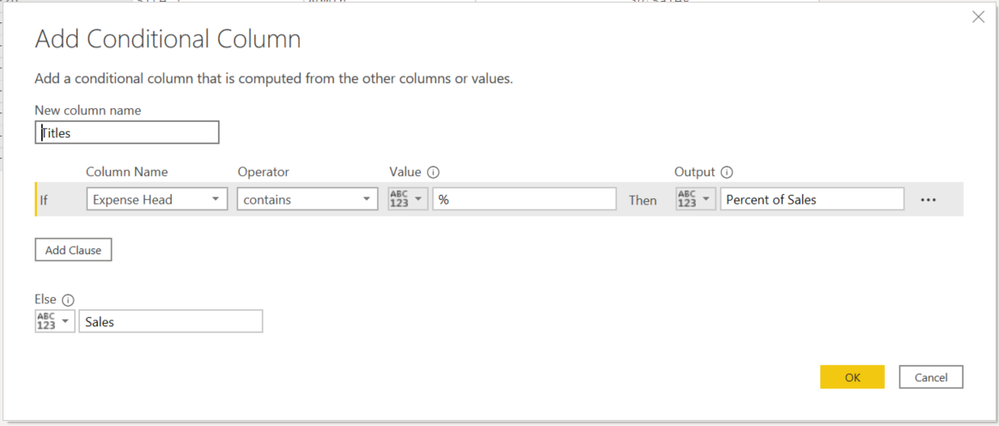
Go to Add Column -> Conditional Column
Enter the following parameters:
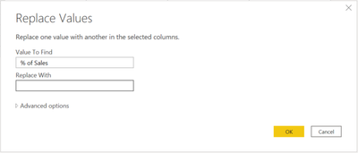
2) Remove the extra text from the Expend Head column:
Select the column Expend Head , go to Transform -> Replace Values, enter the following and click OK.
3) Create one column for values and another for % of Sales
- Select the Titles column (you created this one on step 1) -> Go to Transform -> Pivot Column
- Then on the section Values Column, select Value and click OK
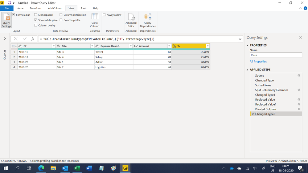
Optionally: Change the data types and names accordingly to get this result:
Hope this helps!
Orlando Mezquita
@PrashantA If this solved your problem, please mark this reply as a solution. Thanks!
- Mark as New
- Bookmark
- Subscribe
- Mute
- Subscribe to RSS Feed
- Permalink
- Report Inappropriate Content
Hi @PrashantA ,
If you are using either a pie chart or a donut chart you can do as follows:
1) Select the visual
2) Go to Format (Paint roller) -> Detail Labels -> Label Style
3) Select the type of label: Value, Value and %, just %.
There's no need to do data transformations for this as long as the % is calculated from the total.
- Mark as New
- Bookmark
- Subscribe
- Mute
- Subscribe to RSS Feed
- Permalink
- Report Inappropriate Content
Can you please be more elaborate with sample data of I/p and o/p
- Mark as New
- Bookmark
- Subscribe
- Mute
- Subscribe to RSS Feed
- Permalink
- Report Inappropriate Content
Hi Pranit,
Here is the small example: For Site 1 and 2, both value and % are reflected in Value column after applying unpivot on selected columns in Power Bi...Now if I make a duplicate of Value column and name it as "Value %" then in FY pie chart I can either add value or value % and hence checking if there is way to separate two different formats (% and value) to reflect both value and % too.
| FY | Site | Value |
| 2019-20 | Site 1 | 30 |
| 2019-20 | Site 2 | 40 |
| 2019-20 | Site 1 % | 20% |
| 2019-20 | Site 2 % | 40% |
- Mark as New
- Bookmark
- Subscribe
- Mute
- Subscribe to RSS Feed
- Permalink
- Report Inappropriate Content
I'm guessing there's more data than just this?
If not, why not skip the Unpivot step, and you'll have FY, Site, #, % as seperate columns, and then you can only use the column you want?
FOrrest
Please give Kudos or Mark as a Solution!
https://www.linkedin.com/in/forrest-hill-04480730/
Proud to give back to the community!
Thank You!
- Mark as New
- Bookmark
- Subscribe
- Mute
- Subscribe to RSS Feed
- Permalink
- Report Inappropriate Content
Hi,
Correct the data is huge....30 locations and 20 expense type. The example shared below is just for two locations and one expense head.
- Mark as New
- Bookmark
- Subscribe
- Mute
- Subscribe to RSS Feed
- Permalink
- Report Inappropriate Content
Hi,
Share some more data and show the expected result.
Regards,
Ashish Mathur
http://www.ashishmathur.com
https://www.linkedin.com/in/excelenthusiasts/
- Mark as New
- Bookmark
- Subscribe
- Mute
- Subscribe to RSS Feed
- Permalink
- Report Inappropriate Content
Hi Ashish,
Below is the sample data and expected output is to have Fiscal year wise visual where Site wise exps to be displayed in one visual and expense % of Sales in another visual however both the visuals should change after applying fiscal year, site, expense head slicer.
| FY | Site | Expense Head | Value |
| 2019-20 | Site 1 | Admin | 30 |
| 2019-20 | Site 2 | Logistics | 40 |
| 2019-20 | Site 1 | Admin % of Sales | 20% |
| 2019-20 | Site 2 | Logistics % of Sales | 40% |
| 2018-19 | Site 3 | Travel | 10 |
| 2018-19 | Site 3 | Travel % of Sales | 35% |
| 2018-19 | Site 4 | Salary | 70 |
| 2018-19 | Site 4 | Salary % of Sales | 25% |
Thanks and Regards,
Prashant A
- Mark as New
- Bookmark
- Subscribe
- Mute
- Subscribe to RSS Feed
- Permalink
- Report Inappropriate Content
Oh! now I understand better what you need.
After you have the data in the query editor, this can be solved in 3 steps:
1) Identify the rows with values or percent.
Go to Add Column -> Conditional Column
Enter the following parameters:
2) Remove the extra text from the Expend Head column:
Select the column Expend Head , go to Transform -> Replace Values, enter the following and click OK.
3) Create one column for values and another for % of Sales
- Select the Titles column (you created this one on step 1) -> Go to Transform -> Pivot Column
- Then on the section Values Column, select Value and click OK
Optionally: Change the data types and names accordingly to get this result:
Hope this helps!
Orlando Mezquita
@PrashantA If this solved your problem, please mark this reply as a solution. Thanks!
- Mark as New
- Bookmark
- Subscribe
- Mute
- Subscribe to RSS Feed
- Permalink
- Report Inappropriate Content
Hi,
This M code transforms your data in a format that would allow you to build your desired visual
let
    Source = Table.FromRows(Json.Document(Binary.Decompress(Binary.FromText("i45WMjIwtNQ1MlDSUQrOLElVMAQyHFNyM/OAtLGBUqwOhgojIMMnPz2zuCQzuRjINsGqCm6OgqpCfppCcGJOKkixkYEqQTNRdZggdFjoGlrCdBgDGSFFiWWpOUCGoQF+JagmGptiNdEExEjMSSyqBDLMsZqIUILmK5CJsQA=", BinaryEncoding.Base64), Compression.Deflate)), let _t = ((type nullable text) meta [Serialized.Text = true]) in type table [FY = _t, Site = _t, #"Expense Head" = _t, Value = _t]),
    #"Changed Type" = Table.TransformColumnTypes(Source,{{"FY", type text}, {"Site", type text}, {"Expense Head", type text}, {"Value", type number}}),
    #"Sorted Rows" = Table.Sort(#"Changed Type",{{"Site", Order.Ascending}, {"Expense Head", Order.Ascending}}),
    #"Split Column by Delimiter" = Table.SplitColumn(#"Sorted Rows", "Expense Head", Splitter.SplitTextByEachDelimiter({" "}, QuoteStyle.Csv, false), {"Expense Head.1", "Expense Head.2"}),
    #"Changed Type1" = Table.TransformColumnTypes(#"Split Column by Delimiter",{{"Expense Head.1", type text}, {"Expense Head.2", type text}}),
    #"Replaced Value" = Table.ReplaceValue(#"Changed Type1",null,"Amount",Replacer.ReplaceValue,{"Expense Head.2"}),
    #"Replaced Value1" = Table.ReplaceValue(#"Replaced Value"," of Sales","",Replacer.ReplaceText,{"Expense Head.2"}),
    #"Pivoted Column" = Table.Pivot(#"Replaced Value1", List.Distinct(#"Replaced Value1"[#"Expense Head.2"]), "Expense Head.2", "Value"),
    #"Changed Type2" = Table.TransformColumnTypes(#"Pivoted Column",{{"%", Percentage.Type}})
in
    #"Changed Type2"
Hope this helps.
Regards,
Ashish Mathur
http://www.ashishmathur.com
https://www.linkedin.com/in/excelenthusiasts/
Helpful resources

Fabric Data Days
Advance your Data & AI career with 50 days of live learning, contests, hands-on challenges, study groups & certifications and more!

Power BI Monthly Update - October 2025
Check out the October 2025 Power BI update to learn about new features.


