- Power BI forums
- Get Help with Power BI
- Desktop
- Service
- Report Server
- Power Query
- Mobile Apps
- Developer
- DAX Commands and Tips
- Custom Visuals Development Discussion
- Health and Life Sciences
- Power BI Spanish forums
- Translated Spanish Desktop
- Training and Consulting
- Instructor Led Training
- Dashboard in a Day for Women, by Women
- Galleries
- Data Stories Gallery
- Themes Gallery
- Contests Gallery
- QuickViz Gallery
- Quick Measures Gallery
- Visual Calculations Gallery
- Notebook Gallery
- Translytical Task Flow Gallery
- TMDL Gallery
- R Script Showcase
- Webinars and Video Gallery
- Ideas
- Custom Visuals Ideas (read-only)
- Issues
- Issues
- Events
- Upcoming Events
Learn from the best! Meet the four finalists headed to the FINALS of the Power BI Dataviz World Championships! Register now
- Power BI forums
- Forums
- Get Help with Power BI
- Desktop
- Help for Conditional Formating
- Subscribe to RSS Feed
- Mark Topic as New
- Mark Topic as Read
- Float this Topic for Current User
- Bookmark
- Subscribe
- Printer Friendly Page
- Mark as New
- Bookmark
- Subscribe
- Mute
- Subscribe to RSS Feed
- Permalink
- Report Inappropriate Content
Help for Conditional Formating
Hello,
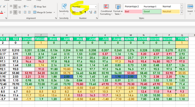
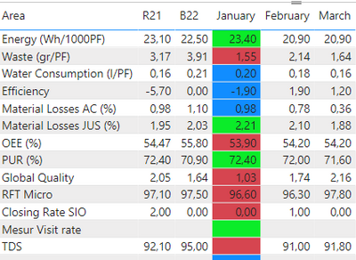
I want the values under the months to be green if they are lower R21, Blue if they are between R21 and B22, and red if they are higher than B22.
like this:
Thank you,
Solved! Go to Solution.
- Mark as New
- Bookmark
- Subscribe
- Mute
- Subscribe to RSS Feed
- Permalink
- Report Inappropriate Content
Allright, your "data" isn't really data. It's already a report. You should consider transforming your data to a more appropriate format.
That being said, here's how to do it with your current format.
Create a measure than checks if its lower than R21 or higher than B22 as below
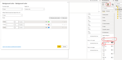
Use the measure to format the specific coloum. Note that you need to do this to every column. jan, feb, mar, etc.
- Mark as New
- Bookmark
- Subscribe
- Mute
- Subscribe to RSS Feed
- Permalink
- Report Inappropriate Content
Measu like as below:
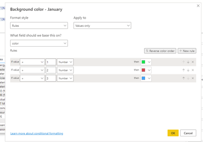
when i done second part it gives error
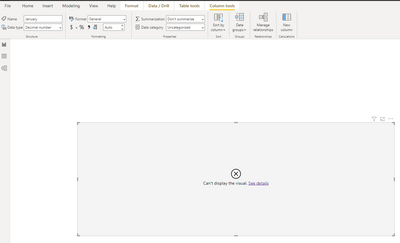
What is wrong?
- Mark as New
- Bookmark
- Subscribe
- Mute
- Subscribe to RSS Feed
- Permalink
- Report Inappropriate Content
It seems you have more than one table, as you are summing on sheet1 and table one
I'm gonna try and ask this again:
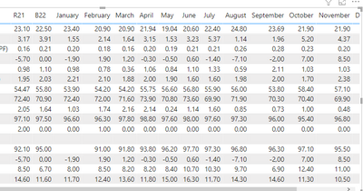
How is your data structured?
- Mark as New
- Bookmark
- Subscribe
- Mute
- Subscribe to RSS Feed
- Permalink
- Report Inappropriate Content
- Mark as New
- Bookmark
- Subscribe
- Mute
- Subscribe to RSS Feed
- Permalink
- Report Inappropriate Content
SUM(Sheet1[January]) < SUM('Table 1 (KPI2022)'[R21])
How is you data loaded into Power Bi? I see you are referencing Sheet1 and Tabel 1 (KPI2022)
Do you have more than one table? Can you send a screenshot of your datamodel?
- Mark as New
- Bookmark
- Subscribe
- Mute
- Subscribe to RSS Feed
- Permalink
- Report Inappropriate Content
Yes my fault you are totally right. Sorry for this. It's fixed now, thank you very much.
But now I realized that in some values, I need to color the opposite.
We did this:
I want the values under the months to be green if they are lower R21, Blue if they are between R21 and B22, and red if they are higher than B22.
But on some of my values, I want to colorize the opposite. I will try to explain in more detail.
We said that if the value is greater than R21, the background should be green. Yes this is true for some fields eg Oee, rft micro etc.
But this is not true for energy, waste, water. It has to be red for them. For this reason, can I differentiate it by specifying Area?
- Mark as New
- Bookmark
- Subscribe
- Mute
- Subscribe to RSS Feed
- Permalink
- Report Inappropriate Content
Sure, you can add an additional condition
- Mark as New
- Bookmark
- Subscribe
- Mute
- Subscribe to RSS Feed
- Permalink
- Report Inappropriate Content
What type of visual is this? How is you data structured?
- Mark as New
- Bookmark
- Subscribe
- Mute
- Subscribe to RSS Feed
- Permalink
- Report Inappropriate Content
Helpful resources
| User | Count |
|---|---|
| 57 | |
| 44 | |
| 30 | |
| 18 | |
| 16 |
| User | Count |
|---|---|
| 71 | |
| 59 | |
| 39 | |
| 22 | |
| 22 |


