FabCon is coming to Atlanta
Join us at FabCon Atlanta from March 16 - 20, 2026, for the ultimate Fabric, Power BI, AI and SQL community-led event. Save $200 with code FABCOMM.
Register now!- Power BI forums
- Get Help with Power BI
- Desktop
- Service
- Report Server
- Power Query
- Mobile Apps
- Developer
- DAX Commands and Tips
- Custom Visuals Development Discussion
- Health and Life Sciences
- Power BI Spanish forums
- Translated Spanish Desktop
- Training and Consulting
- Instructor Led Training
- Dashboard in a Day for Women, by Women
- Galleries
- Data Stories Gallery
- Themes Gallery
- Contests Gallery
- QuickViz Gallery
- Quick Measures Gallery
- Visual Calculations Gallery
- Notebook Gallery
- Translytical Task Flow Gallery
- TMDL Gallery
- R Script Showcase
- Webinars and Video Gallery
- Ideas
- Custom Visuals Ideas (read-only)
- Issues
- Issues
- Events
- Upcoming Events
The Power BI Data Visualization World Championships is back! Get ahead of the game and start preparing now! Learn more
- Power BI forums
- Forums
- Get Help with Power BI
- Desktop
- Help creating the following Chart.
- Subscribe to RSS Feed
- Mark Topic as New
- Mark Topic as Read
- Float this Topic for Current User
- Bookmark
- Subscribe
- Printer Friendly Page
- Mark as New
- Bookmark
- Subscribe
- Mute
- Subscribe to RSS Feed
- Permalink
- Report Inappropriate Content
Help creating the following Chart.
So I have a data set that has the following columns:
Number, Status, Priority, Date Originated
Status can be "Working", "Pending", "Incorporated"
Priority can be "Yellow", "Orange", or "Red"
I want to create a Stacked Column Chart.
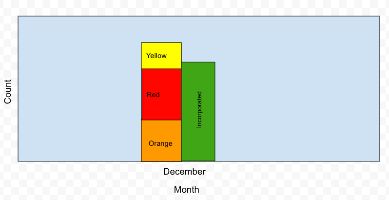
How can I create a stacked bar that has "Yellow, Orange, Red" with appropriate counts and a seperate bar next to it that only includes the count of entries with the status "Incorporated"?
Something like this:
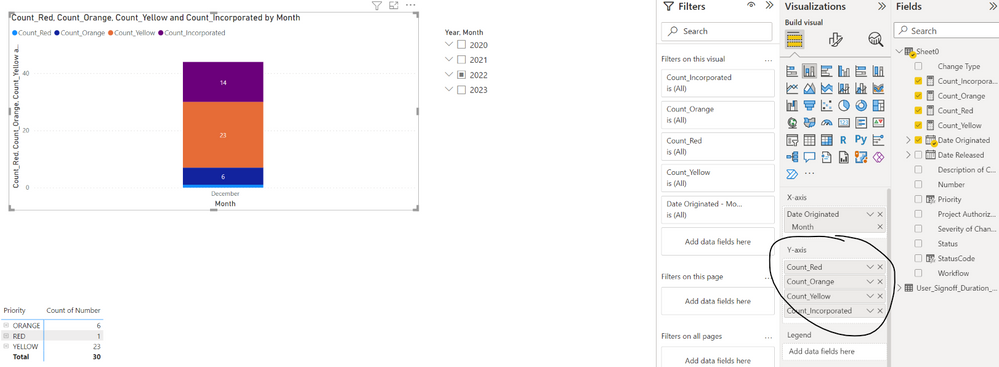
Currently, right now this is what I have and I am having trouble.
Solved! Go to Solution.
- Mark as New
- Bookmark
- Subscribe
- Mute
- Subscribe to RSS Feed
- Permalink
- Report Inappropriate Content
Hi @powerbinoobster ,
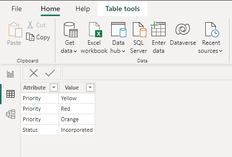
As a workaround, you can create a seperate table as follows. I created by entering data.
Then create the following measure, which you can replace and modify it as needed.
Conditional Count =
VAR _incorporated =
    CALCULATE (
        COUNT ( 'Table'[ID] ),
        FILTER ( ALLSELECTED ( 'Table' ), [Status] = "Incorporated" )
    )
VAR _red =
    CALCULATE (
        COUNT ( 'Table'[ID] ),
        FILTER ( ALLSELECTED ( 'Table' ), [Priority] = "Red" )
    )
VAR _orange =
    CALCULATE (
        COUNT ( 'Table'[ID] ),
        FILTER ( ALLSELECTED ( 'Table' ), [Priority] = "Orange" )
    )
VAR _yellow =
    CALCULATE (
        COUNT ( 'Table'[ID] ),
        FILTER ( ALLSELECTED ( 'Table' ), [Priority] = "Yellow" )
    )
RETURN
    SWITCH (
        SELECTEDVALUE ( 'Table (2)'[Attribute] ),
        "Status", _incorporated,
        "Priority",
            SWITCH (
                SELECTEDVALUE ( 'Table (2)'[Value] ),
                "Red", _red,
                "Orange", _orange,
                "Yellow", _yellow
            )
    )
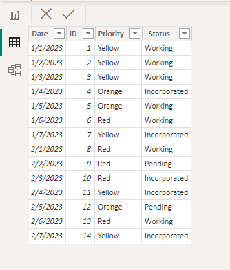
Sample data:
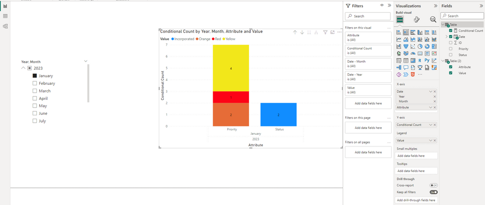
Expected result:
You can download my attachment for more details.
Best Regards,
Stephen Tao
If this post helps, then please consider Accept it as the solution to help the other members find it more quickly.
- Mark as New
- Bookmark
- Subscribe
- Mute
- Subscribe to RSS Feed
- Permalink
- Report Inappropriate Content
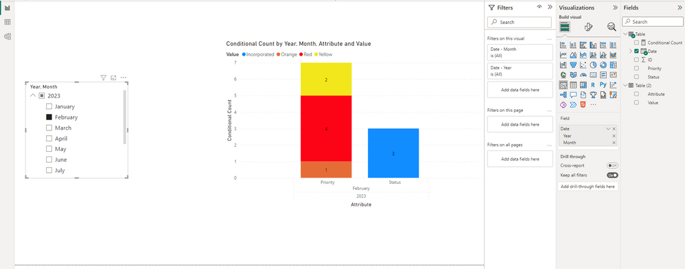
Hello, this works! But do you know why when selecting mutiple months, the visual does not refect those values? For example, when you selected January and February on the slicer, Januarys data gets applied to February's columns and both become identical.
Helpful resources

Power BI Monthly Update - November 2025
Check out the November 2025 Power BI update to learn about new features.

Fabric Data Days
Advance your Data & AI career with 50 days of live learning, contests, hands-on challenges, study groups & certifications and more!

| User | Count |
|---|---|
| 57 | |
| 44 | |
| 40 | |
| 21 | |
| 18 |
