Huge last-minute discounts for FabCon Vienna from September 15-18, 2025
Supplies are limited. Contact info@espc.tech right away to save your spot before the conference sells out.
Get your discount- Power BI forums
- Get Help with Power BI
- Desktop
- Service
- Report Server
- Power Query
- Mobile Apps
- Developer
- DAX Commands and Tips
- Custom Visuals Development Discussion
- Health and Life Sciences
- Power BI Spanish forums
- Translated Spanish Desktop
- Training and Consulting
- Instructor Led Training
- Dashboard in a Day for Women, by Women
- Galleries
- Data Stories Gallery
- Themes Gallery
- Contests Gallery
- Quick Measures Gallery
- Notebook Gallery
- Translytical Task Flow Gallery
- TMDL Gallery
- R Script Showcase
- Webinars and Video Gallery
- Ideas
- Custom Visuals Ideas (read-only)
- Issues
- Issues
- Events
- Upcoming Events
Score big with last-minute savings on the final tickets to FabCon Vienna. Secure your discount
- Power BI forums
- Forums
- Get Help with Power BI
- Desktop
- Help creating a measure to show cumulative values ...
- Subscribe to RSS Feed
- Mark Topic as New
- Mark Topic as Read
- Float this Topic for Current User
- Bookmark
- Subscribe
- Printer Friendly Page
- Mark as New
- Bookmark
- Subscribe
- Mute
- Subscribe to RSS Feed
- Permalink
- Report Inappropriate Content
Help creating a measure to show cumulative values by week and category within a matrix visual
Hi folks, Hopng someone can help show me how to create a measure to populate a matrix visual as described below
Here is an example of my source data:
| Week | Category | Value |
| 9/2/2023 | A | 1 |
| 9/2/2023 | C | 4 |
| 9/2/2023 | D | 5 |
| 9/9/2023 | A | 7 |
| 9/9/2023 | B | 3 |
| 9/9/2023 | D | 5 |
| 9/16/2023 | A | 4 |
| 9/16/2023 | B | 7 |
| 9/16/2023 | C | 8 |
From this data I am trying to create a matrix visual that resembles the following:
| Week | Cumulative Value |
| 9/2/2023 | 10 |
| A | 1 |
| B | 0 |
| C | 4 |
| D | 5 |
| 9/9/2023 | 25 |
| A | 8 |
| B | 3 |
| C | 4 |
| D | 10 |
| 9/16/2023 | 44 |
| A | 12 |
| B | 10 |
| C | 12 |
| D | 10 |
| Total | 44 |
Note each week includes the cumulative total up through that week, as well as the cumulative totals for each category (to show what is comprising the cumulative total at that week).
Each week shows all categories and their respective cumulative values through that week (or at least, each week should begin including them the first time they register a value, then continue including for subsequent weeks even in weeks when they do not register a new value)
Categories only appear in the data when they have registered a value for that week (otherwise they do not appear in the data for that week. For example in above data, Category "D" in week 9/16/2023)
Thank you for your help!
Solved! Go to Solution.
- Mark as New
- Bookmark
- Subscribe
- Mute
- Subscribe to RSS Feed
- Permalink
- Report Inappropriate Content
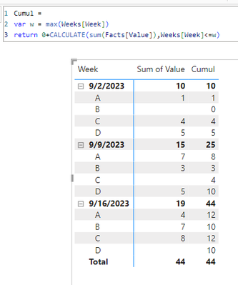
create a proper data model
To report on things that are not there you need to use a crossjoin and a measure.
Cumul =
var w = max(Weeks[Week])
return 0+CALCULATE(sum(Facts[Value]),Weeks[Week]<=w)
- Mark as New
- Bookmark
- Subscribe
- Mute
- Subscribe to RSS Feed
- Permalink
- Report Inappropriate Content
- Mark as New
- Bookmark
- Subscribe
- Mute
- Subscribe to RSS Feed
- Permalink
- Report Inappropriate Content
Brilliant, thank you!


