Get Fabric certified for FREE!
Don't miss your chance to take the Fabric Data Engineer (DP-700) exam on us!
Learn more- Power BI forums
- Get Help with Power BI
- Desktop
- Service
- Report Server
- Power Query
- Mobile Apps
- Developer
- DAX Commands and Tips
- Custom Visuals Development Discussion
- Health and Life Sciences
- Power BI Spanish forums
- Translated Spanish Desktop
- Training and Consulting
- Instructor Led Training
- Dashboard in a Day for Women, by Women
- Galleries
- Data Stories Gallery
- Themes Gallery
- Contests Gallery
- QuickViz Gallery
- Quick Measures Gallery
- Visual Calculations Gallery
- Notebook Gallery
- Translytical Task Flow Gallery
- TMDL Gallery
- R Script Showcase
- Webinars and Video Gallery
- Ideas
- Custom Visuals Ideas (read-only)
- Issues
- Issues
- Events
- Upcoming Events
We've captured the moments from FabCon & SQLCon that everyone is talking about, and we are bringing them to the community, live and on-demand. Starts on April 14th. Register now
- Power BI forums
- Forums
- Get Help with Power BI
- Desktop
- Heat Map Color Coding
- Subscribe to RSS Feed
- Mark Topic as New
- Mark Topic as Read
- Float this Topic for Current User
- Bookmark
- Subscribe
- Printer Friendly Page
- Mark as New
- Bookmark
- Subscribe
- Mute
- Subscribe to RSS Feed
- Permalink
- Report Inappropriate Content
Heat Map Color Coding
Good morning,
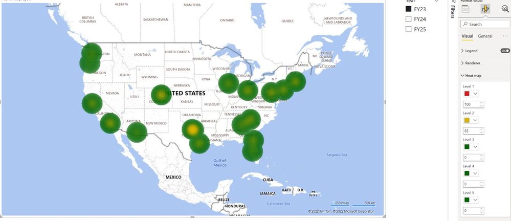
I have a heat map where I'm trying to show the locations where we are over 100% capacity (red), 85%+ capacity (yellow), and <85% capacity (green). I have the parameters set but there are quite a few locations that aren't showing as red where they should be. For example, Denver, Dallas, and Los Angeles should all be red and most of the other cities should be yellow but they're showing as primarily green. Am I marking the parameters incorrectly? Also, is there a way to have a circle be solid green rather than have yellow in the middle? Chicago is only 78% so it should be solid green. I changed the percentages so they were whole numbers, which is why there aren't decimals in the parameters. Thank you!
Solved! Go to Solution.
- Mark as New
- Bookmark
- Subscribe
- Mute
- Subscribe to RSS Feed
- Permalink
- Report Inappropriate Content
Hi @adamjon92 , I don't think the heat map colouring works the way you are intending. I suggest using conditional formatting to colour bubbles on a map chart. In my example below I've added the city and capacity columns to the location field and then created a rule based on the capacity.
If this answer solves your problem please mark it as a solution!
- Mark as New
- Bookmark
- Subscribe
- Mute
- Subscribe to RSS Feed
- Permalink
- Report Inappropriate Content
Thank you very much! This worked. Have a great weekend!
Helpful resources

New to Fabric Survey
If you have recently started exploring Fabric, we'd love to hear how it's going. Your feedback can help with product improvements.

Power BI DataViz World Championships - June 2026
A new Power BI DataViz World Championship is coming this June! Don't miss out on submitting your entry.

Join our Fabric User Panel
Share feedback directly with Fabric product managers, participate in targeted research studies and influence the Fabric roadmap.

| User | Count |
|---|---|
| 51 | |
| 37 | |
| 35 | |
| 19 | |
| 17 |
| User | Count |
|---|---|
| 72 | |
| 70 | |
| 39 | |
| 34 | |
| 23 |


