FabCon is coming to Atlanta
Join us at FabCon Atlanta from March 16 - 20, 2026, for the ultimate Fabric, Power BI, AI and SQL community-led event. Save $200 with code FABCOMM.
Register now!- Power BI forums
- Get Help with Power BI
- Desktop
- Service
- Report Server
- Power Query
- Mobile Apps
- Developer
- DAX Commands and Tips
- Custom Visuals Development Discussion
- Health and Life Sciences
- Power BI Spanish forums
- Translated Spanish Desktop
- Training and Consulting
- Instructor Led Training
- Dashboard in a Day for Women, by Women
- Galleries
- Data Stories Gallery
- Themes Gallery
- Contests Gallery
- QuickViz Gallery
- Quick Measures Gallery
- Visual Calculations Gallery
- Notebook Gallery
- Translytical Task Flow Gallery
- TMDL Gallery
- R Script Showcase
- Webinars and Video Gallery
- Ideas
- Custom Visuals Ideas (read-only)
- Issues
- Issues
- Events
- Upcoming Events
The Power BI Data Visualization World Championships is back! Get ahead of the game and start preparing now! Learn more
- Power BI forums
- Forums
- Get Help with Power BI
- Desktop
- Having date and hour on the X axis
- Subscribe to RSS Feed
- Mark Topic as New
- Mark Topic as Read
- Float this Topic for Current User
- Bookmark
- Subscribe
- Printer Friendly Page
- Mark as New
- Bookmark
- Subscribe
- Mute
- Subscribe to RSS Feed
- Permalink
- Report Inappropriate Content
Having date and hour on the X axis
I am trying to plot values / numbers on a bar chart with the x -axis containing the date like 1st July 2019 then as you go along the x-axis, it goes up in 1 hour increments like 8 9 10 11 12 13 14 15 16 17 18 then 2nd July 2019 with the same hours 8 9 10 11 12 13 14 15 16 17 18 etc. Hope that makes sense
So far I have been only able to have one or the other on the x-axis but would be great to know how to have a continuous date and hour on the x-axis.
Solved! Go to Solution.
- Mark as New
- Bookmark
- Subscribe
- Mute
- Subscribe to RSS Feed
- Permalink
- Report Inappropriate Content
Hi @Anonymous ,
If my above post helps, could you please consider Accept it as the solution to help the other members find it more quickly. thanks!
Best regards,
Dina Ye
If this post helps, then please consider Accept it as the solution to help the other members find it more
quickly.
- Mark as New
- Bookmark
- Subscribe
- Mute
- Subscribe to RSS Feed
- Permalink
- Report Inappropriate Content
Hi @Anonymous ,
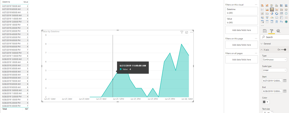
Based on my research, we’re able to set both date and hour in the X-axis, but the minimum interval is 3 hours. The chart could be shown like below:
All time involved, but only 3.6.9.12 clock listed in the X-axis
Please share your idea here if you’d like to bring the 1 hour-interval feature coming:
https://ideas.powerbi.com/forums/265200-power-bi-ideas
Best regards,
Dina Ye
If this post helps, then please consider Accept it as the solution to help the other members find it more
quickly.
- Mark as New
- Bookmark
- Subscribe
- Mute
- Subscribe to RSS Feed
- Permalink
- Report Inappropriate Content
Hi @Anonymous ,
If my above post helps, could you please consider Accept it as the solution to help the other members find it more quickly. thanks!
Best regards,
Dina Ye
If this post helps, then please consider Accept it as the solution to help the other members find it more
quickly.
- Mark as New
- Bookmark
- Subscribe
- Mute
- Subscribe to RSS Feed
- Permalink
- Report Inappropriate Content
Hi Dina
On the fields for the visual, can you let me know how you got the time on the X-Axis, was there a setting in the fields or format area, just having a blank when it comes to that.
Also my data is in separate columns for date, time and hour [eg 06/08/2019, 08:35:22 AM, 8] and this seems to mess up the graph. I am assuming from your example the date and time needs to be in the one column but in regards to the value how is that collated if you have a value of 1 next to each time stamp,
eg
06/08/2019 08:35:22 AM = 1,
06/08/2019 09:30:47 AM = 1,
06/08/2019 10:15:10 AM = 1,
06/08/2019 12:45:05 PM = 1 etc
Helpful resources

Power BI Dataviz World Championships
The Power BI Data Visualization World Championships is back! Get ahead of the game and start preparing now!

Power BI Monthly Update - November 2025
Check out the November 2025 Power BI update to learn about new features.

| User | Count |
|---|---|
| 59 | |
| 43 | |
| 42 | |
| 23 | |
| 17 |
| User | Count |
|---|---|
| 190 | |
| 122 | |
| 96 | |
| 66 | |
| 47 |

