FabCon is coming to Atlanta
Join us at FabCon Atlanta from March 16 - 20, 2026, for the ultimate Fabric, Power BI, AI and SQL community-led event. Save $200 with code FABCOMM.
Register now!- Power BI forums
- Get Help with Power BI
- Desktop
- Service
- Report Server
- Power Query
- Mobile Apps
- Developer
- DAX Commands and Tips
- Custom Visuals Development Discussion
- Health and Life Sciences
- Power BI Spanish forums
- Translated Spanish Desktop
- Training and Consulting
- Instructor Led Training
- Dashboard in a Day for Women, by Women
- Galleries
- Data Stories Gallery
- Themes Gallery
- Contests Gallery
- QuickViz Gallery
- Quick Measures Gallery
- Visual Calculations Gallery
- Notebook Gallery
- Translytical Task Flow Gallery
- TMDL Gallery
- R Script Showcase
- Webinars and Video Gallery
- Ideas
- Custom Visuals Ideas (read-only)
- Issues
- Issues
- Events
- Upcoming Events
The Power BI Data Visualization World Championships is back! Get ahead of the game and start preparing now! Learn more
- Power BI forums
- Forums
- Get Help with Power BI
- Desktop
- HH:MM:SS Will Not Chart
- Subscribe to RSS Feed
- Mark Topic as New
- Mark Topic as Read
- Float this Topic for Current User
- Bookmark
- Subscribe
- Printer Friendly Page
- Mark as New
- Bookmark
- Subscribe
- Mute
- Subscribe to RSS Feed
- Permalink
- Report Inappropriate Content
HH:MM:SS Will Not Chart
I am trying to chart data that is in the format HH:MM:SS along the Y-Axis and CallMonth along the X-Axis, and I am not able to do so. The DAX that I am using is below.
ACW___Avg =
VAR a = [ACWAvg]
VAR hours = INT ( a / 3600 )
VAR minutes = INT ( MOD ( a - ( hours * 3600 ), 3600 ) / 60 )
VAR seconds = ROUNDUP ( MOD ( MOD ( a - ( hours * 3600 ), 3600 ), 60 ), 0 )
RETURN
TIME ( hours, minutes, seconds )
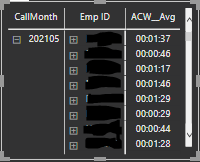
When I enter this data into a matrix, the data compiles as seen below.
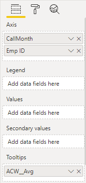
However, when I enter this data into a line graph, the data does not chart. Specifically, when I try putting ‘ACW___Avg’ into ‘Values’ under the ‘Fields’ list under ‘Visualizations’, it does not work. In fact, Power BI puts ‘ACW___Avg’ into ‘Tooltips’ automatically as seen below.
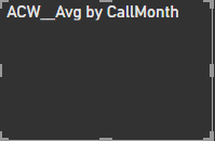
Below is a picture of the line graph that I get -- as you can see, there is no line graph 😞
Does anyone know how to fix this?
Thanks
Dan
Solved! Go to Solution.
- Mark as New
- Bookmark
- Subscribe
- Mute
- Subscribe to RSS Feed
- Permalink
- Report Inappropriate Content
- Mark as New
- Bookmark
- Subscribe
- Mute
- Subscribe to RSS Feed
- Permalink
- Report Inappropriate Content
@i820017 , As this is a text value, I doubt you can use that in values of visual like bar pie, etc. But I think, if there is a value already there in visual, you should be able to use this measure or tooltip
- Mark as New
- Bookmark
- Subscribe
- Mute
- Subscribe to RSS Feed
- Permalink
- Report Inappropriate Content
hello,
and if the variable is in date / time format, is possible to use this in the y axis?
I am trying to do that but power bi always create a "count of" ans shows the number of ocurrences and not the time value that I want.
- Mark as New
- Bookmark
- Subscribe
- Mute
- Subscribe to RSS Feed
- Permalink
- Report Inappropriate Content
Ok...I will accept this as a solution...thanks.
Helpful resources

Power BI Dataviz World Championships
The Power BI Data Visualization World Championships is back! Get ahead of the game and start preparing now!

Power BI Monthly Update - November 2025
Check out the November 2025 Power BI update to learn about new features.

| User | Count |
|---|---|
| 59 | |
| 43 | |
| 42 | |
| 23 | |
| 17 |
| User | Count |
|---|---|
| 190 | |
| 122 | |
| 96 | |
| 66 | |
| 47 |


