FabCon is coming to Atlanta
Join us at FabCon Atlanta from March 16 - 20, 2026, for the ultimate Fabric, Power BI, AI and SQL community-led event. Save $200 with code FABCOMM.
Register now!- Power BI forums
- Get Help with Power BI
- Desktop
- Service
- Report Server
- Power Query
- Mobile Apps
- Developer
- DAX Commands and Tips
- Custom Visuals Development Discussion
- Health and Life Sciences
- Power BI Spanish forums
- Translated Spanish Desktop
- Training and Consulting
- Instructor Led Training
- Dashboard in a Day for Women, by Women
- Galleries
- Data Stories Gallery
- Themes Gallery
- Contests Gallery
- QuickViz Gallery
- Quick Measures Gallery
- Visual Calculations Gallery
- Notebook Gallery
- Translytical Task Flow Gallery
- TMDL Gallery
- R Script Showcase
- Webinars and Video Gallery
- Ideas
- Custom Visuals Ideas (read-only)
- Issues
- Issues
- Events
- Upcoming Events
The Power BI Data Visualization World Championships is back! Get ahead of the game and start preparing now! Learn more
- Power BI forums
- Forums
- Get Help with Power BI
- Desktop
- Grouping a column with numbers and null values
- Subscribe to RSS Feed
- Mark Topic as New
- Mark Topic as Read
- Float this Topic for Current User
- Bookmark
- Subscribe
- Printer Friendly Page
- Mark as New
- Bookmark
- Subscribe
- Mute
- Subscribe to RSS Feed
- Permalink
- Report Inappropriate Content
Grouping a column with numbers and null values
Hi all,
I need help to create customized groups or bins that based on a column.
The column is last promised date of shipment and actual shipment date.
Which goes from something like -4000 to +4000 ish.
Those outer points are outliers, so im looking to create a group called +100 days and -100 days.
and then smaller groups near the 0 value.
how can i achieve this? thanks
i have tried various approaches, but i cant find any help online on this for some reason they dont apply to my problem.
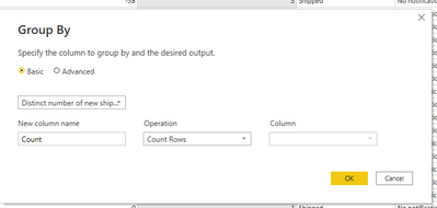
Tried to click group by in the edit query, but it doesn't seem to be the right approach.
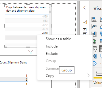
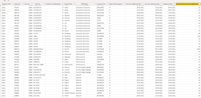
i also tried to highlight multiple numbers in a simple table, but the "group" option is not available:
Solved! Go to Solution.
- Mark as New
- Bookmark
- Subscribe
- Mute
- Subscribe to RSS Feed
- Permalink
- Report Inappropriate Content
Hi @Anonymous ,
Do you have defined groups that you require? Like how many total groups you need?
What is the minimum and maximum value in this column "Days between last promised shipment date and actual shipment date" ?
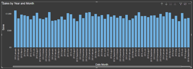
You can try to create BINS in Power BI. Consider the scenario where I have got Totals Sales displayed over-time.
Now I want to create BINS for the SALES value displayed above.
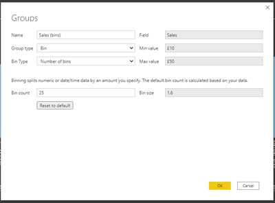
What I will do is, under FIELDS PANE, right-click on my SALES column and get following options and select NEW GROUP:
A new window opens where I can create some bins using options based on my requirement:
Read more about Bons here: https://docs.microsoft.com/en-us/power-bi/create-reports/desktop-grouping-and-binning#using-binning
Once you create bins, a new grouping appears as follows under Fields pane below your column:
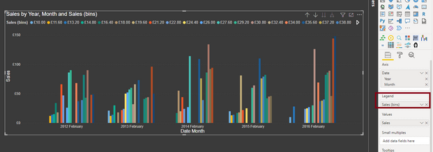
Then you can use those BINS under LEGEND area to show the groups by different colors for sales value (in my case):
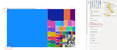
In a tree-map visual you can achieve something as below:
My bins are marked in RED in above visual.
Let me know if this is what you are looking for.
Thanks,
Pragati
- Mark as New
- Bookmark
- Subscribe
- Mute
- Subscribe to RSS Feed
- Permalink
- Report Inappropriate Content
Thanks @Pragati11 .
I did however end up doing a SQL case statement for grouping because Power BI felt very rigid in this scenario, where I don't want the bin sizes to be equal in size and the naming of bins was not customizable.
,CASE
when DATEDIFF(DAY, MAX(RDL.[New Shipment Date]),SSL.[Shipment Date])
< -100 then 'less than -100'
when DATEDIFF(DAY, MAX(RDL.[New Shipment Date]),SSL.[Shipment Date])
between -100 and -51 then '-51 to -100'
when DATEDIFF(DAY, MAX(RDL.[New Shipment Date]),SSL.[Shipment Date])
between -50 and -11 then '-11 to -50'
when DATEDIFF(DAY, MAX(RDL.[New Shipment Date]),SSL.[Shipment Date])
between -10 and -5 then '-5 to -10'
when DATEDIFF(DAY, MAX(RDL.[New Shipment Date]),SSL.[Shipment Date])
between -4 and -1 then '-1 to -4'
when DATEDIFF(DAY, MAX(RDL.[New Shipment Date]),SSL.[Shipment Date])
= 0 then '0'
when DATEDIFF(DAY, MAX(RDL.[New Shipment Date]),SSL.[Shipment Date])
between 1 and 4 then '1 to 4'
when DATEDIFF(DAY, MAX(RDL.[New Shipment Date]),SSL.[Shipment Date])
between 5 and 10 then '5 to 10'
when DATEDIFF(DAY, MAX(RDL.[New Shipment Date]),SSL.[Shipment Date])
between 11 and 50 then '11 to 50'
when DATEDIFF(DAY, MAX(RDL.[New Shipment Date]),SSL.[Shipment Date])
between 51 and 100 then '51 to 100'
when DATEDIFF(DAY, MAX(RDL.[New Shipment Date]),SSL.[Shipment Date])
> 100 then 'more than 100'
Else 'Null' end as 'Group days between last promised shipment date and actual shipment date'
- Mark as New
- Bookmark
- Subscribe
- Mute
- Subscribe to RSS Feed
- Permalink
- Report Inappropriate Content
Hi @Anonymous ,
Can you kindly share some sample data here as I am not clear on what data you have, what columns you are talking about here?
Follow this link to see how you can add details to your query:
https://community.powerbi.com/t5/Desktop/How-to-Get-Your-Question-Answered-Quickly/m-p/1447523
Thanks,
Pragati
- Mark as New
- Bookmark
- Subscribe
- Mute
- Subscribe to RSS Feed
- Permalink
- Report Inappropriate Content
Hi @Pragati11
The data table is quite straighforward.
There are 3 columns
1. Last promised shipment date
2. Actual shipment date
3. Days between last promised shipment date and actual shipment date.
And i just need to group the last column.
If i dont do anything with the data i can show the distribution and see that 670.000 orders were delivered same day as promised, but i would like to group those numbers, so i say everything between +1 to 5 days. and -1 to -5 days etc.
- Mark as New
- Bookmark
- Subscribe
- Mute
- Subscribe to RSS Feed
- Permalink
- Report Inappropriate Content
Hi @Anonymous ,
Do you have defined groups that you require? Like how many total groups you need?
What is the minimum and maximum value in this column "Days between last promised shipment date and actual shipment date" ?
You can try to create BINS in Power BI. Consider the scenario where I have got Totals Sales displayed over-time.
Now I want to create BINS for the SALES value displayed above.
What I will do is, under FIELDS PANE, right-click on my SALES column and get following options and select NEW GROUP:
A new window opens where I can create some bins using options based on my requirement:
Read more about Bons here: https://docs.microsoft.com/en-us/power-bi/create-reports/desktop-grouping-and-binning#using-binning
Once you create bins, a new grouping appears as follows under Fields pane below your column:
Then you can use those BINS under LEGEND area to show the groups by different colors for sales value (in my case):
In a tree-map visual you can achieve something as below:
My bins are marked in RED in above visual.
Let me know if this is what you are looking for.
Thanks,
Pragati
Helpful resources

Power BI Dataviz World Championships
The Power BI Data Visualization World Championships is back! Get ahead of the game and start preparing now!

Power BI Monthly Update - November 2025
Check out the November 2025 Power BI update to learn about new features.

| User | Count |
|---|---|
| 65 | |
| 46 | |
| 43 | |
| 26 | |
| 19 |
| User | Count |
|---|---|
| 198 | |
| 126 | |
| 102 | |
| 68 | |
| 51 |

