European Microsoft Fabric Community Conference
The ultimate Microsoft Fabric, Power BI, Azure AI, and SQL learning event: Join us in Stockholm, September 24-27, 2024.
Save €200 with code MSCUST on top of early bird pricing!
- Power BI forums
- Updates
- News & Announcements
- Get Help with Power BI
- Desktop
- Service
- Report Server
- Power Query
- Mobile Apps
- Developer
- DAX Commands and Tips
- Custom Visuals Development Discussion
- Health and Life Sciences
- Power BI Spanish forums
- Translated Spanish Desktop
- Training and Consulting
- Instructor Led Training
- Dashboard in a Day for Women, by Women
- Galleries
- Community Connections & How-To Videos
- COVID-19 Data Stories Gallery
- Themes Gallery
- Data Stories Gallery
- R Script Showcase
- Webinars and Video Gallery
- Quick Measures Gallery
- 2021 MSBizAppsSummit Gallery
- 2020 MSBizAppsSummit Gallery
- 2019 MSBizAppsSummit Gallery
- Events
- Ideas
- Custom Visuals Ideas
- Issues
- Issues
- Events
- Upcoming Events
- Community Blog
- Power BI Community Blog
- Custom Visuals Community Blog
- Community Support
- Community Accounts & Registration
- Using the Community
- Community Feedback
Find everything you need to get certified on Fabric—skills challenges, live sessions, exam prep, role guidance, and more. Get started
- Power BI forums
- Forums
- Get Help with Power BI
- Desktop
- Re: Group by Month
- Subscribe to RSS Feed
- Mark Topic as New
- Mark Topic as Read
- Float this Topic for Current User
- Bookmark
- Subscribe
- Printer Friendly Page
- Mark as New
- Bookmark
- Subscribe
- Mute
- Subscribe to RSS Feed
- Permalink
- Report Inappropriate Content
Group by Month
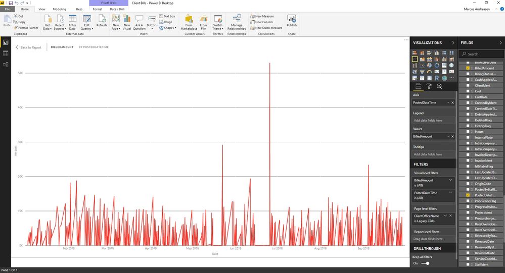
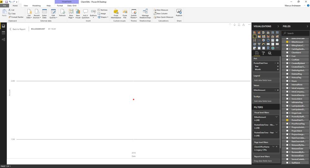
I need this chart (see attached) to be group by month. It should show the total for the month instead of listing everything out by each day, so jsut one point for each month. I have already selected tried clicking the "x" to remove quarter and day from the options but when i have it viewed like that it only gives me one point for all the data (see second attached photo). What can I do to get this done?
Solved! Go to Solution.
- Mark as New
- Bookmark
- Subscribe
- Mute
- Subscribe to RSS Feed
- Permalink
- Report Inappropriate Content
Hello Orangemarcus,
just initial takeout,
have you tried to use the split dimension button?
its in the top right hand corner of your graph, looks like a small fork 😉 i believe that is what you need 🙂
- Mark as New
- Bookmark
- Subscribe
- Mute
- Subscribe to RSS Feed
- Permalink
- Report Inappropriate Content
That is exactly what i needed! Thank you!
Helpful resources

Europe’s largest Microsoft Fabric Community Conference
Join the community in Stockholm for expert Microsoft Fabric learning including a very exciting keynote from Arun Ulag, Corporate Vice President, Azure Data.

Power BI Monthly Update - July 2024
Check out the July 2024 Power BI update to learn about new features.

| User | Count |
|---|---|
| 115 | |
| 112 | |
| 69 | |
| 48 | |
| 43 |
| User | Count |
|---|---|
| 188 | |
| 87 | |
| 77 | |
| 74 | |
| 60 |


