FabCon is coming to Atlanta
Join us at FabCon Atlanta from March 16 - 20, 2026, for the ultimate Fabric, Power BI, AI and SQL community-led event. Save $200 with code FABCOMM.
Register now!- Power BI forums
- Get Help with Power BI
- Desktop
- Service
- Report Server
- Power Query
- Mobile Apps
- Developer
- DAX Commands and Tips
- Custom Visuals Development Discussion
- Health and Life Sciences
- Power BI Spanish forums
- Translated Spanish Desktop
- Training and Consulting
- Instructor Led Training
- Dashboard in a Day for Women, by Women
- Galleries
- Data Stories Gallery
- Themes Gallery
- Contests Gallery
- QuickViz Gallery
- Quick Measures Gallery
- Visual Calculations Gallery
- Notebook Gallery
- Translytical Task Flow Gallery
- TMDL Gallery
- R Script Showcase
- Webinars and Video Gallery
- Ideas
- Custom Visuals Ideas (read-only)
- Issues
- Issues
- Events
- Upcoming Events
Learn from the best! Meet the four finalists headed to the FINALS of the Power BI Dataviz World Championships! Register now
- Subscribe to RSS Feed
- Mark Topic as New
- Mark Topic as Read
- Float this Topic for Current User
- Bookmark
- Subscribe
- Printer Friendly Page
- Mark as New
- Bookmark
- Subscribe
- Mute
- Subscribe to RSS Feed
- Permalink
- Report Inappropriate Content
Graphs
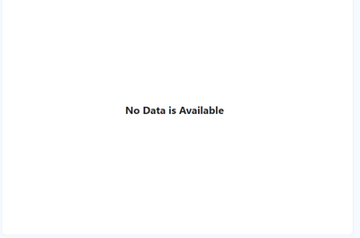
when a garph is not data, how to remove the axis labels in powerbi.
Can anyone please help me with this
Solved! Go to Solution.
- Mark as New
- Bookmark
- Subscribe
- Mute
- Subscribe to RSS Feed
- Permalink
- Report Inappropriate Content
- Mark as New
- Bookmark
- Subscribe
- Mute
- Subscribe to RSS Feed
- Permalink
- Report Inappropriate Content
I think i got the solution for my specific case:
- Mark as New
- Bookmark
- Subscribe
- Mute
- Subscribe to RSS Feed
- Permalink
- Report Inappropriate Content
@Anonymous , Do put the dax expression and mark it as solution if anyone encounter the same problem/doubt.
- Mark as New
- Bookmark
- Subscribe
- Mute
- Subscribe to RSS Feed
- Permalink
- Report Inappropriate Content
@ChiragGarg2512 i have used the advanced function available in text in axis and it worked for my requirement
- Mark as New
- Bookmark
- Subscribe
- Mute
- Subscribe to RSS Feed
- Permalink
- Report Inappropriate Content
A measure can be created with if statement also. This can reduce the work getting put into formatting the other values. If statement will return white for blank values and blank for any other values.
- Mark as New
- Bookmark
- Subscribe
- Mute
- Subscribe to RSS Feed
- Permalink
- Report Inappropriate Content
Hello @Anonymous ,
Switch the titles off in both x-axis and y-axis.
If I answered your question, please mark my post as solution, Appreciate your Kudos 👍
Follow me on Linkedin
Vote for my Community Mobile App Idea 💡
Proud to be a Super User! |  |
- Mark as New
- Bookmark
- Subscribe
- Mute
- Subscribe to RSS Feed
- Permalink
- Report Inappropriate Content
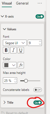
The axis labels are not dynamic. If the requirement is to remove the labels all together, go to format visual -> X-axis/Y-axis -> Title(off).
- Mark as New
- Bookmark
- Subscribe
- Mute
- Subscribe to RSS Feed
- Permalink
- Report Inappropriate Content
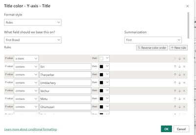
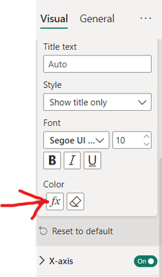
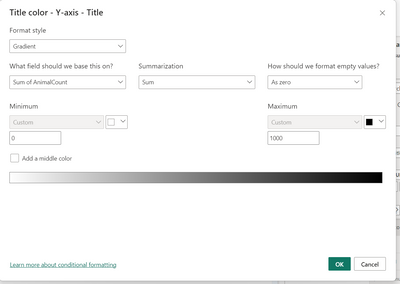
in this section only, i found one obtion conditional fomat obtion below:
how can i use measure in the below section in powerbi, suppose i am creating any measure which will count the the rows, and if rows are blank it will show blank and titile will be shown in white colour and if row have data the then measure color will be black
@CaptainCowell can you please look into it, i think you can help me in this
- Mark as New
- Bookmark
- Subscribe
- Mute
- Subscribe to RSS Feed
- Permalink
- Report Inappropriate Content
Yes, that will work. That is great catch.
1) Need to create a measure that will count the number of rows in the data. [measure]
2) Another measure that will work on switch function.
For Ex., measure1 = switch([measure], 0, "White")
3) Apply this to conditional formatting in X-axis. {Field value -> Select [measure]}
That is great observation. Nice work @Anonymous
- Mark as New
- Bookmark
- Subscribe
- Mute
- Subscribe to RSS Feed
- Permalink
- Report Inappropriate Content
ok if graph axis is not dynamic like i have specific requirement to remove the axis label, when i am selecting any filter and not showing any data, which visual is best in this situation
- Mark as New
- Bookmark
- Subscribe
- Mute
- Subscribe to RSS Feed
- Permalink
- Report Inappropriate Content
It depends on the output data type. If the output is continous over time, a line visual works. If its going to be just a text/numeric value card visual is great. For comparing value for different categories clustered column chart works well.
- Mark as New
- Bookmark
- Subscribe
- Mute
- Subscribe to RSS Feed
- Permalink
- Report Inappropriate Content
Hi @Anonymous ,
remove from filter visual options
Helpful resources

Join our Fabric User Panel
Share feedback directly with Fabric product managers, participate in targeted research studies and influence the Fabric roadmap.

Power BI Monthly Update - February 2026
Check out the February 2026 Power BI update to learn about new features.

| User | Count |
|---|---|
| 62 | |
| 55 | |
| 39 | |
| 16 | |
| 15 |
| User | Count |
|---|---|
| 93 | |
| 85 | |
| 33 | |
| 31 | |
| 25 |


