FabCon is coming to Atlanta
Join us at FabCon Atlanta from March 16 - 20, 2026, for the ultimate Fabric, Power BI, AI and SQL community-led event. Save $200 with code FABCOMM.
Register now!- Power BI forums
- Get Help with Power BI
- Desktop
- Service
- Report Server
- Power Query
- Mobile Apps
- Developer
- DAX Commands and Tips
- Custom Visuals Development Discussion
- Health and Life Sciences
- Power BI Spanish forums
- Translated Spanish Desktop
- Training and Consulting
- Instructor Led Training
- Dashboard in a Day for Women, by Women
- Galleries
- Data Stories Gallery
- Themes Gallery
- Contests Gallery
- QuickViz Gallery
- Quick Measures Gallery
- Visual Calculations Gallery
- Notebook Gallery
- Translytical Task Flow Gallery
- TMDL Gallery
- R Script Showcase
- Webinars and Video Gallery
- Ideas
- Custom Visuals Ideas (read-only)
- Issues
- Issues
- Events
- Upcoming Events
The Power BI Data Visualization World Championships is back! Get ahead of the game and start preparing now! Learn more
- Power BI forums
- Forums
- Get Help with Power BI
- Desktop
- Graphical representation of data with different ax...
- Subscribe to RSS Feed
- Mark Topic as New
- Mark Topic as Read
- Float this Topic for Current User
- Bookmark
- Subscribe
- Printer Friendly Page
- Mark as New
- Bookmark
- Subscribe
- Mute
- Subscribe to RSS Feed
- Permalink
- Report Inappropriate Content
Graphical representation of data with different axis
Hi all:
I would like to represent in a graph the number of open incidents in a certain month, with respect to closed ones.
The difficulty lies in the fact that the axis of the data is different in each case and I do not see how to represent it in the same graph.
Example of data to be represented:
| id | Created year | Created Month | Closed Year | Closed Month |
| 148374 | 2017 | 9 | 2017 | 9 |
| 149709 | 2017 | 9 | 2017 | 9 |
| 149948 | 2017 | 9 | 2017 | 9 |
| 150066 | 2017 | 9 | 2017 | 9 |
| 150002 | 2017 | 9 | 2017 | 9 |
| 149928 | 2017 | 9 | 2017 | 9 |
| 149869 | 2017 | 9 | 2017 | 10 |
| 150070 | 2017 | 9 | 2017 | 9 |
| 150092 | 2017 | 9 | 2017 | 9 |
| 150077 | 2017 | 9 | 2017 | 9 |
| 150004 | 2017 | 9 | 2017 | 9 |
| 150000 | 2017 | 9 | 2017 | 9 |
| 149966 | 2017 | 9 | 2017 | 9 |
| 149900 | 2017 | 9 | 2017 | 9 |
| 149960 | 2017 | 9 | 2017 | 10 |
| 149904 | 2017 | 9 | 2017 | 10 |
| 150234 | 2017 | 9 | 2017 | 9 |
| 150235 | 2017 | 9 | 2017 | 9 |
| 150236 | 2017 | 9 | 2017 | 9 |
| 150237 | 2017 | 9 | 2017 | 9 |
| 150238 | 2017 | 9 | 2017 | 9 |
| 150244 | 2017 | 9 | 2017 | 9 |
| 150618 | 2017 | 9 | 2017 | 9 |
| 151253 | 2017 | 9 | 2017 | 9 |
| 151187 | 2017 | 9 | 2017 | 9 |
| 151102 | 2017 | 9 | 2017 | 11 |
Any ideas?
Thnks
Solved! Go to Solution.
- Mark as New
- Bookmark
- Subscribe
- Mute
- Subscribe to RSS Feed
- Permalink
- Report Inappropriate Content
Hi @davidestg,
Based on my test, you could refer to below steps:
Sample data:
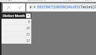
Create a new table to list the distinct month:
a = DISTINCT(UNION(VALUES(Table1[Closed Month]),VALUES(Table1[Created Month])))
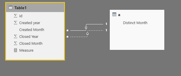
Create two relationships between the [Distinct Month] and the other two columns.
Create two measures:
Created Month count = CALCULATE(COUNT(Table1[id]),USERELATIONSHIP(Table1[Created Month],a[Distinct Month]))
Closed Month count = CALCULATE(COUNT(Table1[id]),USERELATIONSHIP(Table1[Closed Month],a[Distinct Month]))
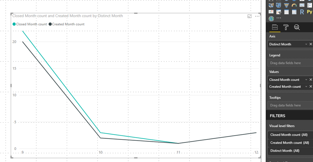
Result:
You could also download the pbix file to have a view.
Regards,
Daniel He
If this post helps, then please consider Accept it as the solution to help the other members find it more quickly.
- Mark as New
- Bookmark
- Subscribe
- Mute
- Subscribe to RSS Feed
- Permalink
- Report Inappropriate Content
Hi @davidestg,
From your description, I could not figure out what is your desired result? Could you please post me your desired picture if possible/
Regards,
Daniel He
If this post helps, then please consider Accept it as the solution to help the other members find it more quickly.
- Mark as New
- Bookmark
- Subscribe
- Mute
- Subscribe to RSS Feed
- Permalink
- Report Inappropriate Content
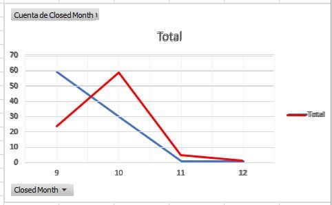
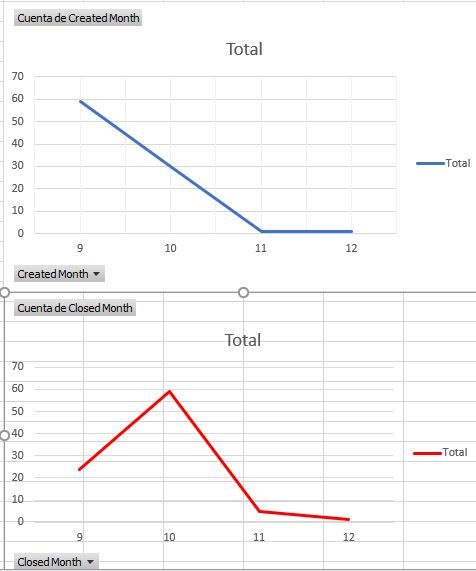
I mean, as the graph showed, that is an overlap of two graphs, because de x axis is based in different series:
I can represent a different data in the same grapg if the main axis is equal, but in this case I have to represent the open issues Vs the closed issues every month, so i have to count how many issues I open in a month and how many issues I close, it means that every series have a different x axis.
Additionally, it have to change in the panel when I select a different year or month to show
BR
David
- Mark as New
- Bookmark
- Subscribe
- Mute
- Subscribe to RSS Feed
- Permalink
- Report Inappropriate Content
Hi @davidestg,
Based on my test, you could refer to below steps:
Sample data:
Create a new table to list the distinct month:
a = DISTINCT(UNION(VALUES(Table1[Closed Month]),VALUES(Table1[Created Month])))
Create two relationships between the [Distinct Month] and the other two columns.
Create two measures:
Created Month count = CALCULATE(COUNT(Table1[id]),USERELATIONSHIP(Table1[Created Month],a[Distinct Month]))
Closed Month count = CALCULATE(COUNT(Table1[id]),USERELATIONSHIP(Table1[Closed Month],a[Distinct Month]))
Result:
You could also download the pbix file to have a view.
Regards,
Daniel He
If this post helps, then please consider Accept it as the solution to help the other members find it more quickly.
- Mark as New
- Bookmark
- Subscribe
- Mute
- Subscribe to RSS Feed
- Permalink
- Report Inappropriate Content
Helpful resources

Power BI Dataviz World Championships
The Power BI Data Visualization World Championships is back! Get ahead of the game and start preparing now!

| User | Count |
|---|---|
| 64 | |
| 44 | |
| 42 | |
| 34 | |
| 23 |
| User | Count |
|---|---|
| 199 | |
| 124 | |
| 104 | |
| 74 | |
| 55 |
