FabCon is coming to Atlanta
Join us at FabCon Atlanta from March 16 - 20, 2026, for the ultimate Fabric, Power BI, AI and SQL community-led event. Save $200 with code FABCOMM.
Register now!- Power BI forums
- Get Help with Power BI
- Desktop
- Service
- Report Server
- Power Query
- Mobile Apps
- Developer
- DAX Commands and Tips
- Custom Visuals Development Discussion
- Health and Life Sciences
- Power BI Spanish forums
- Translated Spanish Desktop
- Training and Consulting
- Instructor Led Training
- Dashboard in a Day for Women, by Women
- Galleries
- Data Stories Gallery
- Themes Gallery
- Contests Gallery
- QuickViz Gallery
- Quick Measures Gallery
- Visual Calculations Gallery
- Notebook Gallery
- Translytical Task Flow Gallery
- TMDL Gallery
- R Script Showcase
- Webinars and Video Gallery
- Ideas
- Custom Visuals Ideas (read-only)
- Issues
- Issues
- Events
- Upcoming Events
The Power BI Data Visualization World Championships is back! Get ahead of the game and start preparing now! Learn more
- Power BI forums
- Forums
- Get Help with Power BI
- Desktop
- Graphic visual with Moving Annual Total values
- Subscribe to RSS Feed
- Mark Topic as New
- Mark Topic as Read
- Float this Topic for Current User
- Bookmark
- Subscribe
- Printer Friendly Page
- Mark as New
- Bookmark
- Subscribe
- Mute
- Subscribe to RSS Feed
- Permalink
- Report Inappropriate Content
Graphic visual with Moving Annual Total values
Hi!
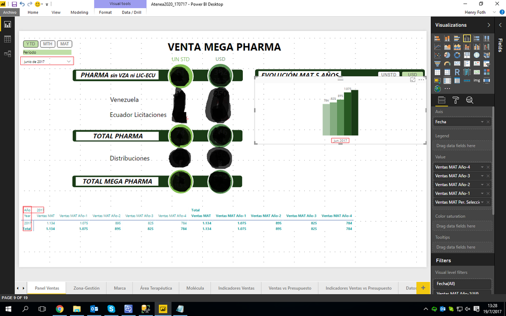
I'm trying to make a report that has a graphic visual to show an evolution of moving annual total sales for 5 years. I made 5 measures, one for each year.
In the report, I have a date selector that references a master table with dates. This master table is related to the facts table and whas used to perform the 5 moving annual total measures.
So, in the graphic visual I put the Date as axis and the 5 measures as values. The problem that I have, is that the 5 columns and together and shown all in the same year.
How can I make it to show seperate columns for each measure and by its respective year?
The main measure is this:
Ventas MAT =
SWITCH(
	VALUES(
		'Selector Medida'[Medida]
	);
	"USD";
	CALCULATE(
		DIVIDE(
			SUM(
				'Ventas Mensuales'[USD]
			);
			1000
		);
		DATESINPERIOD(
			'Período a Analizar'[Fecha];
			LASTDATE(
				'Período a Analizar'[Fecha]
			);
			-1;
			YEAR
		)
	);
	"UNSTD";
	CALCULATE(
		DIVIDE(
			SUM(
				'Ventas Mensuales'[UNSTD]
			);
			1000
		);
		DATESINPERIOD(
			'Período a Analizar'[Fecha];
			LASTDATE(
				'Período a Analizar'[Fecha]
			);
			-1;
			YEAR
		)
	)
)
And for every previous year I made this:
Ventas MAT Año-1 =
CALCULATE(
	'Medidas VentasMPh'[Ventas MAT];
	DATESINPERIOD(
		'Período a Analizar'[Fecha];
		LASTDATE(
			DATEADD(
				'Período a Analizar'[Fecha];
				-1;
				YEAR
			)
		);
		-1;
		YEAR
	)
)
And this is how the report looks like:
Thanks in advance!
- Mark as New
- Bookmark
- Subscribe
- Mute
- Subscribe to RSS Feed
- Permalink
- Report Inappropriate Content
@Anonymous,
Firstly, you can follow the guide in the blogs below to create a Moving Annual Total measure.
https://www.microsoftpressstore.com/articles/article.aspx?p=2228441&seqNum=2
http://www.dash-intel.com/powerbi/modeling_date_functions.php
Secondly, create a new table using DAX below. Please note that there is no relationship between the new table and your original table.
Date = ADDCOLUMNS(CALENDAR(DATE(2010,1,1),DATE(2017,12,30)),"Year",YEAR([Date]),"Month",MONTH([Date]),"YearMonth",FORMAT([Date],"YYYYMM"))
Thirdly, create a measure in your original table, drag the measure to the visual level filter of your bar chart and set its value to “not blank”
checkmeasure = IF(MAX(YourOriginalTable[Year])>(MAX('Date'[Year])-5)&&MAX(YourOriginalTable[Year])<=MAX('Date'[Year]),IF(MAX(YourOriginalTable[Month])=MAX('Date'[Month]),1,BLANK()),BLANK())
At last, create a slicer using the YearMonth column of the new Date table, then use it to filter your bar chart.
Regards,
Lydia
Helpful resources

Power BI Dataviz World Championships
The Power BI Data Visualization World Championships is back! Get ahead of the game and start preparing now!

| User | Count |
|---|---|
| 38 | |
| 38 | |
| 36 | |
| 28 | |
| 28 |
| User | Count |
|---|---|
| 124 | |
| 88 | |
| 74 | |
| 66 | |
| 65 |


