FabCon is coming to Atlanta
Join us at FabCon Atlanta from March 16 - 20, 2026, for the ultimate Fabric, Power BI, AI and SQL community-led event. Save $200 with code FABCOMM.
Register now!- Power BI forums
- Get Help with Power BI
- Desktop
- Service
- Report Server
- Power Query
- Mobile Apps
- Developer
- DAX Commands and Tips
- Custom Visuals Development Discussion
- Health and Life Sciences
- Power BI Spanish forums
- Translated Spanish Desktop
- Training and Consulting
- Instructor Led Training
- Dashboard in a Day for Women, by Women
- Galleries
- Data Stories Gallery
- Themes Gallery
- Contests Gallery
- QuickViz Gallery
- Quick Measures Gallery
- Visual Calculations Gallery
- Notebook Gallery
- Translytical Task Flow Gallery
- TMDL Gallery
- R Script Showcase
- Webinars and Video Gallery
- Ideas
- Custom Visuals Ideas (read-only)
- Issues
- Issues
- Events
- Upcoming Events
Learn from the best! Meet the four finalists headed to the FINALS of the Power BI Dataviz World Championships! Register now
- Power BI forums
- Forums
- Get Help with Power BI
- Desktop
- Graph will not display correctly
- Subscribe to RSS Feed
- Mark Topic as New
- Mark Topic as Read
- Float this Topic for Current User
- Bookmark
- Subscribe
- Printer Friendly Page
- Mark as New
- Bookmark
- Subscribe
- Mute
- Subscribe to RSS Feed
- Permalink
- Report Inappropriate Content
Graph will not display correctly
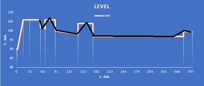
Hello, i have a set of data that I trying to graph but will not display how I would like, below is the data and what i would like/expect to have the graph to look like.
the black overlay is the graph I get in Power BI
here is the data.
| X - Axis | Y - Axis |
| 0.1 | 90 |
| 2.38 | 90 |
| 15 | 106 |
| 30 | 106 |
| 54 | 106 |
| 54 | 102.120889 |
| 65 | 101.315693 |
| 65 | 106 |
| 88 | 106 |
| 88 | 100 |
| 140 | 97.9835464 |
| 140 | 103.98 |
| 174 | 103.98 |
| 174 | 97 |
| 380 | 97 |
| 380 | 99.6469908 |
| 400 | 99.4242268 |
Any help would be great, thankyou.
- Collin
- Mark as New
- Bookmark
- Subscribe
- Mute
- Subscribe to RSS Feed
- Permalink
- Report Inappropriate Content
hi, @Anonymous
Based on my test on your sample data, I'm afraid it couldn't achieve in Power BI for now.
In your data, some X-Axis have more than one Y-Axis and they don't be aggregated. so there is no graph is available for now.
For your requirement, you could post your new idea in Power BI ideas and make this feature coming sooner .
Best Regards,
Lin
If this post helps, then please consider Accept it as the solution to help the other members find it more quickly.
- Mark as New
- Bookmark
- Subscribe
- Mute
- Subscribe to RSS Feed
- Permalink
- Report Inappropriate Content
Alright , thanks , what I did for now is change the double values by .1 so it offsets the values as not the same. and doesnt aggitate them,
Helpful resources

Join our Fabric User Panel
Share feedback directly with Fabric product managers, participate in targeted research studies and influence the Fabric roadmap.

Power BI Monthly Update - February 2026
Check out the February 2026 Power BI update to learn about new features.

| User | Count |
|---|---|
| 50 | |
| 47 | |
| 29 | |
| 15 | |
| 14 |
| User | Count |
|---|---|
| 89 | |
| 74 | |
| 40 | |
| 26 | |
| 25 |

