FabCon is coming to Atlanta
Join us at FabCon Atlanta from March 16 - 20, 2026, for the ultimate Fabric, Power BI, AI and SQL community-led event. Save $200 with code FABCOMM.
Register now!- Power BI forums
- Get Help with Power BI
- Desktop
- Service
- Report Server
- Power Query
- Mobile Apps
- Developer
- DAX Commands and Tips
- Custom Visuals Development Discussion
- Health and Life Sciences
- Power BI Spanish forums
- Translated Spanish Desktop
- Training and Consulting
- Instructor Led Training
- Dashboard in a Day for Women, by Women
- Galleries
- Data Stories Gallery
- Themes Gallery
- Contests Gallery
- QuickViz Gallery
- Quick Measures Gallery
- Visual Calculations Gallery
- Notebook Gallery
- Translytical Task Flow Gallery
- TMDL Gallery
- R Script Showcase
- Webinars and Video Gallery
- Ideas
- Custom Visuals Ideas (read-only)
- Issues
- Issues
- Events
- Upcoming Events
Get Fabric Certified for FREE during Fabric Data Days. Don't miss your chance! Request now
- Power BI forums
- Forums
- Get Help with Power BI
- Desktop
- Graph showing popular times
- Subscribe to RSS Feed
- Mark Topic as New
- Mark Topic as Read
- Float this Topic for Current User
- Bookmark
- Subscribe
- Printer Friendly Page
- Mark as New
- Bookmark
- Subscribe
- Mute
- Subscribe to RSS Feed
- Permalink
- Report Inappropriate Content
Graph showing popular times
Hi everyone,
Very much a newbie to PowerBI so apologies if this is a silly question. I have a large dataset which shows meeting room bookings for the year to date. This includes seperate fields for the start time and then end time of each meeting. I'd like to produce a graph showing the most popular time of day for meetings so that users have a high level view of when they would be most likely to obtain a meeting room. Sadly I've no idea how to actually do this! Is anyone able to set me on the right path please?
- Mark as New
- Bookmark
- Subscribe
- Mute
- Subscribe to RSS Feed
- Permalink
- Report Inappropriate Content
I'm curious where this dataset came from. I'm trying to do a similar analysis in my organization, where meeting rooms are tracked in Office 365, and it seems like it is difficult to get this sort of information out of the system.
- Mark as New
- Bookmark
- Subscribe
- Mute
- Subscribe to RSS Feed
- Permalink
- Report Inappropriate Content
I think you can first create another table which includes all the working minutes. Then we can create a new calculated column in this table which counts the used meeting rooms.
I’ve uploaded my .pbix file here for reference. Please refer to following steps for details.
I assume we have an original table as below. We can use the function of split column in Query Editor to split the columns of Start Time and End Time.
In another working minutes table, we can create a column with following DAX formula.
Count =
CALCULATE (
    COUNTROWS ( Table1 ),
    FILTER (
        ALL ( Table1 ),
        Table1[Start Time.2] <= Table2[Time.2]
            && Table1[End Time.2] >= Table2[Time.2]
    )
)
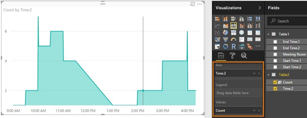
At last, drag the stacked area chart into your canvas as below.
Best Regards,
Herbert
- Mark as New
- Bookmark
- Subscribe
- Mute
- Subscribe to RSS Feed
- Permalink
- Report Inappropriate Content
Start a Table Visual template
Drag the Start Time field from the Field pane into the Visualization Pane Values field
....that will create a list of all start times
Repeat - this part is not intuitive - Drag the Start Time field a second time right on top of the first....and now you'll have the same column twice.
Then in the second field, in the Visualizations Pane - use its drop down to select Count
Helpful resources

Power BI Monthly Update - November 2025
Check out the November 2025 Power BI update to learn about new features.

Fabric Data Days
Advance your Data & AI career with 50 days of live learning, contests, hands-on challenges, study groups & certifications and more!


