Jumpstart your career with the Fabric Career Hub
Find everything you need to get certified on Fabric—skills challenges, live sessions, exam prep, role guidance, and more.
Get started- Power BI forums
- Updates
- News & Announcements
- Get Help with Power BI
- Desktop
- Service
- Report Server
- Power Query
- Mobile Apps
- Developer
- DAX Commands and Tips
- Custom Visuals Development Discussion
- Health and Life Sciences
- Power BI Spanish forums
- Translated Spanish Desktop
- Power Platform Integration - Better Together!
- Power Platform Integrations (Read-only)
- Power Platform and Dynamics 365 Integrations (Read-only)
- Training and Consulting
- Instructor Led Training
- Dashboard in a Day for Women, by Women
- Galleries
- Community Connections & How-To Videos
- COVID-19 Data Stories Gallery
- Themes Gallery
- Data Stories Gallery
- R Script Showcase
- Webinars and Video Gallery
- Quick Measures Gallery
- 2021 MSBizAppsSummit Gallery
- 2020 MSBizAppsSummit Gallery
- 2019 MSBizAppsSummit Gallery
- Events
- Ideas
- Custom Visuals Ideas
- Issues
- Issues
- Events
- Upcoming Events
- Community Blog
- Power BI Community Blog
- Custom Visuals Community Blog
- Community Support
- Community Accounts & Registration
- Using the Community
- Community Feedback
Grow your Fabric skills and prepare for the DP-600 certification exam by completing the latest Microsoft Fabric challenge.
- Power BI forums
- Forums
- Get Help with Power BI
- Desktop
- Re: Graph Labels Not Visible
- Subscribe to RSS Feed
- Mark Topic as New
- Mark Topic as Read
- Float this Topic for Current User
- Bookmark
- Subscribe
- Printer Friendly Page
- Mark as New
- Bookmark
- Subscribe
- Mute
- Subscribe to RSS Feed
- Permalink
- Report Inappropriate Content
Graph Labels Not Visible
Hi Everyone,
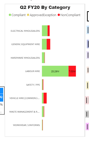
I have developed a stack bar graph and On the data labels. Though my data are huge (In millions) therefore while decreasing the visual size my data labels are invisible. I want to mimize the size and would like to see the data labels. I tried everthing from fomatting pane but unable to get the see the data labels.
Is there any way I could see the data labels without expanding the graph as I have different visuals on one dashboard.
Kindly refer the image 1 where data labels are visible for few bars. In the other hand image expaning the graph but still labels or not so clear.
Need help. If we have any alternate Except Stack Bar graph (100% option).
Thanks in advance.
Uphar Tandon
Solved! Go to Solution.
- Mark as New
- Bookmark
- Subscribe
- Mute
- Subscribe to RSS Feed
- Permalink
- Report Inappropriate Content
the issue here is the range of data that you have, to accomodate the larger values in proportion it has to make the smaller values small. You might have to do a matrix with conditional formatting because you have a few categories.
Are you able to provide some dummy data? that would help otherwise you will need to try different things.
Have you looked at the custom visualistions?
If I took the time to answer your question and I came up with a solution, please mark my post as a solution and /or give kudos freely for the effort 🙂 Thank you!
Proud to be a Super User!
- Mark as New
- Bookmark
- Subscribe
- Mute
- Subscribe to RSS Feed
- Permalink
- Report Inappropriate Content
Hi @vanessafvg
Thanks for your suggestion. I have added multiple axis chart (ixviz chart) from import options , It is having a alot of formatting capbility and now I am able to display the labels after formatting the lables. Please see below snapshot.
Again thanks for your support.
Regards
Uphar Tandon
Helpful resources

Europe’s largest Microsoft Fabric Community Conference
Join the community in Stockholm for expert Microsoft Fabric learning including a very exciting keynote from Arun Ulag, Corporate Vice President, Azure Data.

New forum boards available in Real-Time Intelligence.
Ask questions in Eventhouse and KQL, Eventstream, and Reflex.

| User | Count |
|---|---|
| 90 | |
| 82 | |
| 62 | |
| 61 | |
| 58 |
| User | Count |
|---|---|
| 159 | |
| 114 | |
| 100 | |
| 75 | |
| 65 |


