FabCon is coming to Atlanta
Join us at FabCon Atlanta from March 16 - 20, 2026, for the ultimate Fabric, Power BI, AI and SQL community-led event. Save $200 with code FABCOMM.
Register now!- Power BI forums
- Get Help with Power BI
- Desktop
- Service
- Report Server
- Power Query
- Mobile Apps
- Developer
- DAX Commands and Tips
- Custom Visuals Development Discussion
- Health and Life Sciences
- Power BI Spanish forums
- Translated Spanish Desktop
- Training and Consulting
- Instructor Led Training
- Dashboard in a Day for Women, by Women
- Galleries
- Data Stories Gallery
- Themes Gallery
- Contests Gallery
- QuickViz Gallery
- Quick Measures Gallery
- Visual Calculations Gallery
- Notebook Gallery
- Translytical Task Flow Gallery
- TMDL Gallery
- R Script Showcase
- Webinars and Video Gallery
- Ideas
- Custom Visuals Ideas (read-only)
- Issues
- Issues
- Events
- Upcoming Events
The Power BI Data Visualization World Championships is back! Get ahead of the game and start preparing now! Learn more
- Power BI forums
- Forums
- Get Help with Power BI
- Desktop
- Globe Map - increase resolution
- Subscribe to RSS Feed
- Mark Topic as New
- Mark Topic as Read
- Float this Topic for Current User
- Bookmark
- Subscribe
- Printer Friendly Page
- Mark as New
- Bookmark
- Subscribe
- Mute
- Subscribe to RSS Feed
- Permalink
- Report Inappropriate Content
Globe Map - increase resolution
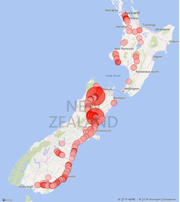
I have given the Globe Map a go and got it working however my datapoints are very close together. Not really global.
End up with a picture like this (thats all of New Zealand under there)
I realise it's called "Globe Map" but am wondering if anyone knows a way to zoom in to more localised data? Also if its possible to remove the bars - I am really just after the heat map. This is the current workaround until there is a real heatmap in Power BI.
Cheers
Solved! Go to Solution.
- Mark as New
- Bookmark
- Subscribe
- Mute
- Subscribe to RSS Feed
- Permalink
- Report Inappropriate Content
Cheers to all who helped with this one. I ended up going with just the basic map as it showed the details I need for now. Hopefully an update soon will allow further manipulation of the way it is presented in PowerBI.
One remaining issue (which I would have thought impossible) is that I have events occuring in exactly the same point even with GPS coordinates down to the second! PowerBI then joins the two events and increases the dot size (and adds the value) annoying but something I guess I can live with for now.
Great help and advise on the forums again though ![]()
ED
- Mark as New
- Bookmark
- Subscribe
- Mute
- Subscribe to RSS Feed
- Permalink
- Report Inappropriate Content
Bit late to the party I guess, but NZ is not a region of the world understoof by Bing. I have had lots of success heatmapping down to property size for NZ, but this has all been based on specialist polygons in other tools. I have had some luck bringing in shapes in my queries but it seems to slow down performance more than it should. Your last attempt is the best you will get out of the current powerbi suite. Bring in post code and you get mapping points all over the world, your lat/lng is the best you will get at the mo.
- Mark as New
- Bookmark
- Subscribe
- Mute
- Subscribe to RSS Feed
- Permalink
- Report Inappropriate Content
I imported this globe map visual to the visualizations pane but unable to see the images. Unexpected error messages is displayed each time as I click on navigation keys. After providing each value inut i can only see their names as legends bt no map just a white screen. can u help me and tell how it appeared on your powerbi desktop. m using the latest version of powerbi and visual too.
- Mark as New
- Bookmark
- Subscribe
- Mute
- Subscribe to RSS Feed
- Permalink
- Report Inappropriate Content
@elliotdixon apparently this visual is not perfected yet - if you read the comments at this link
http://blogs.msdn.com/b/powerbi/archive/2015/11/24/visual-awesomeness-unlocked-the-globe-map.aspx
seems people are complaining from the same issue
I couldn't get the HEAT MAP to look any better
- Mark as New
- Bookmark
- Subscribe
- Mute
- Subscribe to RSS Feed
- Permalink
- Report Inappropriate Content
Cheers to all who helped with this one. I ended up going with just the basic map as it showed the details I need for now. Hopefully an update soon will allow further manipulation of the way it is presented in PowerBI.
One remaining issue (which I would have thought impossible) is that I have events occuring in exactly the same point even with GPS coordinates down to the second! PowerBI then joins the two events and increases the dot size (and adds the value) annoying but something I guess I can live with for now.
Great help and advise on the forums again though ![]()
ED
- Mark as New
- Bookmark
- Subscribe
- Mute
- Subscribe to RSS Feed
- Permalink
- Report Inappropriate Content
Bit late to the party I guess, but NZ is not a region of the world understoof by Bing. I have had lots of success heatmapping down to property size for NZ, but this has all been based on specialist polygons in other tools. I have had some luck bringing in shapes in my queries but it seems to slow down performance more than it should. Your last attempt is the best you will get out of the current powerbi suite. Bring in post code and you get mapping points all over the world, your lat/lng is the best you will get at the mo.
- Mark as New
- Bookmark
- Subscribe
- Mute
- Subscribe to RSS Feed
- Permalink
- Report Inappropriate Content
Very difficult to recreate this without some sample data and information on how you configured your map, any chance you can post?
Follow on LinkedIn
@ me in replies or I'll lose your thread!!!
Instead of a Kudo, please vote for this idea
Become an expert!: Enterprise DNA
External Tools: MSHGQM
YouTube Channel!: Microsoft Hates Greg
Latest book!: DAX For Humans
DAX is easy, CALCULATE makes DAX hard...
- Mark as New
- Bookmark
- Subscribe
- Mute
- Subscribe to RSS Feed
- Permalink
- Report Inappropriate Content
HI @Greg_Deckler Data is pretty basic.
LatLong is used for the location data - it is correct as I can see it coming through and it does actually look right on the Globe Map.
Events are overspeeds for our trucks.
Excel sheet of some randomized data like what I am using HeatMapData
I use code
Events1 = CALCULATE(SUM(Events[TotalOccurs])
Code wise nothing seems to be incorrect - its just that the map must have some sort of zoom level set as the default. I need to change the resolution so that the detail is shown.
Cheers
- Mark as New
- Bookmark
- Subscribe
- Mute
- Subscribe to RSS Feed
- Permalink
- Report Inappropriate Content
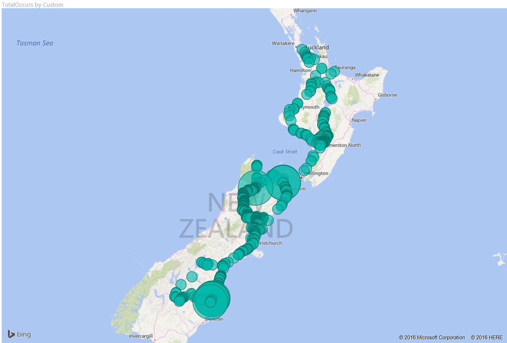
Well, using your sample data, what I get looks pretty good. I had to split the StartLongLat field into two fields using "," separator then recombine in reverse order:
Custom = Text.From([StartLongLat2]) & "," & Text.From(StartLongLat1)
Then I created a custom measure per your formula:
Events1 = CALCULATE(SUM(Events[TotalOccurs])
Then I created a Globe Map and put "Custom" into the Location area and Events1 into the Values area. This is what I got back:
Edit: Oh wait, you are using a custom visual, I am using the default "Map" visual from Power BI. Do you need to use the "Globe Map" visual?
Follow on LinkedIn
@ me in replies or I'll lose your thread!!!
Instead of a Kudo, please vote for this idea
Become an expert!: Enterprise DNA
External Tools: MSHGQM
YouTube Channel!: Microsoft Hates Greg
Latest book!: DAX For Humans
DAX is easy, CALCULATE makes DAX hard...
- Mark as New
- Bookmark
- Subscribe
- Mute
- Subscribe to RSS Feed
- Permalink
- Report Inappropriate Content
Since there are no filters/conditions in the Events1 Measure - why use CALCULATE?
- Mark as New
- Bookmark
- Subscribe
- Mute
- Subscribe to RSS Feed
- Permalink
- Report Inappropriate Content
There is a native heat map in Power BI, it's the filled map visualization. This visual will only work with geographic boundaries that Bing understands: Postal Code, City, State / Province, Country, Continent in increasing order of magnitude.
- Mark as New
- Bookmark
- Subscribe
- Mute
- Subscribe to RSS Feed
- Permalink
- Report Inappropriate Content
@greggyb - I tried the filled map as well when I was testing this, the results were unsatisfactory. I really could get it to do much of anything other than turn New Zealand blueish-green.
@Sean - Good point, but I don't thinkt that is the source of @elliotdixon's woes.
Follow on LinkedIn
@ me in replies or I'll lose your thread!!!
Instead of a Kudo, please vote for this idea
Become an expert!: Enterprise DNA
External Tools: MSHGQM
YouTube Channel!: Microsoft Hates Greg
Latest book!: DAX For Humans
DAX is easy, CALCULATE makes DAX hard...
- Mark as New
- Bookmark
- Subscribe
- Mute
- Subscribe to RSS Feed
- Permalink
- Report Inappropriate Content
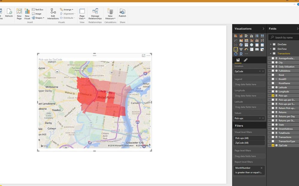
I don't have any data set with NZ addresses handy, but here's how the heat map looks for me with real data from a demo I'm putting together presently. I've got zip codes that have the data category set as 'Postal Code', and each code gets its own delineated block.
It's important to make sure that all of the geo-data is categorized properly in the modelling ribbon menu.
- Mark as New
- Bookmark
- Subscribe
- Mute
- Subscribe to RSS Feed
- Permalink
- Report Inappropriate Content
@greggyb - @elliotdixon posted a link to her data in a post above, HeatMapData. Unfortunately it only has Long/Lat data which doesn't play nice with Filled Maps. Looks like telemetry data to me.
Follow on LinkedIn
@ me in replies or I'll lose your thread!!!
Instead of a Kudo, please vote for this idea
Become an expert!: Enterprise DNA
External Tools: MSHGQM
YouTube Channel!: Microsoft Hates Greg
Latest book!: DAX For Humans
DAX is easy, CALCULATE makes DAX hard...
- Mark as New
- Bookmark
- Subscribe
- Mute
- Subscribe to RSS Feed
- Permalink
- Report Inappropriate Content
Ah, sorry I missed that link. Yeah, a heat map can only work with a region. There's no way to create a heat map with lat/lon points - it just doesn't make sense. How can you shade a region, when the data you've got only represents a single point on the earth's surface? The only way to shade a region is to have an outline defined. Using the native maps, only standard geo-political borders are included.
I'd probably pursue the Synoptic Panel visualization and define regions that each lat/lon pair should fall into, persisting that region name as an attribute in the geography dimension. Any SVG image can be used, and you can get very fine grained control over where your borders lie. It's either that or mapping lat/lon to postal codes, which is the finest granularity supported by the Bing maps API that makes sense in a heatmap type chart.
Helpful resources

Power BI Dataviz World Championships
The Power BI Data Visualization World Championships is back! Get ahead of the game and start preparing now!

| User | Count |
|---|---|
| 39 | |
| 38 | |
| 38 | |
| 28 | |
| 27 |
| User | Count |
|---|---|
| 124 | |
| 88 | |
| 73 | |
| 66 | |
| 65 |


