FabCon is coming to Atlanta
Join us at FabCon Atlanta from March 16 - 20, 2026, for the ultimate Fabric, Power BI, AI and SQL community-led event. Save $200 with code FABCOMM.
Register now!- Power BI forums
- Get Help with Power BI
- Desktop
- Service
- Report Server
- Power Query
- Mobile Apps
- Developer
- DAX Commands and Tips
- Custom Visuals Development Discussion
- Health and Life Sciences
- Power BI Spanish forums
- Translated Spanish Desktop
- Training and Consulting
- Instructor Led Training
- Dashboard in a Day for Women, by Women
- Galleries
- Data Stories Gallery
- Themes Gallery
- Contests Gallery
- QuickViz Gallery
- Quick Measures Gallery
- Visual Calculations Gallery
- Notebook Gallery
- Translytical Task Flow Gallery
- TMDL Gallery
- R Script Showcase
- Webinars and Video Gallery
- Ideas
- Custom Visuals Ideas (read-only)
- Issues
- Issues
- Events
- Upcoming Events
Get Fabric Certified for FREE during Fabric Data Days. Don't miss your chance! Request now
- Power BI forums
- Forums
- Get Help with Power BI
- Desktop
- Generating timestamp for each hour problem
- Subscribe to RSS Feed
- Mark Topic as New
- Mark Topic as Read
- Float this Topic for Current User
- Bookmark
- Subscribe
- Printer Friendly Page
- Mark as New
- Bookmark
- Subscribe
- Mute
- Subscribe to RSS Feed
- Permalink
- Report Inappropriate Content
Generating timestamp for each hour problem
Context:
I have a table with timeshifts of people working with an hourly gross rate associated with it. In it's original form, the timeshift entries only contain daily timestamps indicating:
- On what day did the shift take place
- Employee name
- Timeshift started
- Timeshift ended
- Hourly gross rate
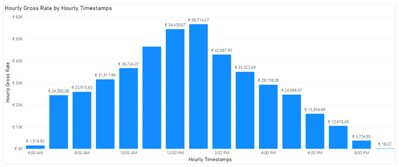
What I want to achieve is a graph that shows labour costs per hour within a 24h day. Something like this:
Since I don't have a row per hour in my data set, I followed THIS tutorial to create an "hourly timestamp" to be able to visualise that graph.
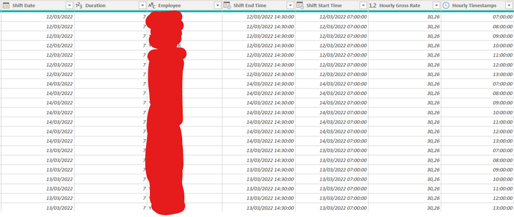
Everything looked fine because I got this result:
As you can see, this employee has an hourly gross rate of 30,26 which in Power Query always shows 30,26 (which is correct).
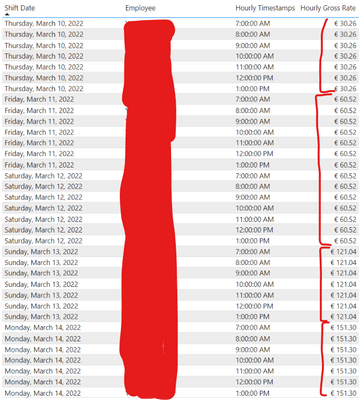
Now, when I add this to a graph/table, that hourly gross rate starts to go crazy. Instead of getting 30,26 per Hourly Timestamp of a shift date, that number grows the further we go down. So on Mar 10, the hourly gross rate is okay, but the day after it doubles for every single row.
I have my Shift date connected to my main date table. I also tried disconnecting it to see if that's the problem, but it isn't. I am really puzzled why does Power Query show one set of numbers and on the dashboard I get something else. I know that I "artificially" generated those timestamps so is that perhaps the problem?
Could someone let me know what the issue is or how to do this without generating those artificial Hourly timestamps? Many thanks!
Solved! Go to Solution.
- Mark as New
- Bookmark
- Subscribe
- Mute
- Subscribe to RSS Feed
- Permalink
- Report Inappropriate Content
Found the issue. Once I added the source file name (since these are multiple CSVs appended from blob storage) I was able to identify that the issue was in the CSV exports.
- Mark as New
- Bookmark
- Subscribe
- Mute
- Subscribe to RSS Feed
- Permalink
- Report Inappropriate Content
Found the issue. Once I added the source file name (since these are multiple CSVs appended from blob storage) I was able to identify that the issue was in the CSV exports.
Helpful resources

Power BI Monthly Update - November 2025
Check out the November 2025 Power BI update to learn about new features.

Fabric Data Days
Advance your Data & AI career with 50 days of live learning, contests, hands-on challenges, study groups & certifications and more!


