Join us at FabCon Vienna from September 15-18, 2025
The ultimate Fabric, Power BI, SQL, and AI community-led learning event. Save €200 with code FABCOMM.
Get registered- Power BI forums
- Get Help with Power BI
- Desktop
- Service
- Report Server
- Power Query
- Mobile Apps
- Developer
- DAX Commands and Tips
- Custom Visuals Development Discussion
- Health and Life Sciences
- Power BI Spanish forums
- Translated Spanish Desktop
- Training and Consulting
- Instructor Led Training
- Dashboard in a Day for Women, by Women
- Galleries
- Data Stories Gallery
- Themes Gallery
- Contests Gallery
- Quick Measures Gallery
- Notebook Gallery
- Translytical Task Flow Gallery
- TMDL Gallery
- R Script Showcase
- Webinars and Video Gallery
- Ideas
- Custom Visuals Ideas (read-only)
- Issues
- Issues
- Events
- Upcoming Events
Compete to become Power BI Data Viz World Champion! First round ends August 18th. Get started.
- Power BI forums
- Forums
- Get Help with Power BI
- Desktop
- Gauge conditional formatting based on other measur...
- Subscribe to RSS Feed
- Mark Topic as New
- Mark Topic as Read
- Float this Topic for Current User
- Bookmark
- Subscribe
- Printer Friendly Page
- Mark as New
- Bookmark
- Subscribe
- Mute
- Subscribe to RSS Feed
- Permalink
- Report Inappropriate Content
Gauge conditional formatting based on other measure
Hello Community,
Perhaps one of you know a solution for the following.
I have a gauge that shows a target gross margin that a team needs to hit. What I would ideally want to show is the actual margin as well as the forecasted margin. Because you can only have 1 value in a gauge, I thought maybe it's possible to have the forecasted margin as value while using conditional formatting to fill the gauge based on actual margin. Can this be done? I only found options to format based on fixed values rather than changing values/a measure.
Thanks in advance.
- Mark as New
- Bookmark
- Subscribe
- Mute
- Subscribe to RSS Feed
- Permalink
- Report Inappropriate Content
Thanks for the response. Is it possible to use a similar measure to get 2 colours in 1 gauge though?
For example, I can have an actual margin of 300k, a forecasted margin of 900k and a target of 700k.
I would like to have the forecasted margin up to 300k show up as yellow and the rest of the value up to 900k as light yellow.
- Mark as New
- Bookmark
- Subscribe
- Mute
- Subscribe to RSS Feed
- Permalink
- Report Inappropriate Content
Hi, @Anonymous
Of course, you need to write an if function to assign two cases according to your needs, and then use conditional formatting.
If you can share some sample data and your desired result, I will help you in detail.
Best Regards,
Community Support Team _ Janey
- Mark as New
- Bookmark
- Subscribe
- Mute
- Subscribe to RSS Feed
- Permalink
- Report Inappropriate Content
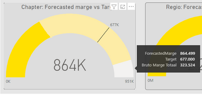
Below is the result I would like to achieve so it's easy to see the forecasted margin as well as the current realised margin. I did create a measure with "BonusColour = IF(MeasureTable[Bruto Marge Totaal]<[ForecastedMarge],"#FFE000","#FFF399")" but I don't think that's how it works 😄
- Mark as New
- Bookmark
- Subscribe
- Mute
- Subscribe to RSS Feed
- Permalink
- Report Inappropriate Content
@Anonymous
How is your conditional formatting set up?
- Mark as New
- Bookmark
- Subscribe
- Mute
- Subscribe to RSS Feed
- Permalink
- Report Inappropriate Content
Within Visual > Colors I selected Fill format style "Field Value" with the field it's based on being the measure "BonusColour".
Given the measure though, I think it would end up being either one or the other colour rather than having both in the same gauge as in the example photo which is more like the gradient style but rather than using fixed values it's based on measures and rather than gradient it's a hard cut-off of colour
- Mark as New
- Bookmark
- Subscribe
- Mute
- Subscribe to RSS Feed
- Permalink
- Report Inappropriate Content
Hi, @Anonymous
I checked it, the content on your screenshot doesn't look like a gradient, just an extra piece of white. So I think you should check if that white section corresponds to the data of [Bruto Marge Totaal] or [ForecastedMarge].
If it is convenient, can you share a sample file?
- Mark as New
- Bookmark
- Subscribe
- Mute
- Subscribe to RSS Feed
- Permalink
- Report Inappropriate Content
Ah that's because I have a measure that makes the maximum value of the gauge 10% higher than either the target or forecasted margin. Where I would llike the 2 colours is in the yellow bar like so:
The visual would end up as:
Gauge target = stand-alone target measure
Gauge max = stand-alone measure that adds 10% to higher value of forecast/target
Value = forecasted Margin
Colour of value = color 1 for up to actual margin, color 2 for rest
Unfortunately I'm not sure how to make an easy sample file for this.
- Mark as New
- Bookmark
- Subscribe
- Mute
- Subscribe to RSS Feed
- Permalink
- Report Inappropriate Content
Hi, @Anonymous
Have you tried to fill the vacancies? I mean force the blank part to be the rest color.
Like this:
BonusColour =
IF (
    MeasureTable[Bruto Marge Totaal] = MAXX ( ALL ( table ), [Bruto Marge Totaal] )
        || Table[ForecastedMarge] = MAXX ( ALL ( table ), [ForecastedMarge] ),
    "#FFF399",
    IF (
        MeasureTable[Bruto Marge Totaal] < [ForecastedMarge],
        "#FFE000",
        "#FFF399"
    )
)
Best Regards,
Community Support Team _ Janey
If this post helps, then please consider Accept it as the solution to help the other members find it more quickly.
- Mark as New
- Bookmark
- Subscribe
- Mute
- Subscribe to RSS Feed
- Permalink
- Report Inappropriate Content
Thanks for the continued help.
I replaced the measure with yours and gave the full value part of the gauge the alternate color (light yellow) rather than just the part where Forecast > Actual. It does leave the intended 10% white part
(Forecast will basically always be higher than actual, mostly because forecast is 6 months and actual 1-6)
- Mark as New
- Bookmark
- Subscribe
- Mute
- Subscribe to RSS Feed
- Permalink
- Report Inappropriate Content
@Anonymous Still not working?
- Mark as New
- Bookmark
- Subscribe
- Mute
- Subscribe to RSS Feed
- Permalink
- Report Inappropriate Content
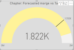
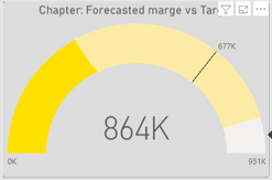
It turns out like this:
Rather than this:
- Mark as New
- Bookmark
- Subscribe
- Mute
- Subscribe to RSS Feed
- Permalink
- Report Inappropriate Content
Hi, @Anonymous
I need some sample data and all your measures used in this visual.
- Mark as New
- Bookmark
- Subscribe
- Mute
- Subscribe to RSS Feed
- Permalink
- Report Inappropriate Content
Hi, @Anonymous
Conditional formatting can also be modified by custom measures or columns.
You can refer the thread:
Solved: Conditional Format Gauge Charts - Microsoft Power BI Community
Did I answer your question? Please mark my reply as solution. Thank you very much.
If not, please feel free to ask me.
Best Regards,
Community Support Team _ Janey


