FabCon is coming to Atlanta
Join us at FabCon Atlanta from March 16 - 20, 2026, for the ultimate Fabric, Power BI, AI and SQL community-led event. Save $200 with code FABCOMM.
Register now!- Power BI forums
- Get Help with Power BI
- Desktop
- Service
- Report Server
- Power Query
- Mobile Apps
- Developer
- DAX Commands and Tips
- Custom Visuals Development Discussion
- Health and Life Sciences
- Power BI Spanish forums
- Translated Spanish Desktop
- Training and Consulting
- Instructor Led Training
- Dashboard in a Day for Women, by Women
- Galleries
- Data Stories Gallery
- Themes Gallery
- Contests Gallery
- QuickViz Gallery
- Quick Measures Gallery
- Visual Calculations Gallery
- Notebook Gallery
- Translytical Task Flow Gallery
- TMDL Gallery
- R Script Showcase
- Webinars and Video Gallery
- Ideas
- Custom Visuals Ideas (read-only)
- Issues
- Issues
- Events
- Upcoming Events
The Power BI Data Visualization World Championships is back! Get ahead of the game and start preparing now! Learn more
- Power BI forums
- Forums
- Get Help with Power BI
- Desktop
- Gauge Visual Auto-Aggregating
- Subscribe to RSS Feed
- Mark Topic as New
- Mark Topic as Read
- Float this Topic for Current User
- Bookmark
- Subscribe
- Printer Friendly Page
- Mark as New
- Bookmark
- Subscribe
- Mute
- Subscribe to RSS Feed
- Permalink
- Report Inappropriate Content
Gauge Visual Auto-Aggregating
Hi everyone,
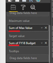
I'm having trouble with my gauge visual--it's automatically aggregating the "max value" and "target value" fields. The visual is on a report that has a slicer for each region (e.g. "Texas", "New York City"). Ideally, the gauge would only show the individual region's target / max value, but it's aggregated all of the region's values together and doesn't separate based on what's selected on the slicer.
Is there a way to turn off the aggregation? I have another tab with territories (there's about 7 territories compared to 20+ regions) and the gauge works exactly as I want it to and doesn't automatically aggregate.
Thanks!
Solved! Go to Solution.
- Mark as New
- Bookmark
- Subscribe
- Mute
- Subscribe to RSS Feed
- Permalink
- Report Inappropriate Content
I fixed the issue! It was a problem with the relationships between my datasets.
- Mark as New
- Bookmark
- Subscribe
- Mute
- Subscribe to RSS Feed
- Permalink
- Report Inappropriate Content
Hi KM3033,
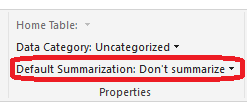
Please remove the visual , then click Modeling -> Default Summarization-> select Don't summarize. Then create the visual again.
Regards,
Jimmy Tao
- Mark as New
- Bookmark
- Subscribe
- Mute
- Subscribe to RSS Feed
- Permalink
- Report Inappropriate Content
Hi @v-yuta-msft,
I went to try your solution, but my default summarization was already at "Don't summarize". I still deleted the visual and re-created it, but ran into the same problem.
- Mark as New
- Bookmark
- Subscribe
- Mute
- Subscribe to RSS Feed
- Permalink
- Report Inappropriate Content
I fixed the issue! It was a problem with the relationships between my datasets.
Helpful resources

Power BI Dataviz World Championships
The Power BI Data Visualization World Championships is back! Get ahead of the game and start preparing now!

| User | Count |
|---|---|
| 38 | |
| 36 | |
| 33 | |
| 33 | |
| 29 |
| User | Count |
|---|---|
| 134 | |
| 96 | |
| 78 | |
| 67 | |
| 65 |


