Join us at the 2025 Microsoft Fabric Community Conference
Microsoft Fabric Community Conference 2025, March 31 - April 2, Las Vegas, Nevada. Use code FABINSIDER for a $400 discount.
Register now- Power BI forums
- Get Help with Power BI
- Desktop
- Service
- Report Server
- Power Query
- Mobile Apps
- Developer
- DAX Commands and Tips
- Custom Visuals Development Discussion
- Health and Life Sciences
- Power BI Spanish forums
- Translated Spanish Desktop
- Training and Consulting
- Instructor Led Training
- Dashboard in a Day for Women, by Women
- Galleries
- Webinars and Video Gallery
- Data Stories Gallery
- Themes Gallery
- Power BI DataViz World Championships Gallery
- Quick Measures Gallery
- R Script Showcase
- COVID-19 Data Stories Gallery
- Community Connections & How-To Videos
- 2021 MSBizAppsSummit Gallery
- 2020 MSBizAppsSummit Gallery
- 2019 MSBizAppsSummit Gallery
- Events
- Ideas
- Custom Visuals Ideas (read-only)
- Issues
- Issues
- Events
- Upcoming Events
The Power BI DataViz World Championships are on! With four chances to enter, you could win a spot in the LIVE Grand Finale in Las Vegas. Show off your skills.
- Power BI forums
- Forums
- Get Help with Power BI
- Desktop
- Re: Gantt Chart Visualisation - "Parent Field"
- Subscribe to RSS Feed
- Mark Topic as New
- Mark Topic as Read
- Float this Topic for Current User
- Bookmark
- Subscribe
- Printer Friendly Page
- Mark as New
- Bookmark
- Subscribe
- Mute
- Subscribe to RSS Feed
- Permalink
- Report Inappropriate Content
Gantt Chart Visualisation - "Parent Field"
Hello,
Does anyone know if it's possible to have the "Parent" field on the Gantt Chart visualisation change dynamically?
E.g. if I had two or more fields that I wanted to use as the parent, is there a way to allow the user to switch between each option, using a slicer or any other method?
Only one field/column can be added to Parent. I've tried creating a few measures that I thought might solve this, however the visual doesn't allow me to add the measures onto the Parent parameter. Not sure if this is because the measure is returning an invalid result, or if the visual doesn't allow measures for this parameter.
Any ideas or work-arounds would be greatly appreciated.
Solved! Go to Solution.
- Mark as New
- Bookmark
- Subscribe
- Mute
- Subscribe to RSS Feed
- Permalink
- Report Inappropriate Content
Hi @Mezga ,
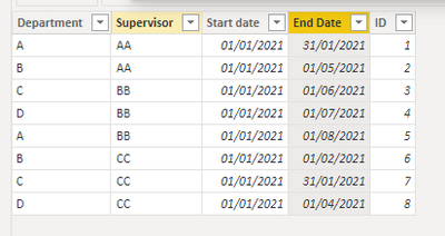
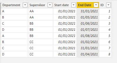
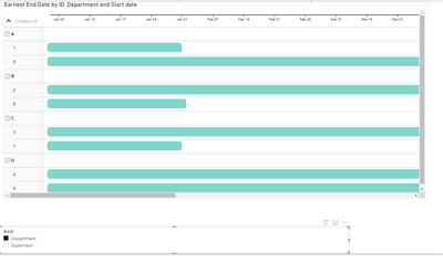
I have made a smal sample with the following setup:
I also created the following table:
Brands & Countries = UNION(
                        SELECTCOLUMNS('Table', "Department", 'Table'[Department], "ID", 'Table'[ID], "Axis", "Department"),
                        SELECTCOLUMNS('Table', "Supervisor", 'Table'[Supervisor], "ID", 'Table'[ID], "Axis", "Supervisor")
               )
Add a relationship between the IDs and then setup you gantt;
Check PBIX file attach.
Regards
Miguel Félix
Did I answer your question? Mark my post as a solution!
Proud to be a Super User!
Check out my blog: Power BI em Português- Mark as New
- Bookmark
- Subscribe
- Mute
- Subscribe to RSS Feed
- Permalink
- Report Inappropriate Content
Hi @Mezga ,
Using a similar approach to this one you can achieve what you need.
https://towardsdatascience.com/dynamic-axis-in-power-bi-daxis-72ecb22c119f
Regards
Miguel Félix
Did I answer your question? Mark my post as a solution!
Proud to be a Super User!
Check out my blog: Power BI em Português- Mark as New
- Bookmark
- Subscribe
- Mute
- Subscribe to RSS Feed
- Permalink
- Report Inappropriate Content
Hi @MFelix ,
Thanks for your response. I've given that suggestion a good attempt, however still not entirely sure how to apply to my scenario.
The example you provided requires creation of a measure as per below:
Sales Amt TREATAS =
   IF(
       HASONEVALUE('Brands & Countries'[Axis]),
          SWITCH(VALUES('Brands & Countries'[Axis])
                 ,"Countries", CALCULATE(SUM('Online Sales'[SalesAmount])
                                      ,TREATAS(VALUES('Brands & Countries'[Value])
                                      ,Geography[RegionCountryName]))
                 ,"Brands",    CALCULATE(SUM('Online Sales'[SalesAmount])
                                      ,TREATAS(VALUES('Brands & Countries'[Value])
                                      ,'Product'[BrandName]))
)
)
However in my case, the fields I want to switch between are all text, so the "SUM" part of the measure is irrelevant.
I tried removing that part of the measure, however it always seems to throw an error.
- Mark as New
- Bookmark
- Subscribe
- Mute
- Subscribe to RSS Feed
- Permalink
- Report Inappropriate Content
Hi @Mezga ,
In this case instead of the SUM you can use SELECTEDVALUE for example or MAX/MIN.
Can you please share a mockup data or sample of your PBIX file. You can use a onedrive, google drive, we transfer or similar link to upload your files.
If the information is sensitive please share it trough private message.
Regards
Miguel Félix
Did I answer your question? Mark my post as a solution!
Proud to be a Super User!
Check out my blog: Power BI em Português- Mark as New
- Bookmark
- Subscribe
- Mute
- Subscribe to RSS Feed
- Permalink
- Report Inappropriate Content
Thanks @MFelix , I gave that a shot but still can't get it to work. Unfortunately I can't really share the data, but I can describe further below:
Basically I'm working with a personnel roster for a project.
One column in the Roster table is named "Department". Each person on the roster resides within a department, e.g. Engineering, Construction, and so on.
Another column in the table is named "Supervisor". Again, each person has a supervisor that they report to.
The Gantt visual allows me to place only one these columns at a time onto the "Parent" field. Both fields can be placed, and work fine, but only one can be placed at a time.
I want to give users the option of using a slicer to select between Department or Supervisor.
So basically I need a measure that looks at the selection of the slicer, and points to either the Department or Supervisor column.
- Mark as New
- Bookmark
- Subscribe
- Mute
- Subscribe to RSS Feed
- Permalink
- Report Inappropriate Content
Hi @Mezga ,
I have made a smal sample with the following setup:
I also created the following table:
Brands & Countries = UNION(
                        SELECTCOLUMNS('Table', "Department", 'Table'[Department], "ID", 'Table'[ID], "Axis", "Department"),
                        SELECTCOLUMNS('Table', "Supervisor", 'Table'[Supervisor], "ID", 'Table'[ID], "Axis", "Supervisor")
               )
Add a relationship between the IDs and then setup you gantt;
Check PBIX file attach.
Regards
Miguel Félix
Did I answer your question? Mark my post as a solution!
Proud to be a Super User!
Check out my blog: Power BI em Português- Mark as New
- Bookmark
- Subscribe
- Mute
- Subscribe to RSS Feed
- Permalink
- Report Inappropriate Content
Hey @MFelix ,
Thanks mate, you're a legend! That has done the trick.
Whilst attempting to apply your solution, I uncovered that I couldn't create the required relationship.
With the way that the data is provided to me, I have four sets of "Start Date" and "End Date" columns (for different locations on the project). I had created an appended table that has multiple instances of the same person, so that it would show all of their start and end dates on one row of the gantt chart.
I think these duplications of the "ID" was therefore preventing me from establishing the relationship between ID of the original table, and ID of the UNION table.
So I reverted to a non-appended version of the table and it worked. However now I'm going to need to work out how to change my data model to allow for multiple start and end dates, whilst still providing the same functionality!
- Mark as New
- Bookmark
- Subscribe
- Mute
- Subscribe to RSS Feed
- Permalink
- Report Inappropriate Content
If you can change my example into the one you have with the multiple dates I can try and get you a solution.
Regards
Miguel Félix
Did I answer your question? Mark my post as a solution!
Proud to be a Super User!
Check out my blog: Power BI em Português- Mark as New
- Bookmark
- Subscribe
- Mute
- Subscribe to RSS Feed
- Permalink
- Report Inappropriate Content
Hey @MFelix,
Back from the Christmas break...looks like I managed to solve the multiple start/end dates issue I mentioned, though it may not be the "right" way.
If for example the original roster looked something like the below:
| ID | Department | Supervisor | Start Date - Location 1 | End Date - Location 1 | Start Date - Location 2 | End Date - Location 2 |
| 1 | A | AA | 01/01/21 | 31/12/21 | 01/06/22 | 31/12/22 |
| 2 | B | BB | 01/01/21 | 31/12/21 | 01/06/22 | 31/12/22 |
| 3 | C | AA | 01/01/21 | 31/12/21 | 01/06/22 | 31/12/22 |
I have transformed/copied/appended the above to look like:
| ID | Location | Start Date | End Date |
| 1 | Location 1 | 01/01/21 | 31/12/21 |
| 1 | Location 2 | 01/06/22 | 31/12/22 |
| 2 | Location 1 | 01/01/21 | 31/12/21 |
| 2 | Location 2 | 01/06/22 | 31/12/22 |
| 3 | Location 1 | 01/01/21 | 31/12/21 |
| 3 | Location 2 | 01/06/22 | 31/12/22 |
And then created a relationship between ID of the second table above, and the ID of the custom table as per your instructions.
Not sure if this is the most efficient method though, given that the original roster has about 1,300 individual people and five locations (not two as per above example). So the final table has 1300 x 5 = 6,500 rows.
Thoughts?
Helpful resources

Join us at the Microsoft Fabric Community Conference
March 31 - April 2, 2025, in Las Vegas, Nevada. Use code MSCUST for a $150 discount!

Power BI Monthly Update - February 2025
Check out the February 2025 Power BI update to learn about new features.

| User | Count |
|---|---|
| 82 | |
| 78 | |
| 52 | |
| 39 | |
| 35 |
| User | Count |
|---|---|
| 94 | |
| 79 | |
| 51 | |
| 47 | |
| 47 |


