FabCon is coming to Atlanta
Join us at FabCon Atlanta from March 16 - 20, 2026, for the ultimate Fabric, Power BI, AI and SQL community-led event. Save $200 with code FABCOMM.
Register now!- Power BI forums
- Get Help with Power BI
- Desktop
- Service
- Report Server
- Power Query
- Mobile Apps
- Developer
- DAX Commands and Tips
- Custom Visuals Development Discussion
- Health and Life Sciences
- Power BI Spanish forums
- Translated Spanish Desktop
- Training and Consulting
- Instructor Led Training
- Dashboard in a Day for Women, by Women
- Galleries
- Data Stories Gallery
- Themes Gallery
- Contests Gallery
- Quick Measures Gallery
- Notebook Gallery
- Translytical Task Flow Gallery
- TMDL Gallery
- R Script Showcase
- Webinars and Video Gallery
- Ideas
- Custom Visuals Ideas (read-only)
- Issues
- Issues
- Events
- Upcoming Events
Calling all Data Engineers! Fabric Data Engineer (Exam DP-700) live sessions are back! Starting October 16th. Sign up.
- Power BI forums
- Forums
- Get Help with Power BI
- Desktop
- Formsatting visualisation title using report theme...
- Subscribe to RSS Feed
- Mark Topic as New
- Mark Topic as Read
- Float this Topic for Current User
- Bookmark
- Subscribe
- Printer Friendly Page
- Mark as New
- Bookmark
- Subscribe
- Mute
- Subscribe to RSS Feed
- Permalink
- Report Inappropriate Content
Formsatting visualisation title using report themes
I'm attempting to format visualisation titles using report themes - upon searching how to achieve this I came across this article:
https://ideas.powerbi.com/forums/265200-power-bi-ideas/suggestions/31543114-format-visualization-tit...
This Idea is marked as completed with the link below provided:
https://powerbi.microsoft.com/en-us/blog/power-bi-desktop-july-2018-feature-summary/#theme
I have not been successful however in attempting to format the title of a stacked column chart visualisation.
Here is my JSON file, which successfully modifies my visualisation, just not the visualisation title as I had expected based on the above 2 articles:
{
   "name":"Test",
   "dataColors":["#555555", "#444444", "#444445",  "#444446", "#444447", "#444448","#444449"],
   "background":"#888888",
   "foreground":"#999999",
   "tableAccent":"#AAAAAA",
   "visualStyles":{
      "*":{
         "*":{
    "title": [{
                    "show": true,
                    "fontColor": { "solid": { "color": "#EEEEEE" } },
                    "background": { "solid": { "color": "#FFFFFF" } },
                    "alignment": "center",
                    "fontSize": 30,
                    "fontFamily": "Calibri, Cambria"
                }],
            "*":[{"fontSize":30,"fontFamily":"Calibri, Cambria","color":{"solid":{}}}]
             }
          },
      "*":{
         "*":{
                  "grid":[
                             {
                                "outlineColor":{"solid":{"color":"#777777"}},
                                "gridVertical":false,
                                "gridVerticalColor":{"solid":{"color":"#777777"}},
                                "gridHorizontal":false,
                                "gridHorizontalColor":{"solid":{"color":"#777777"}}
                             }
                         ],
                  "columnHeaders":[
                                       {
                                         "fontColor":{"solid":{"color":"#777777"}},
                                         "backColor":{"solid":{"color":"#FFFFFF"}},
                                         "fontFamily":"Calibri, Cambria"
                                               }
                                     ],
                  "values":[
                                {
                                  "backColorSecondary":{"solid":{"color":"#FFFFFF"}}
                                }
                           ]
                   }
                }
          ,"columnChart":{
      "*":{
       "legend":
        [{"fontSize":20}],
       "categoryAxis":
        [
         {"labelColor":
          {"solid":
           {"color":"#123456"}
          },
          "fontSize":20,
          "showAxisTitle":true,
          "titleFontSize":20
          }
        ],
       "valueAxis":
        [
         {
         "fontSize":20,
         "titleFontSize":30
         }
        ],
       "labels":
        [
         {"fontSize":20}
        ],
       "legend":
        [
         {
          "show": true,
          "position": "Top",
          "showTitle": true,
          "titleText": "",
          "labelColor": { "solid": { "color": "#123456"}},
          "fontFamily": "Courier New",
          "fontSize": 30
         }
        ]
       }
      }
    }
}
Can anybody point out where I've gone wrong?
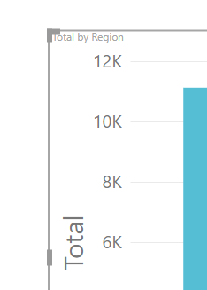
Here is a screenshot of my visualisation title:
- Mark as New
- Bookmark
- Subscribe
- Mute
- Subscribe to RSS Feed
- Permalink
- Report Inappropriate Content
Follow on LinkedIn
@ me in replies or I'll lose your thread!!!
Instead of a Kudo, please vote for this idea
Become an expert!: Enterprise DNA
External Tools: MSHGQM
YouTube Channel!: Microsoft Hates Greg
Latest book!: DAX For Humans
DAX is easy, CALCULATE makes DAX hard...
Helpful resources

FabCon Global Hackathon
Join the Fabric FabCon Global Hackathon—running virtually through Nov 3. Open to all skill levels. $10,000 in prizes!

Power BI Monthly Update - September 2025
Check out the September 2025 Power BI update to learn about new features.


