New Offer! Become a Certified Fabric Data Engineer
Check your eligibility for this 50% exam voucher offer and join us for free live learning sessions to get prepared for Exam DP-700.
Get Started- Power BI forums
- Get Help with Power BI
- Desktop
- Service
- Report Server
- Power Query
- Mobile Apps
- Developer
- DAX Commands and Tips
- Custom Visuals Development Discussion
- Health and Life Sciences
- Power BI Spanish forums
- Translated Spanish Desktop
- Training and Consulting
- Instructor Led Training
- Dashboard in a Day for Women, by Women
- Galleries
- Community Connections & How-To Videos
- COVID-19 Data Stories Gallery
- Themes Gallery
- Data Stories Gallery
- R Script Showcase
- Webinars and Video Gallery
- Quick Measures Gallery
- 2021 MSBizAppsSummit Gallery
- 2020 MSBizAppsSummit Gallery
- 2019 MSBizAppsSummit Gallery
- Events
- Ideas
- Custom Visuals Ideas
- Issues
- Issues
- Events
- Upcoming Events
Don't miss out! 2025 Microsoft Fabric Community Conference, March 31 - April 2, Las Vegas, Nevada. Use code MSCUST for a $150 discount. Prices go up February 11th. Register now.
- Power BI forums
- Forums
- Get Help with Power BI
- Desktop
- Formatting Categories
- Subscribe to RSS Feed
- Mark Topic as New
- Mark Topic as Read
- Float this Topic for Current User
- Bookmark
- Subscribe
- Printer Friendly Page
- Mark as New
- Bookmark
- Subscribe
- Mute
- Subscribe to RSS Feed
- Permalink
- Report Inappropriate Content
Formatting Categories
Hi,
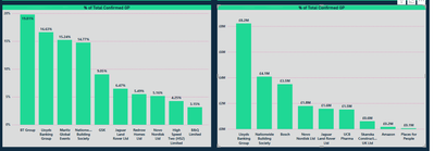
I'm having a weird issue with formatting a category label. With one value onthe Y-Axis the categories format stacked text which is what i want. but with a different value showing the same type of data which it's formatting diagnol and won't format stacked unless i make the chart really wide. But then in a different BI file i have the same chats formatting correctly and its a smaller page layout:
1 - Using SUM Potential GP shown as % it formats like this, but i want it to format the same as the left chart.
2. Using the the different categories but using the same Y-AXIS value as the left chart it formats correctly, but the its showing the wrong accounts:
3 - an old version of this dashboard using the same fields i want to use in both charts formats correctly. but the page layout is smaller just standard 16:9 where as the new dashboard i'm building each page is 1920 x 1080, the only difference on this is that the the 7 axis is a measure calculation that is doing the same as display a % of grand total option:
Any ideas whats going on?
Helpful resources

Join us at the Microsoft Fabric Community Conference
March 31 - April 2, 2025, in Las Vegas, Nevada. Use code MSCUST for a $150 discount!

Power BI Monthly Update - January 2025
Check out the January 2025 Power BI update to learn about new features in Reporting, Modeling, and Data Connectivity.

| User | Count |
|---|---|
| 124 | |
| 79 | |
| 50 | |
| 38 | |
| 38 |
| User | Count |
|---|---|
| 196 | |
| 80 | |
| 70 | |
| 51 | |
| 42 |


