FabCon is coming to Atlanta
Join us at FabCon Atlanta from March 16 - 20, 2026, for the ultimate Fabric, Power BI, AI and SQL community-led event. Save $200 with code FABCOMM.
Register now!- Power BI forums
- Get Help with Power BI
- Desktop
- Service
- Report Server
- Power Query
- Mobile Apps
- Developer
- DAX Commands and Tips
- Custom Visuals Development Discussion
- Health and Life Sciences
- Power BI Spanish forums
- Translated Spanish Desktop
- Training and Consulting
- Instructor Led Training
- Dashboard in a Day for Women, by Women
- Galleries
- Data Stories Gallery
- Themes Gallery
- Contests Gallery
- QuickViz Gallery
- Quick Measures Gallery
- Visual Calculations Gallery
- Notebook Gallery
- Translytical Task Flow Gallery
- TMDL Gallery
- R Script Showcase
- Webinars and Video Gallery
- Ideas
- Custom Visuals Ideas (read-only)
- Issues
- Issues
- Events
- Upcoming Events
The Power BI Data Visualization World Championships is back! Get ahead of the game and start preparing now! Learn more
- Power BI forums
- Forums
- Get Help with Power BI
- Desktop
- Force Secondary Axis Not Possible?
- Subscribe to RSS Feed
- Mark Topic as New
- Mark Topic as Read
- Float this Topic for Current User
- Bookmark
- Subscribe
- Printer Friendly Page
- Mark as New
- Bookmark
- Subscribe
- Mute
- Subscribe to RSS Feed
- Permalink
- Report Inappropriate Content
Force Secondary Axis Not Possible?
Hello,
I'm working in PowerBI in the hopes of replacing tableau. We often use dual-axis charts to show $ and % side by side. I think I've found an issue with Power BI. If possible, I'd like to know if I can get confirmation or if I'm not doing something correctly.
I started with this tutorial: https://powerbi.microsoft.com/en-us/documentation/powerbi-service-tutorial-customize-x-axis-and-y-ax...
In my scenario, I have "Wait Time" and "Abandon Rate". The wait time is typically less than 5 minutes for a phone call. The Abandon Rate is a % (a number less than 1).
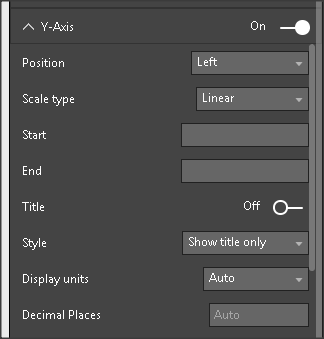
Expected Behavior: I expect that if I'm using a "line and stacked" column chart, that I will always be given a secondary axis for the line chart as long as I turn the secondary axis.
Actual Behavior: It appears that PowerBI tries to outsmart me. It looks like PowerBI won't even present me this option unless my two values are a factor (unknown) different than each other. I can verify this by toggling my wait time between average and sum wait time.
- When I use average, PowerBI forces me to use the same axis even with line and stacked column chart.
- When I sum, the numbers are so far apart, that powerbi decides to let me use a secondary axis (I actually can't find the secondary axis toggle, but it works as I would expect with a secondary axis).
How can I force PowerBI to give me a secondary axis? I'd appreciate anyone's feedback.
Thank you,
Dan
Solved! Go to Solution.
- Mark as New
- Bookmark
- Subscribe
- Mute
- Subscribe to RSS Feed
- Permalink
- Report Inappropriate Content
Hi @dlenz,
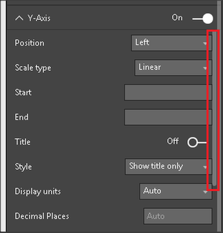
Please drag most inside scroll bar down and you will see Show secondary property, turn it on.
If you have any question, please feel free to ask.
Best Regards,
Qiuyun Yu
If this post helps, then please consider Accept it as the solution to help the other members find it more quickly.
- Mark as New
- Bookmark
- Subscribe
- Mute
- Subscribe to RSS Feed
- Permalink
- Report Inappropriate Content
That's it. I guess I have to get used to this new black modern design. The scrollbars blend right into the border between visualizations and fields. Thank you for the prompt reply!
Dan
- Mark as New
- Bookmark
- Subscribe
- Mute
- Subscribe to RSS Feed
- Permalink
- Report Inappropriate Content
https://community.powerbi.com/t5/Desktop/Force-second-y-axis/m-p/19632#M5917
Helpful resources

Power BI Dataviz World Championships
The Power BI Data Visualization World Championships is back! Get ahead of the game and start preparing now!

| User | Count |
|---|---|
| 39 | |
| 37 | |
| 33 | |
| 32 | |
| 29 |
| User | Count |
|---|---|
| 133 | |
| 88 | |
| 85 | |
| 68 | |
| 64 |


