Join us at the 2025 Microsoft Fabric Community Conference
Microsoft Fabric Community Conference 2025, March 31 - April 2, Las Vegas, Nevada. Use code FABINSIDER for a $400 discount.
Register now- Power BI forums
- Get Help with Power BI
- Desktop
- Service
- Report Server
- Power Query
- Mobile Apps
- Developer
- DAX Commands and Tips
- Custom Visuals Development Discussion
- Health and Life Sciences
- Power BI Spanish forums
- Translated Spanish Desktop
- Training and Consulting
- Instructor Led Training
- Dashboard in a Day for Women, by Women
- Galleries
- Webinars and Video Gallery
- Data Stories Gallery
- Themes Gallery
- Power BI DataViz World Championships Gallery
- Quick Measures Gallery
- R Script Showcase
- COVID-19 Data Stories Gallery
- Community Connections & How-To Videos
- 2021 MSBizAppsSummit Gallery
- 2020 MSBizAppsSummit Gallery
- 2019 MSBizAppsSummit Gallery
- Events
- Ideas
- Custom Visuals Ideas
- Issues
- Issues
- Events
- Upcoming Events
The Power BI DataViz World Championships are on! With four chances to enter, you could win a spot in the LIVE Grand Finale in Las Vegas. Show off your skills.
- Power BI forums
- Forums
- Get Help with Power BI
- Desktop
- Re: Fine tuning the Gauge visual
- Subscribe to RSS Feed
- Mark Topic as New
- Mark Topic as Read
- Float this Topic for Current User
- Bookmark
- Subscribe
- Printer Friendly Page
- Mark as New
- Bookmark
- Subscribe
- Mute
- Subscribe to RSS Feed
- Permalink
- Report Inappropriate Content
Fine tuning the Gauge visual
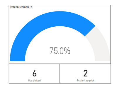
I have some simple data I am trying to dial into the gauge visualisation.
Total pcs, Pcs picked, Pcs left to pick, and percent complete.
Ideally I would like the percentage completed in the middle, with the pcs picked on the left "foot" and the pcs picked on the right "foot".
In my data the columns for Pcs picked, left to pick, and total pcs are all whole numbers with the percent complete as a percentage.
I can't seem to get the setting right to just display the whole numbers with the percent in the middle.
Any Ideas?
Solved! Go to Solution.
- Mark as New
- Bookmark
- Subscribe
- Mute
- Subscribe to RSS Feed
- Permalink
- Report Inappropriate Content
I think you made a typo?
Should
" the pcs picked on the left "foot" and the pcs picked on the right "foot"
say
the pcs picked on the left "foot" and the Pcs left to pick, on the right "foot".
Try this
Create 4 measures
Thanks for reaching out for help.
I put in a lot of effort to help you, now please quickly help me by giving kudos.
Remember we are unpaid volunteers and here to coach you with Power BI and DAX skills and techniques, not do the users job for them. So please click the thumbs up and accept as solution button.
If you give someone a fish then you only give them one meal, but if you teach them how to fish then they can feed themselves and teach others for a lifetime. I prefer to teach members on this forum techniques rather give full solutions and do their job. You can then adapt the technique for your solution, learn some DAX skills for next time and soon become a Power BI Super User like me.
One question per ticket please. If you need to extend your request then please raise a new ticket.
You will get a quicker response and each volunteer solver will get the kudos they deserve. Thank you !
- Mark as New
- Bookmark
- Subscribe
- Mute
- Subscribe to RSS Feed
- Permalink
- Report Inappropriate Content
Thank You!! Great responce.
Helpful resources

Join us at the Microsoft Fabric Community Conference
March 31 - April 2, 2025, in Las Vegas, Nevada. Use code MSCUST for a $150 discount!

Power BI Monthly Update - February 2025
Check out the February 2025 Power BI update to learn about new features.

Join our Community Sticker Challenge 2025
If you love stickers, then you will definitely want to check out our Community Sticker Challenge!

| User | Count |
|---|---|
| 84 | |
| 69 | |
| 68 | |
| 39 | |
| 37 |

