Join us at the 2025 Microsoft Fabric Community Conference
March 31 - April 2, 2025, in Las Vegas, Nevada. Use code MSCUST for a $150 discount! Early bird discount ends December 31.
Register Now- Power BI forums
- Get Help with Power BI
- Desktop
- Service
- Report Server
- Power Query
- Mobile Apps
- Developer
- DAX Commands and Tips
- Custom Visuals Development Discussion
- Health and Life Sciences
- Power BI Spanish forums
- Translated Spanish Desktop
- Training and Consulting
- Instructor Led Training
- Dashboard in a Day for Women, by Women
- Galleries
- Community Connections & How-To Videos
- COVID-19 Data Stories Gallery
- Themes Gallery
- Data Stories Gallery
- R Script Showcase
- Webinars and Video Gallery
- Quick Measures Gallery
- 2021 MSBizAppsSummit Gallery
- 2020 MSBizAppsSummit Gallery
- 2019 MSBizAppsSummit Gallery
- Events
- Ideas
- Custom Visuals Ideas
- Issues
- Issues
- Events
- Upcoming Events
Be one of the first to start using Fabric Databases. View on-demand sessions with database experts and the Microsoft product team to learn just how easy it is to get started. Watch now
- Power BI forums
- Forums
- Get Help with Power BI
- Desktop
- Finding the total of two regions in same axis
- Subscribe to RSS Feed
- Mark Topic as New
- Mark Topic as Read
- Float this Topic for Current User
- Bookmark
- Subscribe
- Printer Friendly Page
- Mark as New
- Bookmark
- Subscribe
- Mute
- Subscribe to RSS Feed
- Permalink
- Report Inappropriate Content
Finding the total of two regions in same axis
Hello Team,
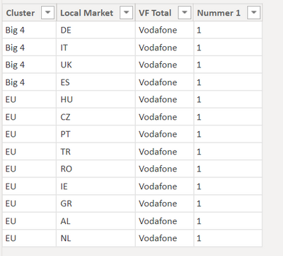
My question is, I have a Table stated below. Local market serves as unique coulmn, cluster is the regions comes under vodafone.
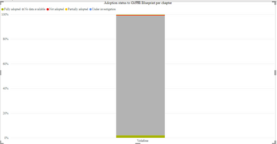
By the data, i have i can visually reprent it as the below two charts. one chart shows the two regions count and after drill trought i get the totals of both regions. Is there a way to show without drilldown, the count also in same x axis?.
your answers are much appreciated.
I want to show like this.......
Regards,
Mad_hu
Solved! Go to Solution.
- Mark as New
- Bookmark
- Subscribe
- Mute
- Subscribe to RSS Feed
- Permalink
- Report Inappropriate Content
Hi @Anonymous ,
You can do this by customizing an axis.
1.Create a table as follows.(If the amount of data is small, you can enter data, and if the amount of data is large, you can create a calculated table.)
2.Create a measure using SWITCH function or IF function.
Measure =
VAR _COUNT=CALCULATE(COUNT('Table'[Local Market]),FILTER(ALLSELECTED('Table'),[Cluster]=MAX('Table (2)'[Type])))
RETURN
SWITCH(SELECTEDVALUE('Table (2)'[Type]),"Big 4",_COUNT,"EU",_COUNT,"VF Total",CALCULATE(COUNT('Table'[Local Market]),ALLSELECTED('Table')))
Measure 2 =
VAR _COUNT=CALCULATE(COUNT('Table'[Local Market]),FILTER(ALLSELECTED('Table'),[Cluster]=MAX('Table (2)'[Type])))
RETURN
IF(SELECTEDVALUE('Table (2)'[Type])="VF Total",CALCULATE(COUNT('Table'[Local Market]),ALLSELECTED('Table')),_COUNT)
Best Regards,
Stephen Tao
If this post helps, then please consider Accept it as the solution to help the other members find it more quickly.
- Mark as New
- Bookmark
- Subscribe
- Mute
- Subscribe to RSS Feed
- Permalink
- Report Inappropriate Content
@Anonymous , in the last visual from where you got the other two values (other than Big 4)
At the Microsoft Analytics Community Conference, global leaders and influential voices are stepping up to share their knowledge and help you master the latest in Microsoft Fabric, Copilot, and Purview. ✨
️ November 12th-14th, 2024
Online Event
Register Here
- Mark as New
- Bookmark
- Subscribe
- Mute
- Subscribe to RSS Feed
- Permalink
- Report Inappropriate Content
Heelo,
That is ppt, I need to create a visual like that.
I could not bale to creat ewhile visualising in power bi
Helpful resources

Join us at the Microsoft Fabric Community Conference
March 31 - April 2, 2025, in Las Vegas, Nevada. Use code MSCUST for a $150 discount!

We want your feedback!
Your insights matter. That’s why we created a quick survey to learn about your experience finding answers to technical questions.

Microsoft Fabric Community Conference 2025
Arun Ulag shares exciting details about the Microsoft Fabric Conference 2025, which will be held in Las Vegas, NV.

| User | Count |
|---|---|
| 129 | |
| 90 | |
| 75 | |
| 58 | |
| 53 |
| User | Count |
|---|---|
| 200 | |
| 104 | |
| 101 | |
| 67 | |
| 55 |


