- Power BI forums
- Updates
- News & Announcements
- Get Help with Power BI
- Desktop
- Service
- Report Server
- Power Query
- Mobile Apps
- Developer
- DAX Commands and Tips
- Custom Visuals Development Discussion
- Health and Life Sciences
- Power BI Spanish forums
- Translated Spanish Desktop
- Power Platform Integration - Better Together!
- Power Platform Integrations (Read-only)
- Power Platform and Dynamics 365 Integrations (Read-only)
- Training and Consulting
- Instructor Led Training
- Dashboard in a Day for Women, by Women
- Galleries
- Community Connections & How-To Videos
- COVID-19 Data Stories Gallery
- Themes Gallery
- Data Stories Gallery
- R Script Showcase
- Webinars and Video Gallery
- Quick Measures Gallery
- 2021 MSBizAppsSummit Gallery
- 2020 MSBizAppsSummit Gallery
- 2019 MSBizAppsSummit Gallery
- Events
- Ideas
- Custom Visuals Ideas
- Issues
- Issues
- Events
- Upcoming Events
- Community Blog
- Power BI Community Blog
- Custom Visuals Community Blog
- Community Support
- Community Accounts & Registration
- Using the Community
- Community Feedback
Register now to learn Fabric in free live sessions led by the best Microsoft experts. From Apr 16 to May 9, in English and Spanish.
- Power BI forums
- Forums
- Get Help with Power BI
- Desktop
- Re: Filtering with map vs filtering with slicer ¿h...
- Subscribe to RSS Feed
- Mark Topic as New
- Mark Topic as Read
- Float this Topic for Current User
- Bookmark
- Subscribe
- Printer Friendly Page
- Mark as New
- Bookmark
- Subscribe
- Mute
- Subscribe to RSS Feed
- Permalink
- Report Inappropriate Content
Filtering with map vs filtering with slicer ¿how can I do the same?
Hello Community,
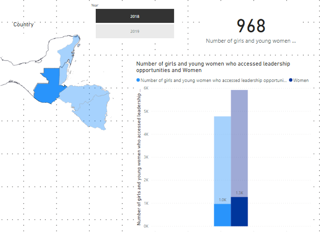
I'm working with a report that shows the results of an indicator in 5 countries. I used a clustered column chart to show the results and at first (without selection) I see the acumulated results for the five countries . If I select one of them in a shape map I can see the country's contribution to the overall results, and this is very helpful as it showns in the diagram below:

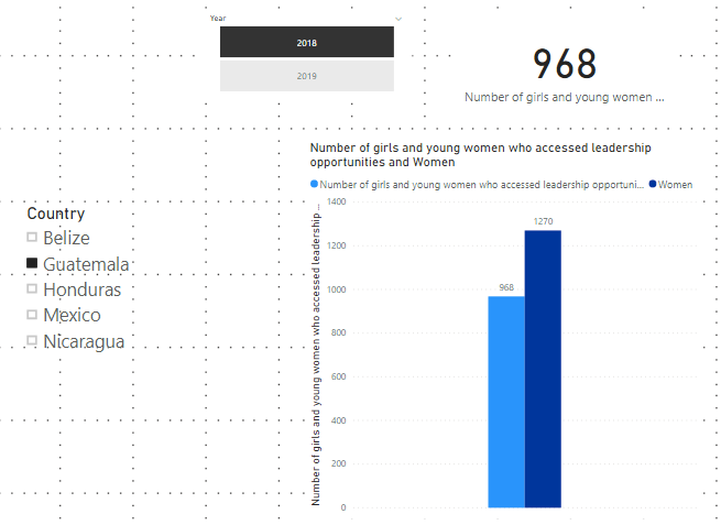
I would like to have the same effect when using a slicer instead of a map to select countries, but I get a different result. With the slicer I don't get to see the specific contribution of the selected country, as shown in the second diagram:

Does anyone knows why filters work different between these two visuals (slicer vs map)? and how do I make the slicer work like the map?
Any help would be appreciated Thanks in advanced
Solved! Go to Solution.
- Mark as New
- Bookmark
- Subscribe
- Mute
- Subscribe to RSS Feed
- Permalink
- Report Inappropriate Content
Hi @Galoyol84
The slicer will apply the filter to the entire data set before the visualization is calculated. The map will cross filter to other visualizations, which is I believe your desired behavior.
One way to do this is not to use a slicer but use a table with "country name" as the only field. You can then click on the country name and it will cross filter.
Helpful resources

Microsoft Fabric Learn Together
Covering the world! 9:00-10:30 AM Sydney, 4:00-5:30 PM CET (Paris/Berlin), 7:00-8:30 PM Mexico City

Power BI Monthly Update - April 2024
Check out the April 2024 Power BI update to learn about new features.

| User | Count |
|---|---|
| 102 | |
| 101 | |
| 87 | |
| 73 | |
| 67 |
| User | Count |
|---|---|
| 116 | |
| 109 | |
| 94 | |
| 79 | |
| 72 |
