Join us at the 2025 Microsoft Fabric Community Conference
Microsoft Fabric Community Conference 2025, March 31 - April 2, Las Vegas, Nevada. Use code MSCUST for a $150 discount.
Register now- Power BI forums
- Get Help with Power BI
- Desktop
- Service
- Report Server
- Power Query
- Mobile Apps
- Developer
- DAX Commands and Tips
- Custom Visuals Development Discussion
- Health and Life Sciences
- Power BI Spanish forums
- Translated Spanish Desktop
- Training and Consulting
- Instructor Led Training
- Dashboard in a Day for Women, by Women
- Galleries
- Webinars and Video Gallery
- Data Stories Gallery
- Themes Gallery
- Contests Gallery
- Quick Measures Gallery
- R Script Showcase
- COVID-19 Data Stories Gallery
- Community Connections & How-To Videos
- 2021 MSBizAppsSummit Gallery
- 2020 MSBizAppsSummit Gallery
- 2019 MSBizAppsSummit Gallery
- Events
- Ideas
- Custom Visuals Ideas
- Issues
- Issues
- Events
- Upcoming Events
The Power BI DataViz World Championships are on! With four chances to enter, you could win a spot in the LIVE Grand Finale in Las Vegas. Show off your skills.
- Power BI forums
- Forums
- Get Help with Power BI
- Desktop
- Re: Filtering Time-Based Line Graph via Top 10 for...
- Subscribe to RSS Feed
- Mark Topic as New
- Mark Topic as Read
- Float this Topic for Current User
- Bookmark
- Subscribe
- Printer Friendly Page
- Mark as New
- Bookmark
- Subscribe
- Mute
- Subscribe to RSS Feed
- Permalink
- Report Inappropriate Content
Filtering Time-Based Line Graph via Top 10 for a Given Month
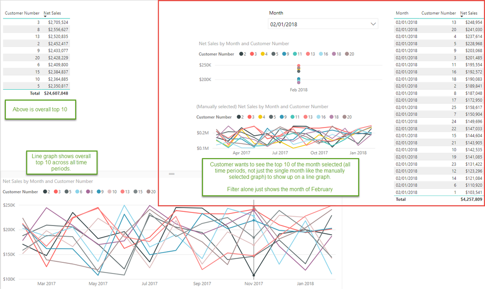
I have created a dashboard that shows the overall top 10 customers based on net sales and a line graph that shows the past 13 months for those top 10 customers. The customer would like to be able to select a particular month (say February 2018) and have the line graph update to show the history for the top 10 customers of February 2018.
I do not think there is a way to resolve this in a single visual/page, but I also cannot think of a way to resolve via any method other than to just manually select the customers on a separate page. Does anyone have any thoughts on the best way to proceed?
- Mark as New
- Bookmark
- Subscribe
- Mute
- Subscribe to RSS Feed
- Permalink
- Report Inappropriate Content
@Anonymous,
In your scenario, you may need to create a new table containing the data of Top 10 users in each month, then create a new line chart using the data in the new table.
If you have any questions, please share sample data of your table and provide dax you use.
Regards,
Lydia
If this post helps, then please consider Accept it as the solution to help the other members find it more quickly.
- Mark as New
- Bookmark
- Subscribe
- Mute
- Subscribe to RSS Feed
- Permalink
- Report Inappropriate Content
I created a sample file and PBIX in a Google drive folder to share:
https://drive.google.com/open?id=15VBBeneWtf7KGDhmdoXPTy12-WEiQQyH
I am not sure how you would setup the filter to draw from the right top 10 table assuming you mean you would create a top 10 table for each month (with the right historical data in there). Appreciate the help and advice!
Brian
Helpful resources

Join us at the Microsoft Fabric Community Conference
March 31 - April 2, 2025, in Las Vegas, Nevada. Use code MSCUST for a $150 discount!

Join our Community Sticker Challenge 2025
If you love stickers, then you will definitely want to check out our Community Sticker Challenge!

| User | Count |
|---|---|
| 126 | |
| 78 | |
| 78 | |
| 59 | |
| 51 |
| User | Count |
|---|---|
| 165 | |
| 83 | |
| 68 | |
| 68 | |
| 59 |

