- Subscribe to RSS Feed
- Mark Topic as New
- Mark Topic as Read
- Float this Topic for Current User
- Bookmark
- Subscribe
- Printer Friendly Page
- Mark as New
- Bookmark
- Subscribe
- Mute
- Subscribe to RSS Feed
- Permalink
- Report Inappropriate Content
Filter another visual by different field
I want the visuals to interact in such a way that only some of the filters in the selected visual apply to the other visual, while other filters do not.
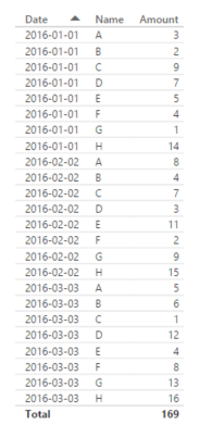
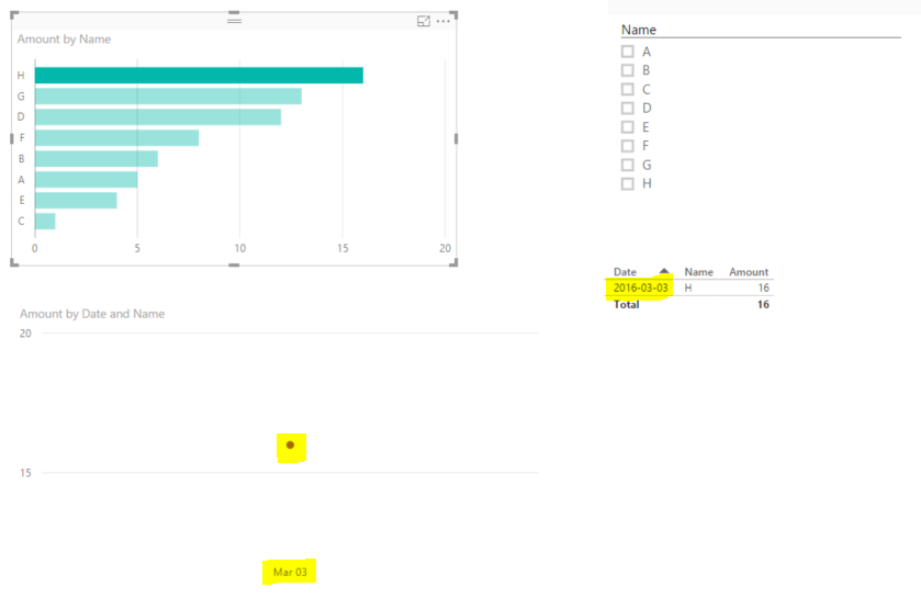
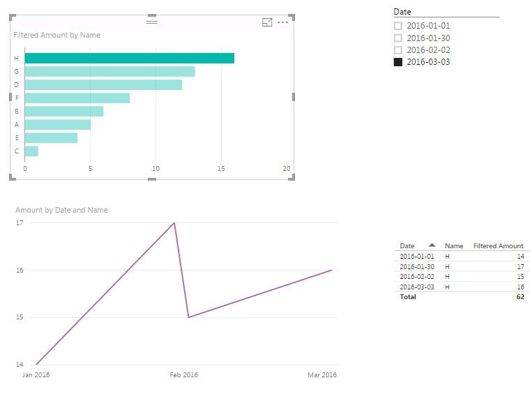
Here's an example. The data is shown here (Date, Name, Amount). The Bar chart represents Name and Amount, and is filtered by date (2016-03-03). Assume there are hundreds of names.
The bar chart shows that H is has the larest value for 2016-03-03. So I want to select H to see only H's time series in the line chart and table. However both those visuals are filtered by 2016-03-03 and H, instead of just H. This behavior is expected in some scenarios, but how do I change hat behavior to show H for all dates?
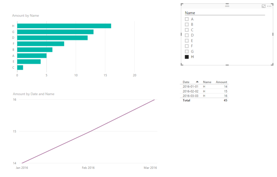
When I select H, the bar chart and table should filter like this:
Is this possible natively? Otherwise I'm wondering if there is a way to create a DAX measure which will somehow "force" the line chart\table to unfilter by date. I tried doing this but had no success.
Thanks.
Solved! Go to Solution.
- Mark as New
- Bookmark
- Subscribe
- Mute
- Subscribe to RSS Feed
- Permalink
- Report Inappropriate Content
That worked @Sean. I made a few modifications so that the filter is more dynamic, and can work for any date (not just months). Here are the steps I took.
Selected Date = MAX(Data[Date])
Filtered Amount = CALCULATE(SUM(Data[Amount]), FILTER(Data, Data[Date] = [Selected Date]))
- Mark as New
- Bookmark
- Subscribe
- Mute
- Subscribe to RSS Feed
- Permalink
- Report Inappropriate Content
I had this issue as well.
I had the date filter (current report) on the bar chart itself. So when I filtered the line graph it would also filter for the current report instead of being all report date datapoints.
The way I fixed this was to have a slicer that selected the current report for the bar chart. And then turned off the slicer for the line graph. Then when you selected the category name the line graph works.
- Mark as New
- Bookmark
- Subscribe
- Mute
- Subscribe to RSS Feed
- Permalink
- Report Inappropriate Content
@Gregg Based on your description I think controlling the interaction of the visuals will solve the issue.
Check out this link
Looking for more Power BI tips, tricks & tools? Check out PowerBI.tips the site I co-own with Mike Carlo. Also, if you are near SE WI? Join our PUG Milwaukee Brew City PUG
- Mark as New
- Bookmark
- Subscribe
- Mute
- Subscribe to RSS Feed
- Permalink
- Report Inappropriate Content
Thanks @Seth_C_Bauer
While that link is useful, it does not quite address what I need. The options there are either
- Filter (assuming by all filters aplied to the selected bar chart), or
- Do not filter
What I need is filter by only one of the filters applied to the bar chart.
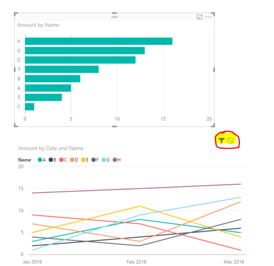
The Highlight option is not available on the Line chart (in this case... I'm not sure why) - see screenshot. Highlight would not be ideal anyway, because the time lines might to be scaled differently.
- Mark as New
- Bookmark
- Subscribe
- Mute
- Subscribe to RSS Feed
- Permalink
- Report Inappropriate Content
@Gregg Create a new measure like in the picture and get rid of the Visual Level Filter
(I've created a custom column Year-Mo = FORMAT(Table1[Date], "YYYY-MM") which I use to filter only March)
You can then even add to the bar chart your SUM of Amount so you have a TOTAL bar and March only bar as in 2nd picture
EDIT: You can of course improve the filter part of the Measure based on another custom column
something like => FILTER(Table1, Table1[Custom Column]="Current Month") or "Previous Month" etc...
- Mark as New
- Bookmark
- Subscribe
- Mute
- Subscribe to RSS Feed
- Permalink
- Report Inappropriate Content
That worked @Sean. I made a few modifications so that the filter is more dynamic, and can work for any date (not just months). Here are the steps I took.
Selected Date = MAX(Data[Date])
Filtered Amount = CALCULATE(SUM(Data[Amount]), FILTER(Data, Data[Date] = [Selected Date]))

- Mark as New
- Bookmark
- Subscribe
- Mute
- Subscribe to RSS Feed
- Permalink
- Report Inappropriate Content
@Gregg This is normal because when you select the bar of H it has 2 filters ( Date - on visual level & H as name ).
You can replace the measure on the line chart so it doesn't filter by dates.
Btw it is better to have always a Date table as dimention.
Timeline =
CALCULATE ( SUM ( Table1[Amount] ); ALL ( Table1[Date] ) )
- Mark as New
- Bookmark
- Subscribe
- Mute
- Subscribe to RSS Feed
- Permalink
- Report Inappropriate Content
@konstantinos I replaced Amount on the Line chart with the TimeLine measure. This has not changed the behavior - it is still filtering by Date (and Name), as in my second screenshot. I tried adding a date table, and adding a relationship to my fact table, then using then applying all to dimDAtes[Date]. That does not work either.
TimeLine = CALCULATE(SUM(Data[Amount]), ALL(dimDates[Date]))
Am I missing a step?
I realize the current behavior is normal, but it would be good to override this behavior, in this particular case.
Thanks for your help.
- Mark as New
- Bookmark
- Subscribe
- Mute
- Subscribe to RSS Feed
- Permalink
- Report Inappropriate Content
Unless you have a different schema with Other dimension tables which might affect - or/ and bi directional relationships which affects crossfiltering.
Do you have the filter on date in Page or Report filter?
Helpful resources

Join us at the Microsoft Fabric Community Conference
March 31 - April 2, 2025, in Las Vegas, Nevada. Use code MSCUST for a $150 discount!

Power BI Monthly Update - February 2025
Check out the February 2025 Power BI update to learn about new features.

| Subject | Author | Posted | |
|---|---|---|---|
| 07-10-2024 04:45 AM | |||
| 07-25-2024 06:03 AM | |||
|
Anonymous
| 10-24-2022 04:21 AM | ||
| 10-25-2022 10:59 AM | |||
| 11-09-2023 05:41 AM |
| User | Count |
|---|---|
| 83 | |
| 80 | |
| 47 | |
| 37 | |
| 37 |
