FabCon is coming to Atlanta
Join us at FabCon Atlanta from March 16 - 20, 2026, for the ultimate Fabric, Power BI, AI and SQL community-led event. Save $200 with code FABCOMM.
Register now!- Power BI forums
- Get Help with Power BI
- Desktop
- Service
- Report Server
- Power Query
- Mobile Apps
- Developer
- DAX Commands and Tips
- Custom Visuals Development Discussion
- Health and Life Sciences
- Power BI Spanish forums
- Translated Spanish Desktop
- Training and Consulting
- Instructor Led Training
- Dashboard in a Day for Women, by Women
- Galleries
- Data Stories Gallery
- Themes Gallery
- Contests Gallery
- QuickViz Gallery
- Quick Measures Gallery
- Visual Calculations Gallery
- Notebook Gallery
- Translytical Task Flow Gallery
- TMDL Gallery
- R Script Showcase
- Webinars and Video Gallery
- Ideas
- Custom Visuals Ideas (read-only)
- Issues
- Issues
- Events
- Upcoming Events
The Power BI Data Visualization World Championships is back! Get ahead of the game and start preparing now! Learn more
- Power BI forums
- Forums
- Get Help with Power BI
- Desktop
- Filter aggregation visual by ID field
- Subscribe to RSS Feed
- Mark Topic as New
- Mark Topic as Read
- Float this Topic for Current User
- Bookmark
- Subscribe
- Printer Friendly Page
- Mark as New
- Bookmark
- Subscribe
- Mute
- Subscribe to RSS Feed
- Permalink
- Report Inappropriate Content
Filter aggregation visual by ID field
My question revolves around two tables, one with the information of each distinct product and another with the amount of users associated with each product in different cities, such as the following example:
My goal is to display the "number" field of products aggregated by category, but be able to filter which BARCODES (i.e. products) should be considered in the aggregation based on the number of users. I set 3 ranges of users, which I want to use to filter the products with this disconnected table:
The main problem is that the number of users is not fixed for each product, but rather by product and city. That is, I need to able to filter which cities should be considered when accounting for this. I created this measure to serve as a flag if the SUM of users is inside the selected range(s).
flag =
IF (
AND (
SUM ( Users[users] ) >= MIN ( pRange[lower_limit] ),
SUM ( Users[users] ) <= MAX ( pRange[upper_limit] )
),
1,
0
)
The following screenshots illustrate what my expected output is with the help of a table visual on the side. Both visuals have the "flag" calculation added as a filter to them (filter: is 1).
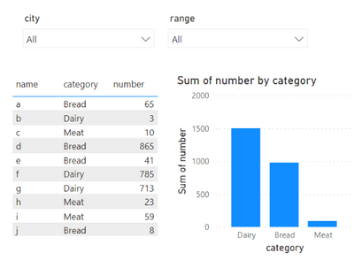
This first image displays all the data, with all cities selected and all possible ranges.
When I try to select a city and a range, the table displays exactly what I expect, only the products that satisfy the condition. However, the bar chart naturally tries to aggregate all products that fall in each of the three categories and then evaluates the number of users, which in this case doesn't fall in the "Low" range, thus, the chart is blank. However, what I want is for the bar chart to categorize exactly the products that we see on the table, which is essentially filtering the chart by barcode, based on the condition.
I attempted to create another table that would do exactly this, to then be able to use as a filter. This is one of the "SUMMARIZE" structures that I tried to create a reduced table with only the cities selected, which didn't work so I didn't add the range filter which is also necessary as well (please note that multiple cities or ranges can also be selected).
attempt =
SUMMARIZE (
FILTER ( Users, Users[city] IN ALLSELECTED ( pCities[city] ) ),
Products[barcode],
"users", SUM ( Users[users] )
)
All example data as well as this "attempt" are available here in this .pbix file.
Thank you in advance for the help! I'd be happy to further explain the problem if necessary.
- Mark as New
- Bookmark
- Subscribe
- Mute
- Subscribe to RSS Feed
- Permalink
- Report Inappropriate Content
Hi @victor_erathos ,
Here are the steps you can follow:
1. Create measure.
User_city =
var _selectcity=SELECTEDVALUE('Users'[city])
var _selectrange=SELECTEDVALUE('pRange'[range])
var _usercity=CALCULATE(SUM('Users'[users]),FILTER(ALL('Users'),'Users'[city]=_selectcity&&'Users'[barcode]=MAX('Products'[barcode])))
return
IF(
_usercity =BLANK(),0,1)
Min =
var _selectrange=SELECTEDVALUE('pRange'[range])
var _min=CALCULATE(MIN('pRange'[lower_limit]),FILTER(ALL(pRange),'pRange'[range]=_selectrange))
return
_minMax =
var _selectrange=SELECTEDVALUE('pRange'[range])
var _max=CALCULATE(Min('pRange'[upper_limit]),FILTER(ALL(pRange),'pRange'[range]=_selectrange))
return
_maxFlag111 =
IF(
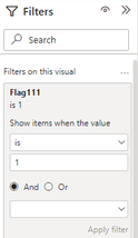
[User_city] >=[Min]&&[User_city]<=[Max],1,0)2. Put [Flag111] in Filter and set is=1
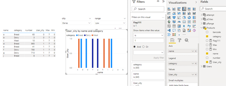
3. Result:
Please click here for the pbix file
Best Regards,
Liu Yang
If this post helps, then please consider Accept it as the solution to help the other members find it more quickly
- Mark as New
- Bookmark
- Subscribe
- Mute
- Subscribe to RSS Feed
- Permalink
- Report Inappropriate Content
I am not sure I understand your approach to the problem. It still does not seem that I can create a bar chart as I mentioned in the post — agregated by category with only the relevant products (please also bear in mind that I created a simplified example, in my actual data I have more than 100k unique products).
Helpful resources

Power BI Dataviz World Championships
The Power BI Data Visualization World Championships is back! Get ahead of the game and start preparing now!

| User | Count |
|---|---|
| 39 | |
| 37 | |
| 33 | |
| 32 | |
| 29 |
| User | Count |
|---|---|
| 133 | |
| 88 | |
| 85 | |
| 68 | |
| 64 |


