FabCon is coming to Atlanta
Join us at FabCon Atlanta from March 16 - 20, 2026, for the ultimate Fabric, Power BI, AI and SQL community-led event. Save $200 with code FABCOMM.
Register now!- Power BI forums
- Get Help with Power BI
- Desktop
- Service
- Report Server
- Power Query
- Mobile Apps
- Developer
- DAX Commands and Tips
- Custom Visuals Development Discussion
- Health and Life Sciences
- Power BI Spanish forums
- Translated Spanish Desktop
- Training and Consulting
- Instructor Led Training
- Dashboard in a Day for Women, by Women
- Galleries
- Data Stories Gallery
- Themes Gallery
- Contests Gallery
- QuickViz Gallery
- Quick Measures Gallery
- Visual Calculations Gallery
- Notebook Gallery
- Translytical Task Flow Gallery
- TMDL Gallery
- R Script Showcase
- Webinars and Video Gallery
- Ideas
- Custom Visuals Ideas (read-only)
- Issues
- Issues
- Events
- Upcoming Events
Get Fabric Certified for FREE during Fabric Data Days. Don't miss your chance! Request now
- Power BI forums
- Forums
- Get Help with Power BI
- Desktop
- Filter a table based on measure selection from a c...
- Subscribe to RSS Feed
- Mark Topic as New
- Mark Topic as Read
- Float this Topic for Current User
- Bookmark
- Subscribe
- Printer Friendly Page
- Mark as New
- Bookmark
- Subscribe
- Mute
- Subscribe to RSS Feed
- Permalink
- Report Inappropriate Content
Filter a table based on measure selection from a clustered bar chart
I have a table with 3 columns - ID, CreateDate, ClosedDate.
In visuals, I have a clustered column chart with two measures - Monthyear on x axis, Measures are 1)Created Cases ='table'( distinctcount(ID) )2)Closed Cases = calculate('table'(distinctcount(ID),Userelationship('datetable'[date], 'Table'[ClosedDate]))
I also have a table visual with ID, CreateDate,ClosedDate. I want to filter this table by clicking on the individual Created Cases/Closed Cases bars and be able to view the respectives IDs and their details. for example, when I click on the Created Cases bar for the month of March 2023 in the clustered column chart, the table below should show IDs created in march.
I am able to achieve this using a slicer that has created cases and closed cases options(Using selectedvalue). I am trying to understand if there's a way to filter the table without using a slicer,i.e directly be able to filter from the column chart
- Mark as New
- Bookmark
- Subscribe
- Mute
- Subscribe to RSS Feed
- Permalink
- Report Inappropriate Content
Thanks for getting back. Here's some sample data
| ID | Create Date | Closed Date |
| 1 | 1/1/2023 | 1/31/2023 |
| 2 | 1/2/2023 | 1/31/2023 |
| 3 | 1/3/2023 | 2/1/2023 |
| 4 | 2/23/2023 | 2/27/2023 |
| 5 | 2/24/2023 | 3/1/2023 |
| 6 | 2/4/2023 | 3/24/2023 |
| 7 | 3/1/2023 | 3/24/2023 |
| 8 | 3/4/2023 | 3/31/2023 |
| 9 | 3/3/2023 | 3/4/2023 |
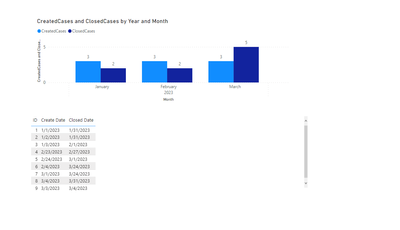
Here are my visuals -
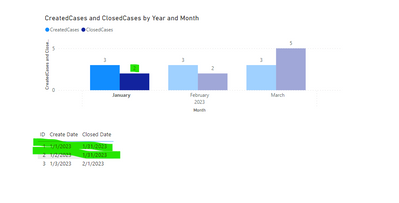
Desired solution - Filter below table to created cases when clicked on created cases and closed cases when clicked on closed cases. Currently it filters Created cases correctly because there is an active relationship between table[createddate] and date[date]. But when I selected Closed cases, It should return 2 rows for the month of Jan as shown below -
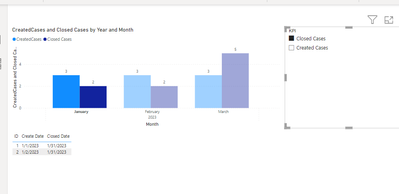
I am able to achieve the desired soultion using a slicer. Just wondering if there is a way to achieve it without a slicer.
For slicer I created a MeasureTable and used selected value
- Mark as New
- Bookmark
- Subscribe
- Mute
- Subscribe to RSS Feed
- Permalink
- Report Inappropriate Content
@Chetanab , Not very clear. But check the field parameters and Calculation group
Power BI Field Parameters — A Quick way for Dynamic Visuals: https://amitchandak.medium.com/power-bi-field-parameters-a-quick-way-for-dynamic-visuals-fc4095ae9af...
Power BI Field Parameters- Measure Slicer and Axis/Dimension slicer: https://youtu.be/lqF3Wa1FllE
Switch TOPN with Field Parameters: https://amitchandak.medium.com/switch-topn-with-field-parameters-299a0ae3725f
Calculation Groups- Measure Slicer, Measure Header Grouping, Measure to dimension conversion. Complex Table display : https://youtu.be/qMNv67P8Go0
Power BI Drill Through when Userelationship is used: https://youtu.be/1BM_WGATrQA
Power BI HR Active Employee Tenure Bucketing, and Hired, Terminated, and Active employees: https://youtu.be/fvgcx8QLqZU
The information you have provided is not making the problem clear to me. Can you please explain with an example.
Appreciate your Kudos.
Helpful resources

Power BI Monthly Update - November 2025
Check out the November 2025 Power BI update to learn about new features.

Fabric Data Days
Advance your Data & AI career with 50 days of live learning, contests, hands-on challenges, study groups & certifications and more!

| User | Count |
|---|---|
| 103 | |
| 80 | |
| 59 | |
| 51 | |
| 46 |


