Get Fabric certified for FREE!
Don't miss your chance to take the Fabric Data Engineer (DP-700) exam on us!
Learn more- Power BI forums
- Get Help with Power BI
- Desktop
- Service
- Report Server
- Power Query
- Mobile Apps
- Developer
- DAX Commands and Tips
- Custom Visuals Development Discussion
- Health and Life Sciences
- Power BI Spanish forums
- Translated Spanish Desktop
- Training and Consulting
- Instructor Led Training
- Dashboard in a Day for Women, by Women
- Galleries
- Data Stories Gallery
- Themes Gallery
- Contests Gallery
- QuickViz Gallery
- Quick Measures Gallery
- Visual Calculations Gallery
- Notebook Gallery
- Translytical Task Flow Gallery
- TMDL Gallery
- R Script Showcase
- Webinars and Video Gallery
- Ideas
- Custom Visuals Ideas (read-only)
- Issues
- Issues
- Events
- Upcoming Events
We've captured the moments from FabCon & SQLCon that everyone is talking about, and we are bringing them to the community, live and on-demand. Starts on April 14th. Register now
- Power BI forums
- Forums
- Get Help with Power BI
- Desktop
- Filter Values To Create Stacked Column Chart
- Subscribe to RSS Feed
- Mark Topic as New
- Mark Topic as Read
- Float this Topic for Current User
- Bookmark
- Subscribe
- Printer Friendly Page
- Mark as New
- Bookmark
- Subscribe
- Mute
- Subscribe to RSS Feed
- Permalink
- Report Inappropriate Content
Filter Values To Create Stacked Column Chart
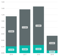
I have created a stacked column chart with 4 columns representing 4 different years and 2 stacked values in each column. This is what it looks like:
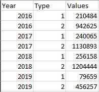
However, to do this, I had to change my directquery to extact a table that previously looked like this:
to this:
Is there any way for me to create a stacked column chart using a filter on the "type" column so it sorts as two separate values? The reason I ask is because I am going to be creating a dynamic matrix/table that I would like to work alongside with this visualization. If I need to use the second table to create the visualization, the two elements won't be connected (and, at least to my knowledge, you won't be able to see which elements/entries are connected when clicking on a cell in the matrix).
Solved! Go to Solution.
- Mark as New
- Bookmark
- Subscribe
- Mute
- Subscribe to RSS Feed
- Permalink
- Report Inappropriate Content
Hello @Anonymous
You should leave your data in the format of the first table. You can get to your goal with just a couple measures. Lets assume your table is called Table1
Amount = SUM ( Table1[Values] )
Type1 = CALCULATE ( [Amount], KEEPFILTERS ( Table1[Type] = 1 ) )
Type2 = CALCULATE ( [Amount], KEEPFILTERS ( Table1[Type] = 2 ) )
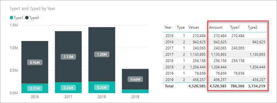
Here is an image of the chart and the data with the three measures above (outlined in red).
By using CALCULATE in our Type measures over our base measure [Amount] we are able to change what each of them calculates. The KEEPFILTERS just lets other things like slicers further filter the measures if they are used.
You will just need to change the name of the table in the measure to whatever it really is in your model. In the spots in blue below.
- Mark as New
- Bookmark
- Subscribe
- Mute
- Subscribe to RSS Feed
- Permalink
- Report Inappropriate Content
Hello!
In this same example, is there a way to add a filter or select what type I want to be displayed. It is true that if I select a specific type in the legend, that type is shown in color and the others in gray. But I would like the graph to only show that particular type, as if I had removed the other one.
My data is displayed as | Year | Values1 | Values 2 |
Helpful resources

New to Fabric Survey
If you have recently started exploring Fabric, we'd love to hear how it's going. Your feedback can help with product improvements.

Power BI DataViz World Championships - June 2026
A new Power BI DataViz World Championship is coming this June! Don't miss out on submitting your entry.

Join our Fabric User Panel
Share feedback directly with Fabric product managers, participate in targeted research studies and influence the Fabric roadmap.

| User | Count |
|---|---|
| 57 | |
| 38 | |
| 35 | |
| 19 | |
| 17 |
| User | Count |
|---|---|
| 73 | |
| 70 | |
| 37 | |
| 35 | |
| 25 |


