Fabric Data Days starts November 4th!
Advance your Data & AI career with 50 days of live learning, dataviz contests, hands-on challenges, study groups & certifications and more!
Get registered- Power BI forums
- Get Help with Power BI
- Desktop
- Service
- Report Server
- Power Query
- Mobile Apps
- Developer
- DAX Commands and Tips
- Custom Visuals Development Discussion
- Health and Life Sciences
- Power BI Spanish forums
- Translated Spanish Desktop
- Training and Consulting
- Instructor Led Training
- Dashboard in a Day for Women, by Women
- Galleries
- Data Stories Gallery
- Themes Gallery
- Contests Gallery
- Quick Measures Gallery
- Visual Calculations Gallery
- Notebook Gallery
- Translytical Task Flow Gallery
- TMDL Gallery
- R Script Showcase
- Webinars and Video Gallery
- Ideas
- Custom Visuals Ideas (read-only)
- Issues
- Issues
- Events
- Upcoming Events
Join us at FabCon Atlanta from March 16 - 20, 2026, for the ultimate Fabric, Power BI, AI and SQL community-led event. Save $200 with code FABCOMM. Register now.
- Power BI forums
- Forums
- Get Help with Power BI
- Desktop
- Excel Pivot Table to Power Query Editor
- Subscribe to RSS Feed
- Mark Topic as New
- Mark Topic as Read
- Float this Topic for Current User
- Bookmark
- Subscribe
- Printer Friendly Page
- Mark as New
- Bookmark
- Subscribe
- Mute
- Subscribe to RSS Feed
- Permalink
- Report Inappropriate Content
Excel Pivot Table to Power Query Editor
Hello,
I am relatively new to power BI and have run in to an issue. What I am trying to do is find a way to build a report that shows which members of our company are viewing reports that we have on the Power BI Service, when they are viewing them, how many times etc.
The "usage metrics" feature and subsequnetly the "Analyse in excel" feature have proven to be a super effective way for me to access who is viewing reports across an entire workspace.
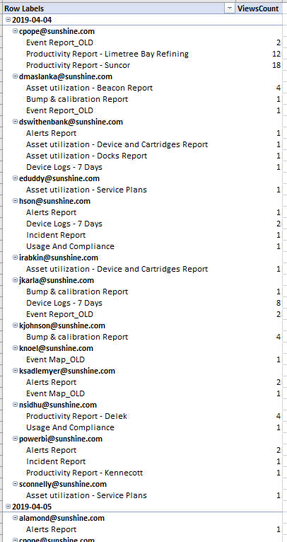
When I "Analyze" the "Usage metrics report" in excel, I do so using a pivot table as is default with the feature. I am able to select the information that I would like to see and excel returns a table that looks as follows:
Here I have first the date, then the user's email and then the specific report they viewed and the amount of times they viewed it on that date. This is exactly the information I would need to meet my goal.
When I put this data in to Power BI, the following is what occurs. As you can see i have first the date in its own row, the the email address and then the reports:
In order for this to be useful to me in power BI, I would like this data to look something like this (i just typed this in to excel to show what i would like to accomplish):
Is there a somewhat efficient way to do this???
Solved! Go to Solution.
- Mark as New
- Bookmark
- Subscribe
- Mute
- Subscribe to RSS Feed
- Permalink
- Report Inappropriate Content
- Mark as New
- Bookmark
- Subscribe
- Mute
- Subscribe to RSS Feed
- Permalink
- Report Inappropriate Content
See this link for solution^
Helpful resources

FabCon Global Hackathon
Join the Fabric FabCon Global Hackathon—running virtually through Nov 3. Open to all skill levels. $10,000 in prizes!

Power BI Monthly Update - October 2025
Check out the October 2025 Power BI update to learn about new features.

| User | Count |
|---|---|
| 76 | |
| 37 | |
| 31 | |
| 27 | |
| 27 |


