Join us at the 2025 Microsoft Fabric Community Conference
Microsoft Fabric Community Conference 2025, March 31 - April 2, Las Vegas, Nevada. Use code FABINSIDER for a $400 discount.
Register now- Power BI forums
- Get Help with Power BI
- Desktop
- Service
- Report Server
- Power Query
- Mobile Apps
- Developer
- DAX Commands and Tips
- Custom Visuals Development Discussion
- Health and Life Sciences
- Power BI Spanish forums
- Translated Spanish Desktop
- Training and Consulting
- Instructor Led Training
- Dashboard in a Day for Women, by Women
- Galleries
- Webinars and Video Gallery
- Data Stories Gallery
- Themes Gallery
- Power BI DataViz World Championships Gallery
- Quick Measures Gallery
- R Script Showcase
- COVID-19 Data Stories Gallery
- Community Connections & How-To Videos
- 2021 MSBizAppsSummit Gallery
- 2020 MSBizAppsSummit Gallery
- 2019 MSBizAppsSummit Gallery
- Events
- Ideas
- Custom Visuals Ideas (read-only)
- Issues
- Issues
- Events
- Upcoming Events
The Power BI DataViz World Championships are on! With four chances to enter, you could win a spot in the LIVE Grand Finale in Las Vegas. Show off your skills.
- Power BI forums
- Forums
- Get Help with Power BI
- Desktop
- Dynamically change the values in a line graph
- Subscribe to RSS Feed
- Mark Topic as New
- Mark Topic as Read
- Float this Topic for Current User
- Bookmark
- Subscribe
- Printer Friendly Page
- Mark as New
- Bookmark
- Subscribe
- Mute
- Subscribe to RSS Feed
- Permalink
- Report Inappropriate Content
Dynamically change the values in a line graph
Hey Guys,
I have 2 large datasets.. one that holds average monthly values (~7,500,000 rows), and one that holds daily values (~4,000,000) rows.
the average monthly values are from 2003 - present, while the daily table is from 2013 - present.
typically, i would use the daily table since it has more data points.. but occasionally, i need to look at more historic trends in the data, and i would really like a way to filter between them.
What i want to do is to have a line graph that will show Date on the x - axis, and 4 different values on the y - axis. (either the dailies, or monthly points). Also, i am not looking at any aggregation or measure, just hoping to have the columns.
i am hoping that after the user selects either "monthly" or "daily" the graph will update accordingly.
Thanks for the help!
Solved! Go to Solution.
- Mark as New
- Bookmark
- Subscribe
- Mute
- Subscribe to RSS Feed
- Permalink
- Report Inappropriate Content
Hi @aar0n
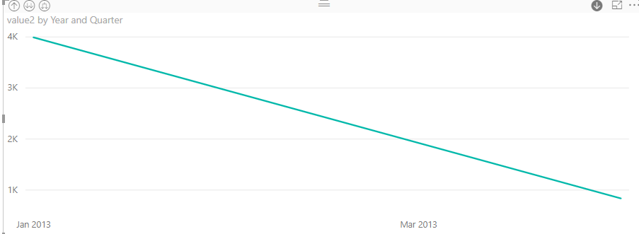
when we use line chart, it can’t show monthly values and the daily value at the same time because the average monthly values and the daily value can’t share one date axis.
We could add date column in the Axis FIELD and make it as date hierarchy, then we can see data in daily level and also in month, quarter and year trend.
Best Regards
Maggie
Helpful resources

Join us at the Microsoft Fabric Community Conference
March 31 - April 2, 2025, in Las Vegas, Nevada. Use code MSCUST for a $150 discount!

Power BI Monthly Update - February 2025
Check out the February 2025 Power BI update to learn about new features.

| User | Count |
|---|---|
| 85 | |
| 78 | |
| 53 | |
| 38 | |
| 36 |
| User | Count |
|---|---|
| 100 | |
| 85 | |
| 47 | |
| 45 | |
| 44 |


