Join us at the 2025 Microsoft Fabric Community Conference
Microsoft Fabric Community Conference 2025, March 31 - April 2, Las Vegas, Nevada. Use code FABINSIDER for a $400 discount.
Register now- Power BI forums
- Get Help with Power BI
- Desktop
- Service
- Report Server
- Power Query
- Mobile Apps
- Developer
- DAX Commands and Tips
- Custom Visuals Development Discussion
- Health and Life Sciences
- Power BI Spanish forums
- Translated Spanish Desktop
- Training and Consulting
- Instructor Led Training
- Dashboard in a Day for Women, by Women
- Galleries
- Webinars and Video Gallery
- Data Stories Gallery
- Themes Gallery
- Power BI DataViz World Championships Gallery
- Quick Measures Gallery
- R Script Showcase
- COVID-19 Data Stories Gallery
- Community Connections & How-To Videos
- 2021 MSBizAppsSummit Gallery
- 2020 MSBizAppsSummit Gallery
- 2019 MSBizAppsSummit Gallery
- Events
- Ideas
- Custom Visuals Ideas
- Issues
- Issues
- Events
- Upcoming Events
The Power BI DataViz World Championships are on! With four chances to enter, you could win a spot in the LIVE Grand Finale in Las Vegas. Show off your skills.
- Power BI forums
- Forums
- Get Help with Power BI
- Desktop
- Dynamically Change the aggregate on a line chart b...
- Subscribe to RSS Feed
- Mark Topic as New
- Mark Topic as Read
- Float this Topic for Current User
- Bookmark
- Subscribe
- Printer Friendly Page
- Mark as New
- Bookmark
- Subscribe
- Mute
- Subscribe to RSS Feed
- Permalink
- Report Inappropriate Content
Dynamically Change the aggregate on a line chart by days or months
Hi all,
So I've got a problem. I have a dataset that contains values which I aggregate and display on a line chart by date. I want to however have the line chart's date axis dynamically change from aggregating in Days to aggregating in months depending on how I select the date slicer. So for example:
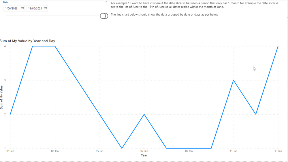
When I then change the date slicer to include more than 1 month for example the below. I want the line chart to dynamically change so that it's now displaying and aggregating by months.
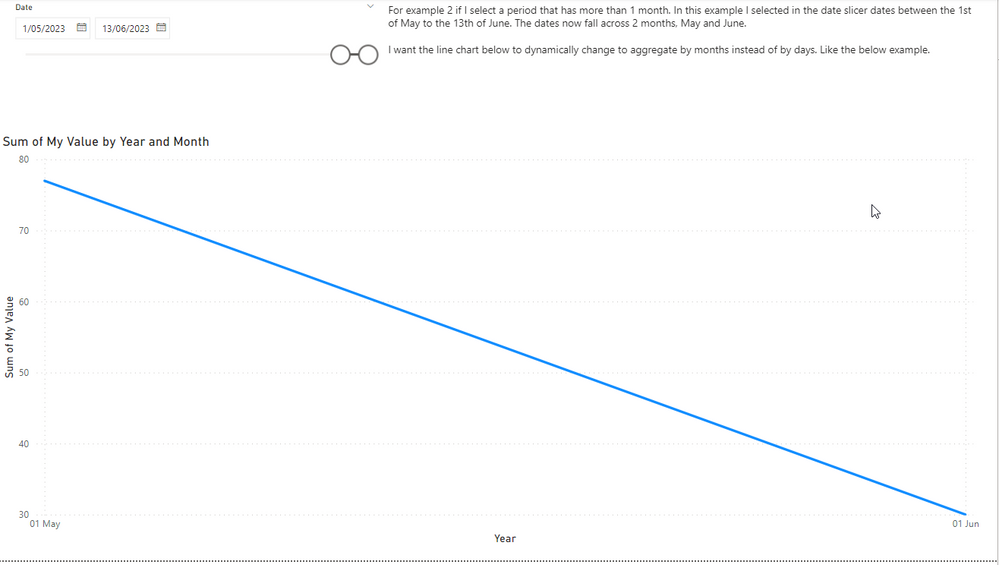
Is there a way of doing this?
Here's the dropbox link to the PBIX file I used to generate the screenshot. Any help would be greatly appreciated.
https://www.dropbox.com/s/kdrayilm4f7pp6u/Help%20Example.pbix?dl=0
Solved! Go to Solution.
- Mark as New
- Bookmark
- Subscribe
- Mute
- Subscribe to RSS Feed
- Permalink
- Report Inappropriate Content
Hi @Mike282
I
While I don't believe it is possible to do it completely automatically, I do believe it is possible to use
Field parametrs
In order to select the granularity level desired
Please follow these steps to modify this option:
1. Add to your date table column for month - year
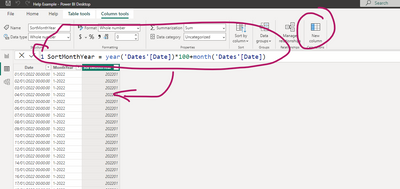
2. Add another column to have the option to sort your month and year in the correct order:
3. Modify sort order of month and year:
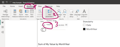
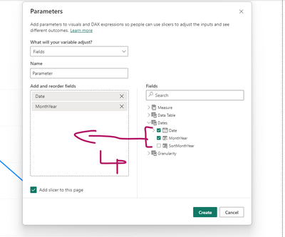
4. Add field parameters:
5. Put the field parameter as a X axis to your chart:
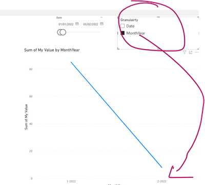
Now you can change desired granularity from the slicer of the parameter:
If this post helps, then please consider Accepting it as the solution to help the other members find it more quickly
Rita Fainshtein | Microsoft MVP
https://www.linkedin.com/in/rita-fainshtein/
Blog : https://www.madeiradata.com/profile/ritaf/profile
- Mark as New
- Bookmark
- Subscribe
- Mute
- Subscribe to RSS Feed
- Permalink
- Report Inappropriate Content
I was just look at this too and saw @Ritaf1983 's post just before I posted.
My only addition to the discussion is that the field parameter selection can be automated.
- Create a measure Date Field Flag that returns 1 if the current field parameter value corresponds to the date selection.
- Ensure there is an explicit "Start of Month" or MonthYear column in the Dates table.
- Add a Top N filter to the line chart visual as shown below.
See attached PBIX.
Date Field Flag measure:
Date Field Flag =
VAR NumMonths =
    DISTINCTCOUNT ( Dates[Start of Month] )
VAR CurrentDateField =
    MIN ( 'Date Field'[Date Field] )
RETURN
    INT (
        OR (
            AND ( NumMonths = 1, CurrentDateField = "Date" ),
            AND ( NumMonths > 1, CurrentDateField = "Start of Month" )
        )
    )
Visual-level filter on line chart:
- Mark as New
- Bookmark
- Subscribe
- Mute
- Subscribe to RSS Feed
- Permalink
- Report Inappropriate Content
Hi @Mike282
I
While I don't believe it is possible to do it completely automatically, I do believe it is possible to use
Field parametrs
In order to select the granularity level desired
Please follow these steps to modify this option:
1. Add to your date table column for month - year
2. Add another column to have the option to sort your month and year in the correct order:
3. Modify sort order of month and year:
4. Add field parameters:
5. Put the field parameter as a X axis to your chart:
Now you can change desired granularity from the slicer of the parameter:
If this post helps, then please consider Accepting it as the solution to help the other members find it more quickly
Rita Fainshtein | Microsoft MVP
https://www.linkedin.com/in/rita-fainshtein/
Blog : https://www.madeiradata.com/profile/ritaf/profile
Helpful resources

Join us at the Microsoft Fabric Community Conference
March 31 - April 2, 2025, in Las Vegas, Nevada. Use code MSCUST for a $150 discount!

Power BI Monthly Update - February 2025
Check out the February 2025 Power BI update to learn about new features.

Join our Community Sticker Challenge 2025
If you love stickers, then you will definitely want to check out our Community Sticker Challenge!

| User | Count |
|---|---|
| 84 | |
| 69 | |
| 68 | |
| 39 | |
| 37 |

