FabCon is coming to Atlanta
Join us at FabCon Atlanta from March 16 - 20, 2026, for the ultimate Fabric, Power BI, AI and SQL community-led event. Save $200 with code FABCOMM.
Register now!- Power BI forums
- Get Help with Power BI
- Desktop
- Service
- Report Server
- Power Query
- Mobile Apps
- Developer
- DAX Commands and Tips
- Custom Visuals Development Discussion
- Health and Life Sciences
- Power BI Spanish forums
- Translated Spanish Desktop
- Training and Consulting
- Instructor Led Training
- Dashboard in a Day for Women, by Women
- Galleries
- Data Stories Gallery
- Themes Gallery
- Contests Gallery
- QuickViz Gallery
- Quick Measures Gallery
- Visual Calculations Gallery
- Notebook Gallery
- Translytical Task Flow Gallery
- TMDL Gallery
- R Script Showcase
- Webinars and Video Gallery
- Ideas
- Custom Visuals Ideas (read-only)
- Issues
- Issues
- Events
- Upcoming Events
The Power BI Data Visualization World Championships is back! Get ahead of the game and start preparing now! Learn more
- Power BI forums
- Forums
- Get Help with Power BI
- Desktop
- Dynamic text that will show different cases depend...
- Subscribe to RSS Feed
- Mark Topic as New
- Mark Topic as Read
- Float this Topic for Current User
- Bookmark
- Subscribe
- Printer Friendly Page
- Mark as New
- Bookmark
- Subscribe
- Mute
- Subscribe to RSS Feed
- Permalink
- Report Inappropriate Content
Dynamic text that will show different cases depends on values
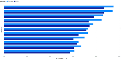
Hello. I have a percentage that I divided into 2 genders, male and female. It looks like this:
So, my problem is kinda complicated. I need to put dynamic text on my dashboard, that will show either all females scored higher that males, or opposite. Ideally, I would like to have the third case, if for example females scored higher in all bars, except something, then the text will be like:
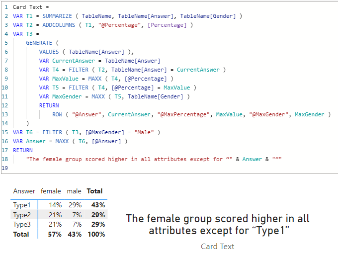
"The female group scored higher in all attributes except for “smth” ".
Does anyone has an idea? I will be very gratefull.
Solved! Go to Solution.
- Mark as New
- Bookmark
- Subscribe
- Mute
- Subscribe to RSS Feed
- Permalink
- Report Inappropriate Content
@Anonymous
Apologies for the late reply, I got distracted with some other business. Here is the sample file with he solution https://www.dropbox.com/t/x57u2iHQmfZyrYPv
Actually this need some improvement. It need to be more dynamic by interchanging between male and female (whoever scores more) and perhaps concatenate the lower scored answered and/or providing counts of higher and lower answers in order to have accurate presentation of the results.
- Mark as New
- Bookmark
- Subscribe
- Mute
- Subscribe to RSS Feed
- Permalink
- Report Inappropriate Content
Hi @Anonymous
Yes that can be done. Would you please provide more details about your source data?
- Mark as New
- Bookmark
- Subscribe
- Mute
- Subscribe to RSS Feed
- Permalink
- Report Inappropriate Content
As I can't share real names and values, I'm trying to make similar:
a table like:
| person_id | _question | _answer | _gender | |
| 1 . | some_quest? . | 1st_type . | male | |
| 2 . | some_quest? . | 1st_type . | male | |
| 3 . | some_quest? . | 2st_type . | female | |
| 4 . | some_quest? . | 3st_type . | male | |
| 5 . | some_quest? . | 3st_type . | female | |
| 6 . | some_quest? . | 1st_type . | female | |
| 7 . | some_quest? | 1st_type . | female | |
| 8 . | some_quest? . | 2st_type . | female | |
| 9 . | some_quest? . | 2st_type . | female |
Then I calculate simple percentage for each answer, when I divede number of people who answered each type of answer and devide by all people who answered this question by any answer, for example in this table the calculation for 1st_type of answer will be 4/9.
This percentage I report as bar chart where x-axis is calculated value, y-axis is type of answer and divide it by gender legend.
- Mark as New
- Bookmark
- Subscribe
- Mute
- Subscribe to RSS Feed
- Permalink
- Report Inappropriate Content
@Anonymous
Apologies for the late reply, I got distracted with some other business. Here is the sample file with he solution https://www.dropbox.com/t/x57u2iHQmfZyrYPv
Actually this need some improvement. It need to be more dynamic by interchanging between male and female (whoever scores more) and perhaps concatenate the lower scored answered and/or providing counts of higher and lower answers in order to have accurate presentation of the results.
Helpful resources

Power BI Monthly Update - November 2025
Check out the November 2025 Power BI update to learn about new features.

Fabric Data Days
Advance your Data & AI career with 50 days of live learning, contests, hands-on challenges, study groups & certifications and more!

| User | Count |
|---|---|
| 58 | |
| 45 | |
| 40 | |
| 21 | |
| 18 |


