FabCon is coming to Atlanta
Join us at FabCon Atlanta from March 16 - 20, 2026, for the ultimate Fabric, Power BI, AI and SQL community-led event. Save $200 with code FABCOMM.
Register now!- Power BI forums
- Get Help with Power BI
- Desktop
- Service
- Report Server
- Power Query
- Mobile Apps
- Developer
- DAX Commands and Tips
- Custom Visuals Development Discussion
- Health and Life Sciences
- Power BI Spanish forums
- Translated Spanish Desktop
- Training and Consulting
- Instructor Led Training
- Dashboard in a Day for Women, by Women
- Galleries
- Data Stories Gallery
- Themes Gallery
- Contests Gallery
- QuickViz Gallery
- Quick Measures Gallery
- Visual Calculations Gallery
- Notebook Gallery
- Translytical Task Flow Gallery
- TMDL Gallery
- R Script Showcase
- Webinars and Video Gallery
- Ideas
- Custom Visuals Ideas (read-only)
- Issues
- Issues
- Events
- Upcoming Events
Get Fabric Certified for FREE during Fabric Data Days. Don't miss your chance! Request now
- Power BI forums
- Forums
- Get Help with Power BI
- Desktop
- Dynamic measures and blank spaces in column chart
- Subscribe to RSS Feed
- Mark Topic as New
- Mark Topic as Read
- Float this Topic for Current User
- Bookmark
- Subscribe
- Printer Friendly Page
- Mark as New
- Bookmark
- Subscribe
- Mute
- Subscribe to RSS Feed
- Permalink
- Report Inappropriate Content
Dynamic measures and blank spaces in column chart
Hi,
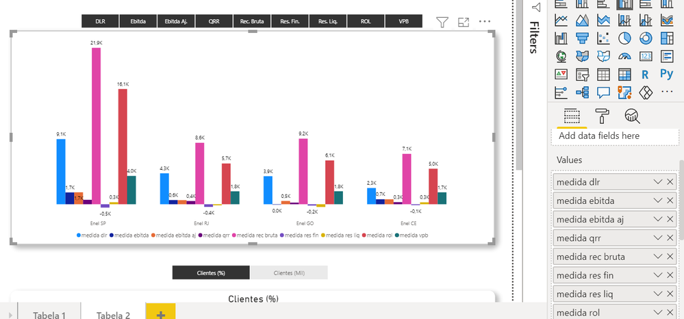
I created one visual with many measures into the Clustered Column Chart. All measures can be dinamically selected by the user to be shown in the chart at the same time, as in the following picture (where the 9 measures are shown to each X company name):
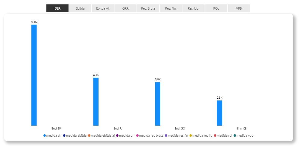
So far ok. The problem is: when I start to deselect some measures that I dont want to see in the chart, Power BI "reserves" one blank space to the deselected measure, and the chart turns into an unpleasant fashion, with lots of white spaces between X values, as in the following picture (where I selected just one measure):
Here is the Dax formula that I'm using to each "dynamic measure" (they are all the same logic):
medida dlr =
Var LogicTest =
COUNTROWS(DISTINCT(
    FILTER(ALLSELECTED(Variaveis_Receita_Tabela_2),
        Variaveis_Receita_Tabela_2[Valor 2] = "DLR"
    )
)) = 1
Return
IF (
    LogicTest,
    sum(econ_ind_sustentabilidade_tab_2[dlr]),
    BLANK()
)
Do you know if there is some way to get rid from those white spaces when the measures are deselected?
Thanks
Solved! Go to Solution.
- Mark as New
- Bookmark
- Subscribe
- Mute
- Subscribe to RSS Feed
- Permalink
- Report Inappropriate Content
Hi @mau_habert ,
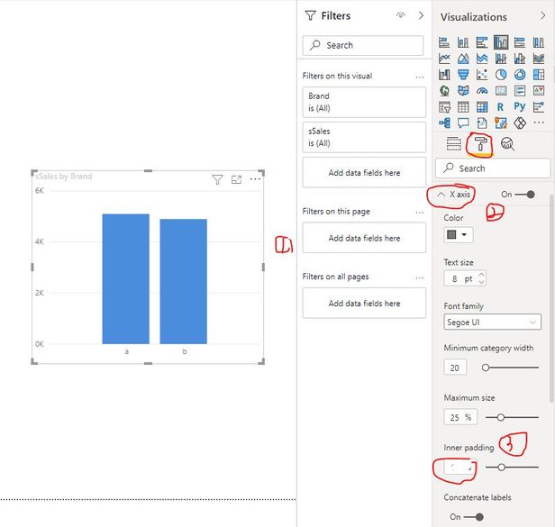
Please select the related column chart and navigate to Format pane. Find X axis options to adjust the value of Inner padding just as below screenshot.
Best Regards
- Mark as New
- Bookmark
- Subscribe
- Mute
- Subscribe to RSS Feed
- Permalink
- Report Inappropriate Content
Hi @mau_habert ,
Please select the related column chart and navigate to Format pane. Find X axis options to adjust the value of Inner padding just as below screenshot.
Best Regards
- Mark as New
- Bookmark
- Subscribe
- Mute
- Subscribe to RSS Feed
- Permalink
- Report Inappropriate Content
Hi @mau_habert
No I don't believe you can change this spacing between columns dynamically like that, it's the way the visual works.
Regards
Phil
Did I answer your question? Then please mark my post as the solution.
If I helped you, click on the Thumbs Up to give Kudos.
Blog :: YouTube Channel :: Connect on Linkedin
Proud to be a Super User!
Helpful resources

Power BI Monthly Update - November 2025
Check out the November 2025 Power BI update to learn about new features.

Fabric Data Days
Advance your Data & AI career with 50 days of live learning, contests, hands-on challenges, study groups & certifications and more!


