This is best Fabric, Power BI, SQL and AI community event. How do we know? The last event sold out! Save €200 with code FABCMTY200.
Register nowA new Data Days event is coming soon! This time we’re going bigger than ever. Fabric, Power BI, SQL, AI and more. Don't miss out.
Hi!
This is my first post, I really hope you can help me.
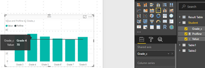
On an analysis we're working on (Primary and Middle School Analysis) , we've created a line and stacked column of performance level with score values. In that visual we have grades 3, 4, 5, 6, 7, and 8. There's a slicer set up to only display the selected grade, and that's working perfectly.
I think the way to do this is to create a measure based on the grade field and place it in the line values of the chart. We want to add a proficiency line, but that line will be different for each grade. So ideally, when 'Grade 4' is selected in the slicer, their unique line value appears. We tried to create a new measure for the line value. The formula entered is below, but this is not working :
"ProfLine = IF(ISFILTERED(Student[Grade__c]),LOOKUPVALUE(3,Student[Grade__c],Student[3],66)))"
These are the values for each grade:
Grade 3: 66
Grade 4: 70
Grade 5: 63
Grade 6: 58
Grade 7: 56
Grade 8: 62
Is there a way to set up different value lines that are only displayed when the specific grade is selected?
Thanks in advance!
Solved! Go to Solution.
Hi @Lorraine,
Please create a measure using the formula below. You can add more choice in the SWITCH function, for example, ELA 5, ELA 6, ELA 7 and so on.
line =
IF (
ISFILTERED ( Table[ClassGrades] ),
SWITCH ( SELECTEDVALUE ( Table[ClassGrades] ), "ELA 3", 58, "ELA 4", 61, 100 ),
0
)
Then add the measure in line chart field, you will get expected result.
Best Regards,
Angelia
Hi @Lorraine,
I create a a line and stacked column as follows.
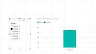
As I tested, when you create a slicer to filter the a line and stacked column visual, when a value is selected in slicer, the line become a dot and there only one bar, what result do you want to get? Could you please share more details?
Best Regards,
Angelia
Hi @v-huizhn-msft,
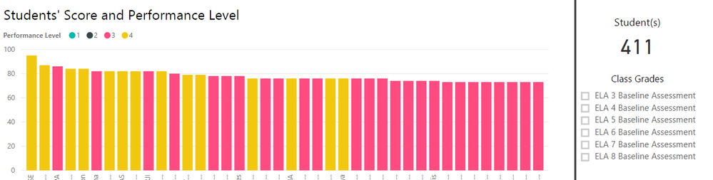
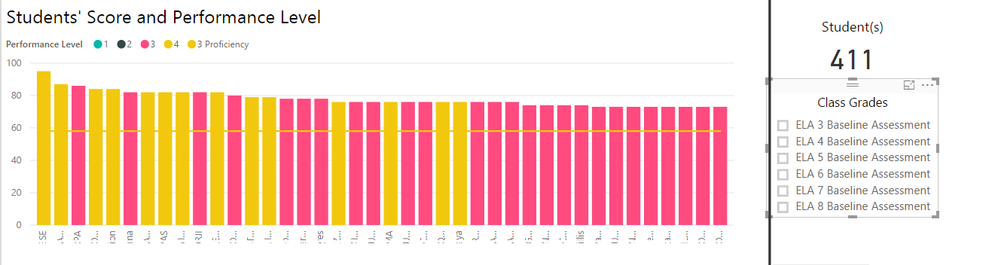
This is what my chart originially looks like:
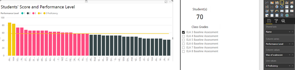
For ELA 3 I want to add a line value of 58, so I added a measure to equal 58. When using the slicer to select ELA 3, I have this:
That's how I want the data to be displayed, so that's great. The problem is when I deselect ELA 3, and go back to viewing all grades at once, this is the visual:
The issue is that I only want that line value to be shown when I select Grade 3 in the slicer. I want each grade to have a different line measure, but for it to show only when that grade is selected in the slicer. For example, the line value for grade 4 is 61. So when I select grade 4, I want the line value to be 61, not 58. I want the line values dynamic in the sense that the lines will change when I change the grade selected in the slicer. Please let me know if this is possible and how I can set it up!
Thanks,
Lorraine
Hi @Lorraine,
Please create a measure using the formula below. You can add more choice in the SWITCH function, for example, ELA 5, ELA 6, ELA 7 and so on.
line =
IF (
ISFILTERED ( Table[ClassGrades] ),
SWITCH ( SELECTEDVALUE ( Table[ClassGrades] ), "ELA 3", 58, "ELA 4", 61, 100 ),
0
)
Then add the measure in line chart field, you will get expected result.
Best Regards,
Angelia
Check out the May 2026 Power BI update to learn about new features.
Sign up to receive a private message when registration opens and key events begin.
If you have recently started exploring Fabric, we'd love to hear how it's going. Your feedback can help with product improvements.
| User | Count |
|---|---|
| 30 | |
| 26 | |
| 25 | |
| 22 | |
| 13 |
| User | Count |
|---|---|
| 60 | |
| 50 | |
| 26 | |
| 20 | |
| 19 |