FabCon is coming to Atlanta
Join us at FabCon Atlanta from March 16 - 20, 2026, for the ultimate Fabric, Power BI, AI and SQL community-led event. Save $200 with code FABCOMM.
Register now!- Power BI forums
- Get Help with Power BI
- Desktop
- Service
- Report Server
- Power Query
- Mobile Apps
- Developer
- DAX Commands and Tips
- Custom Visuals Development Discussion
- Health and Life Sciences
- Power BI Spanish forums
- Translated Spanish Desktop
- Training and Consulting
- Instructor Led Training
- Dashboard in a Day for Women, by Women
- Galleries
- Data Stories Gallery
- Themes Gallery
- Contests Gallery
- QuickViz Gallery
- Quick Measures Gallery
- Visual Calculations Gallery
- Notebook Gallery
- Translytical Task Flow Gallery
- TMDL Gallery
- R Script Showcase
- Webinars and Video Gallery
- Ideas
- Custom Visuals Ideas (read-only)
- Issues
- Issues
- Events
- Upcoming Events
The Power BI Data Visualization World Championships is back! Get ahead of the game and start preparing now! Learn more
- Power BI forums
- Forums
- Get Help with Power BI
- Desktop
- Dynamic Hierarchy selection with slicer - data lab...
- Subscribe to RSS Feed
- Mark Topic as New
- Mark Topic as Read
- Float this Topic for Current User
- Bookmark
- Subscribe
- Printer Friendly Page
- Mark as New
- Bookmark
- Subscribe
- Mute
- Subscribe to RSS Feed
- Permalink
- Report Inappropriate Content
Dynamic Hierarchy selection with slicer - data labels not displaying correctly
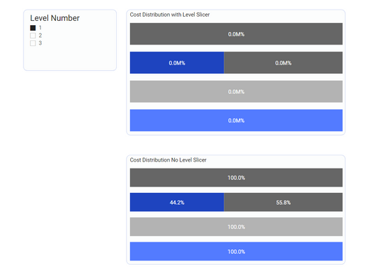
I am creating a dashboard where I would like the users to have the ability to select a level of a hierarchy to display the distribution of that hierarchy for a set of categories. I made use of this blog post on how to set dynamic categories/legends, which works perfectly with the exception of the data labels. (https://xxlbi.com/blog/dynamic-hierarchies-in-power-bi/) For the 100% stacked bar chart, I would need the Legend to reflect the level the user selects in the slicer. Here's what I am seeing, the top stacked chart is with the dynamic selection, the bottom is without. The distribution for both is correctly sliced, however the data label for the dynamic version is showing 0.0% instead of the expected % distribution. I'm not sure why this doesn't display correctly in the dynamic legend scenario, any ideas on this? When I hover over the top chart, the tool tip does show the correct % distribution.
Solved! Go to Solution.
- Mark as New
- Bookmark
- Subscribe
- Mute
- Subscribe to RSS Feed
- Permalink
- Report Inappropriate Content
That unfortunately didn't work - for whatever reason, when I went back and re-created the visualization from scratch, it seemed to work with the correct data values showing. (I had at first just changed the chart from a regular bar to the stacked %) I am not sure why that worked vs. changing the chart type, but it's fixed now.
- Mark as New
- Bookmark
- Subscribe
- Mute
- Subscribe to RSS Feed
- Permalink
- Report Inappropriate Content
Hi @Anonymous ,
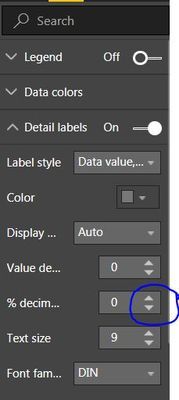
Try to change the decimals up or down and then set it to zero again. I hope that this helps!
If possible, please share your .pbix file and remove confidential data.
Best Regards
Lucien
- Mark as New
- Bookmark
- Subscribe
- Mute
- Subscribe to RSS Feed
- Permalink
- Report Inappropriate Content
That unfortunately didn't work - for whatever reason, when I went back and re-created the visualization from scratch, it seemed to work with the correct data values showing. (I had at first just changed the chart from a regular bar to the stacked %) I am not sure why that worked vs. changing the chart type, but it's fixed now.
Helpful resources

Power BI Monthly Update - November 2025
Check out the November 2025 Power BI update to learn about new features.

Fabric Data Days
Advance your Data & AI career with 50 days of live learning, contests, hands-on challenges, study groups & certifications and more!

| User | Count |
|---|---|
| 57 | |
| 43 | |
| 41 | |
| 22 | |
| 17 |
| User | Count |
|---|---|
| 186 | |
| 116 | |
| 95 | |
| 64 | |
| 45 |


