New Offer! Become a Certified Fabric Data Engineer
Check your eligibility for this 50% exam voucher offer and join us for free live learning sessions to get prepared for Exam DP-700.
Get Started- Power BI forums
- Get Help with Power BI
- Desktop
- Service
- Report Server
- Power Query
- Mobile Apps
- Developer
- DAX Commands and Tips
- Custom Visuals Development Discussion
- Health and Life Sciences
- Power BI Spanish forums
- Translated Spanish Desktop
- Training and Consulting
- Instructor Led Training
- Dashboard in a Day for Women, by Women
- Galleries
- Community Connections & How-To Videos
- COVID-19 Data Stories Gallery
- Themes Gallery
- Data Stories Gallery
- R Script Showcase
- Webinars and Video Gallery
- Quick Measures Gallery
- 2021 MSBizAppsSummit Gallery
- 2020 MSBizAppsSummit Gallery
- 2019 MSBizAppsSummit Gallery
- Events
- Ideas
- Custom Visuals Ideas
- Issues
- Issues
- Events
- Upcoming Events
Don't miss out! 2025 Microsoft Fabric Community Conference, March 31 - April 2, Las Vegas, Nevada. Use code MSCUST for a $150 discount. Prices go up February 11th. Register now.
- Power BI forums
- Forums
- Get Help with Power BI
- Desktop
- Dual or multiple Y axis on power bi column and lin...
- Subscribe to RSS Feed
- Mark Topic as New
- Mark Topic as Read
- Float this Topic for Current User
- Bookmark
- Subscribe
- Printer Friendly Page
- Mark as New
- Bookmark
- Subscribe
- Mute
- Subscribe to RSS Feed
- Permalink
- Report Inappropriate Content
Dual or multiple Y axis on power bi column and line chart
Hi All,
I'm having some trouble in creating a primary and secondary Y axis on a power bi chart with year as legend.
Let's say I have a monthly data of cost and sales for two years.
Year | Month | Cost | Sales |
2018 | Month 1 | 1000 | 5000 |
2019 | Month 1 | 1100 | 5050 |
2018 | Month 2 | 1050 | 4500 |
2019 | Month 2 | 1200 | 5100 |
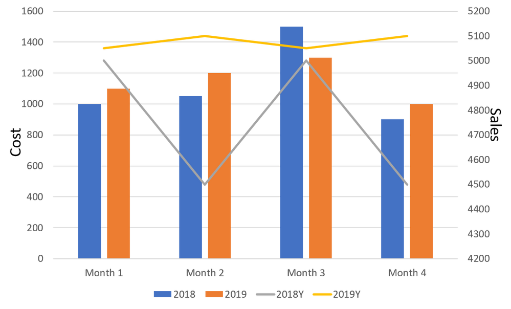
I want to create a time series chart as below, showing the actual values by month and legend coloured by the year. And I want say cost on the primary Y axis and sales on the secondary Y axis.
This is a much simple chart to create in excel, but I'm having a hard time in finding a free power bi visual to create this. Any ideas or suggestions on this would really help!!
- Mark as New
- Bookmark
- Subscribe
- Mute
- Subscribe to RSS Feed
- Permalink
- Report Inappropriate Content
Hi, let's see. The combo charts work like this: The legend will only work for the bars. If you want to try something like that you have to create measures for each line. For example
- Axis: Month
- Legend: Year
- Value: Cost
- Line: two measures Sales2019 and Sales2020
That is how the chart works inside Power Bi. You can always try custom visuals like Amit suggests.
Hope that helps.
Happy to help!
- Mark as New
- Bookmark
- Subscribe
- Mute
- Subscribe to RSS Feed
- Permalink
- Report Inappropriate Content
@Anonymous , In power bi legend, will work only for bar, not for the line.
You can check custom visual: https://appsource.microsoft.com/en-us/marketplace/apps?product=power-bi-visuals
Or create an idea:https://ideas.powerbi.com/ideas/
Helpful resources

Join us at the Microsoft Fabric Community Conference
March 31 - April 2, 2025, in Las Vegas, Nevada. Use code MSCUST for a $150 discount! Prices go up Feb. 11th.

Power BI Monthly Update - January 2025
Check out the January 2025 Power BI update to learn about new features in Reporting, Modeling, and Data Connectivity.

| User | Count |
|---|---|
| 143 | |
| 75 | |
| 63 | |
| 52 | |
| 47 |
| User | Count |
|---|---|
| 218 | |
| 86 | |
| 64 | |
| 63 | |
| 60 |

